
Infragistics Ultimate UI for WPF
掌握您企業的發展速度、可擴展性和觸摸支援,而這些全部都會在 WPF 控制項中找到。
由以下開發商製作:Infragistics
ComponentSource 開始代理銷售的日期:1996年
掌握您企業的發展速度、可擴展性和觸摸支援,而這些全部都會在 WPF 控制項中找到。
由以下開發商製作:Infragistics
ComponentSource 開始代理銷售的日期:1996年
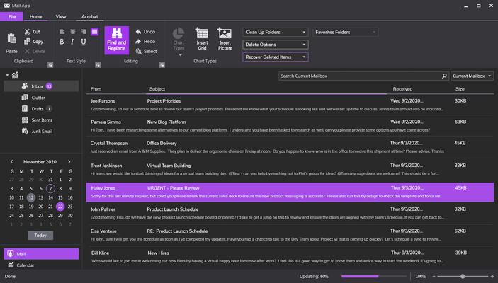
Infragistics Ultimate UI for WPF is the new name for Infragistics WPF and is also available as part of Infragistics Professional and Infragistics Ultimate.
Released: Nov 18, 2011
聯繫電話: (888) 850 9911
傳真: +1 770 250 6199


 (1)
(1)