


官方供應商
我們作為官方授權經銷商,直接提供超過200家開發廠家所發行超過1000個的產品授權給您。
請參閱我們所有的品牌。
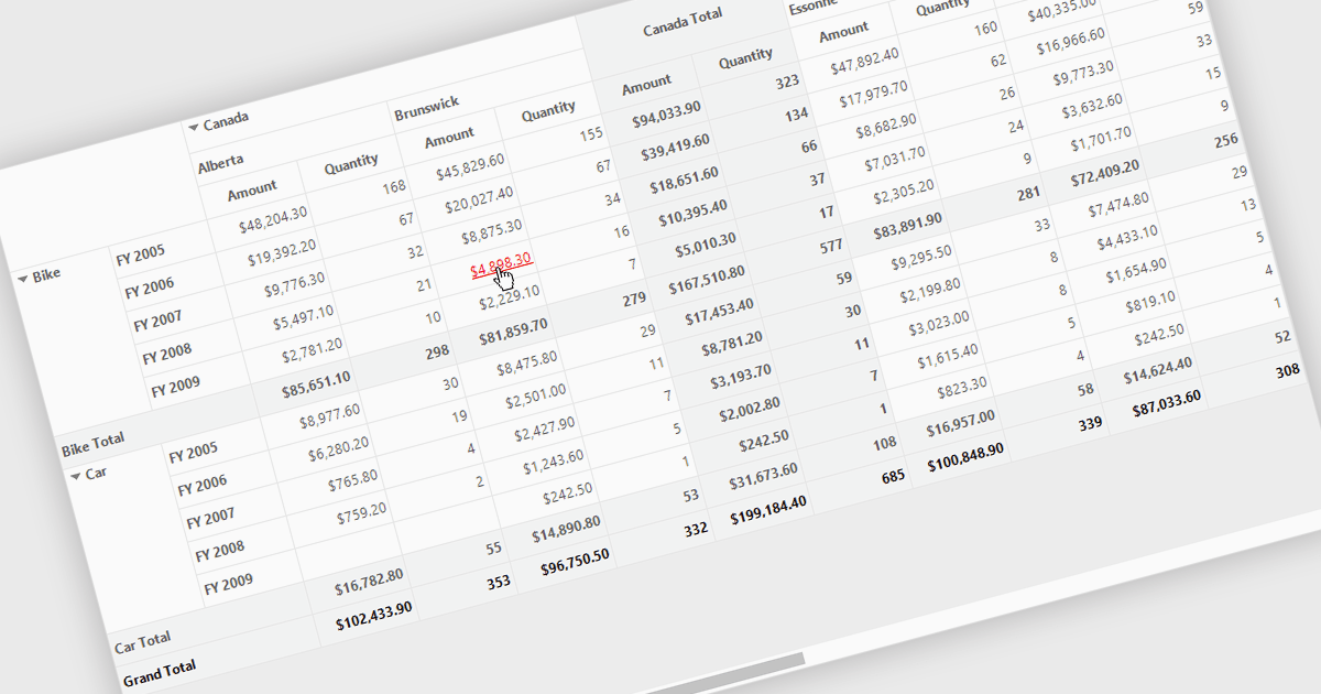
Hyperlinks in grids allow individual cells to function as clickable links, enabling users to navigate directly to related records, pages, or external resources. This makes data more interactive and improves usability by reducing manual searching. Users can quickly access additional context such as detailed views, reports, or linked systems without leaving the grid. Common use cases include linking customer names to profiles, order IDs to transaction details, or connecting data to external documentation, helping improve productivity and efficiency.
Several .NET WinForms grid controls offer hyperlink cell types, including:
For an in-depth analysis of features and price, visit our .NET WinForms grid controls comparison.
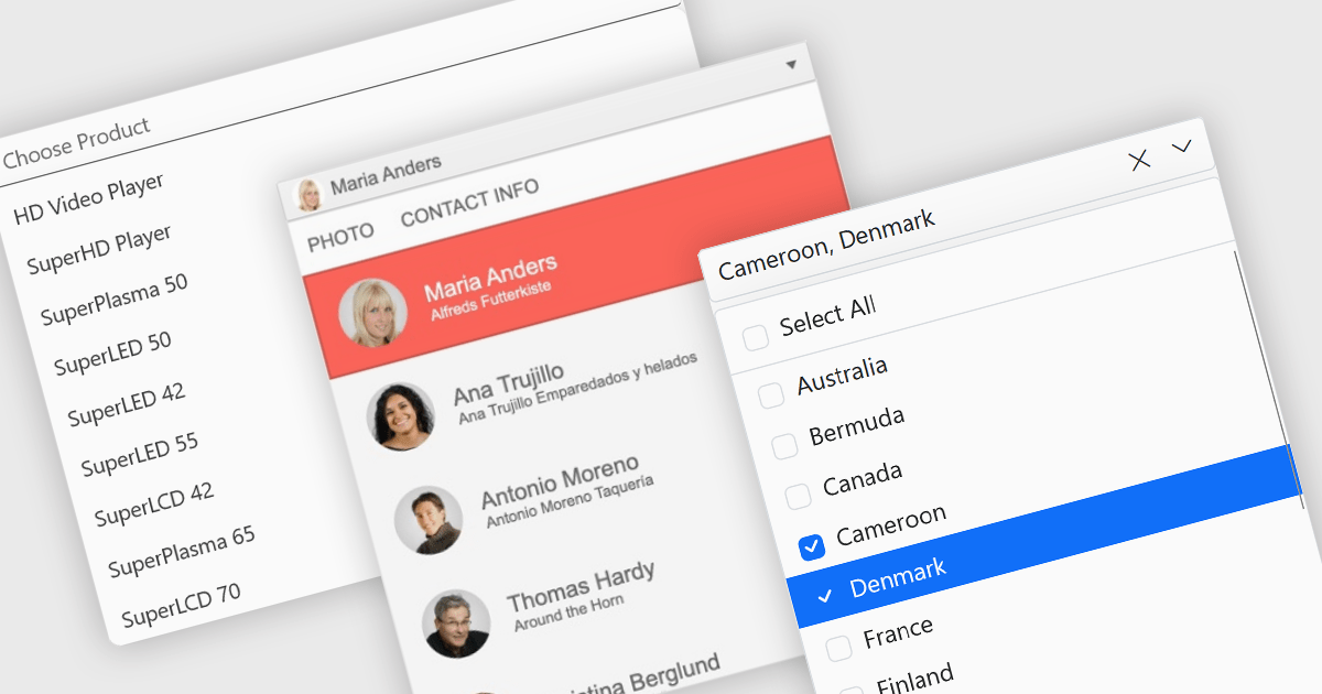
Dropdowns and lists provide structured ways for users to select and manage values within grids, forms, or tables. By constraining input to predefined options, these controls help maintain data consistency, reduce entry errors, and improve overall usability. They are commonly used in business applications where accuracy and efficiency are important, such as configuration panels, data management tools, and enterprise systems.
Common features include:
For an in-depth analysis of features and price, visit our ASP.NET Core data editor components comparison.

PDF redaction is the process of permanently removing sensitive or confidential information from a document so that it cannot be recovered or viewed. Unlike simple visual masking, true redaction deletes the underlying content, ensuring it is not accessible through copying, searching, or metadata extraction. This capability is essential for regulatory compliance, data protection, and secure document sharing, particularly in industries that handle personal, financial, or legal information.
Several ASP.NET Core PDF components allow you to redact PDFs, including:
For an in-depth analysis of features and price, visit our comparison of ASP.NET Core PDF components.
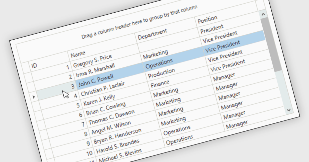
Reorder Rows is a WPF grid feature that lets users move a row by changing its display order directly in the control, usually through drag-and-drop, so data can be arranged in a meaningful custom sequence. For .NET developers, it is useful when row position represents business intent, such as task priority, processing order, or a user-defined layout, because it supports direct interaction while reducing the need for separate ordering controls or additional code for manual sequencing.
Many .NET WPF grid controls contain reorder row functionality including:
For an in-depth analysis of features and price, visit our comparison of .NET WPF grid controls.
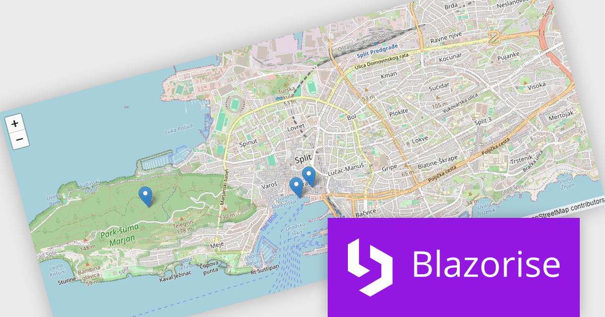
Blazorise is a versatile component library that empowers developers to build modern and feature-rich web applications using Blazor, a client-side web development framework from Microsoft. It offers a comprehensive collection of user interface components, including buttons, forms, charts, and navigation elements, all built with accessibility and responsiveness in mind.
The Blazorise 2.1 update introduces a new maps component that enables developers to build interactive mapping functionality using a provider-neutral component model, allowing applications to remain independent of any specific mapping library. By abstracting core concepts such as maps, layers, markers, and shapes, developers can implement rich, data-driven map experiences with support for events, programmatic control, and synchronization between application state and the rendered map, while retaining the flexibility to adopt additional mapping providers in the future without requiring significant code changes.
To see a full list of what’s new in version 2.1, see our release notes.
Blazorise is licensed per developer and includes a 1 year subscription for updates and support. Professional, Enterprise, and Enterprise Plus editions are available, each offering tailored levels of support and service to meet varying business needs. See our Blazorise licensing page for full details.
For more information, visit our Blazorise product page.
聯繫電話: (888) 850 9911
傳真: +1 770 250 6199


