


官方供應商
我們作為官方授權經銷商,直接提供超過200家開發廠家所發行超過1000個的產品授權給您。
請參閱我們所有的品牌。
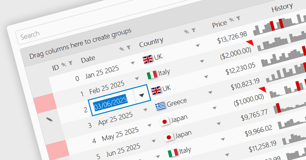
A date/time cell type in a JavaScript Grid control lets developers manage temporal data more effectively by treating input as actual JavaScript Date objects rather than plain text. This enables built-in features like calendar popups, time pickers, and structured output formats such as "09/09/2025" or "Sep 9 2025", making it easier for users to interact with the data accurately. It's especially useful in applications that rely on scheduling, activity logs, or time-driven reports. Most modern grid libraries also support localization, formatting, and input validation to ensure the cell behavior fits seamlessly with the application's design and data standards.
Several JavaScript Grid controls offer support for Date/Time cell types including:
For an in-depth analysis of features and price, visit our comparison of JavaScript Grid controls.
Kendo UI is a comprehensive suite of four JavaScript UI libraries for Angular, React, Vue and jQuery that enables developers to build responsive web applications for desktop, tablet, and mobile platforms with minimal effort. It provides a wide range of customizable components such as data grids, charts, schedulers, and form controls that streamline development and can significantly reduce time to market. With built-in support for theming, accessibility, localization, and state management, Kendo UI is ideal for creating data-driven dashboards, CRM systems, e-commerce portals, and administrative interfaces while maintaining high performance and a consistent user experience.
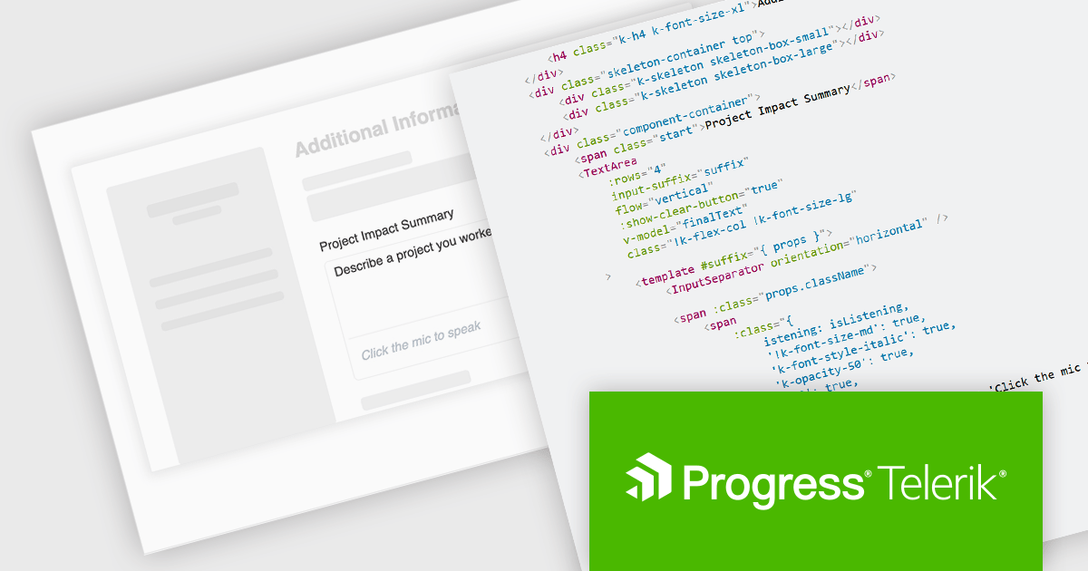
The Kendo UI 2025 Q3 update adds a speech to text button component to its Angular, React, Vue and jQuery libraries. These ready to use components facilitate voice‑driven text input directly within the application, converting speech into text so, with just a single click, users can speak instead of typing. It uses the browser's native Web Speech API and supports over 100 languages with automatic locale detection. Developers also benefit from full control over visual styling, including icons, colors, sizes, fill modes, rounded corners, and CSS, and integration hooks through built‑in states and events, making it straightforward to provide rich voice‑enabled experiences or connect to external AI services.
To see a full list of what's new in 2025 Q3, see our release notes.
KendoReact and Kendo UI are both licensed per developer and share two licensing models: an annual Subscription License and a Perpetual License. The Subscription license provides access to the latest product updates, technical support, and exclusive benefits for a flat annual fee, and must be renewed to continue using the software. The Perpetual license is a one-time purchase granting access to the current released version and includes a one-year subscription for product updates and technical support. After this initial period, users can choose to renew the subscription element to continue receiving updates and support; otherwise, they may continue using the installed version available during their active subscription term but will forgo future updates and support. See our Kendo UI licensing page for full details.
The React library is available individually as KendoReact, while all four Kendo UI libraries are available in the following products:
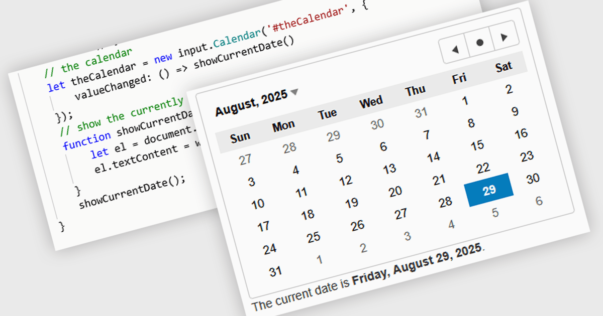
JavaScript calendar controls are user interface components that allow users to select and edit date values directly within data editing environments, such as forms or grids. These controls typically integrate a visual calendar picker, enabling consistent and accurate date input while reducing manual entry errors. For developers, they simplify validation, support localization, and integrate with various data sources, helping ensure a more efficient and user-friendly experience in web applications that require date-related input or filtering.
Several JavaScript data editor collections offer calendar controls including:
For an in-depth analysis of features and price, visit our comparison of JavaScript Data Editors.
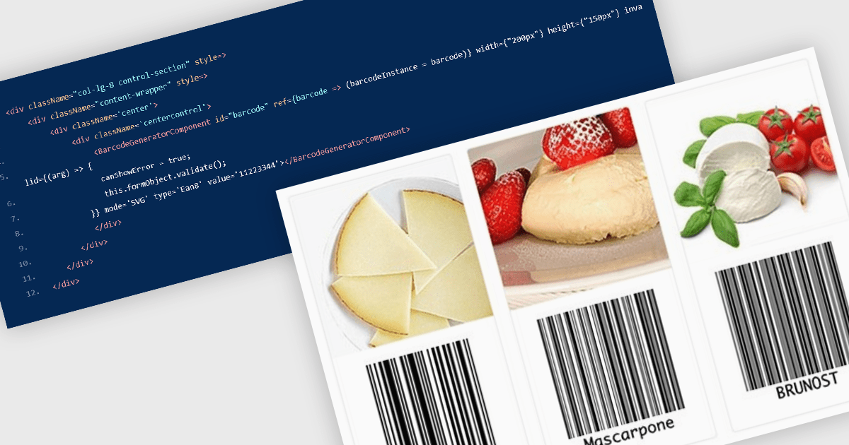
Barcode components in React UI suites deliver a easy way to integrate machine-readable encoding directly into modern web applications. These components offer a high-level interface for rendering both one-dimensional and two-dimensional barcodes, with customizable options for type (symbology), dimensions, styling, and export formats. They enable developers to choose between vector-based (SVG) or bitmap (Canvas) rendering, and often support direct exports to PNG, PDF, or SVG formats. Such features make barcodes a flexible integration point for inventory systems, shipping labels, ticketing, and other use cases requiring reliable, visual encoding of data within React environments.
Several React UI suites offer Barcode components including:
For an in-depth analysis of features and price, visit our React UI suites comparison.
LightningChart JS is a high-performance JavaScript charting library that utilizes WebGL rendering and GPU acceleration to deliver exceptional performance for a wide range of data visualization needs. It is designed to handle large datasets and complex visualizations with ease, enabling developers to create interactive and visually appealing 2D and 3D charts. Ideal for applications demanding smooth real-time data updates, such as financial platforms, engineering tools, scientific research dashboards, and industrial monitoring systems, LightningChart JS provides a comprehensive API for customization and integration into web-based projects.
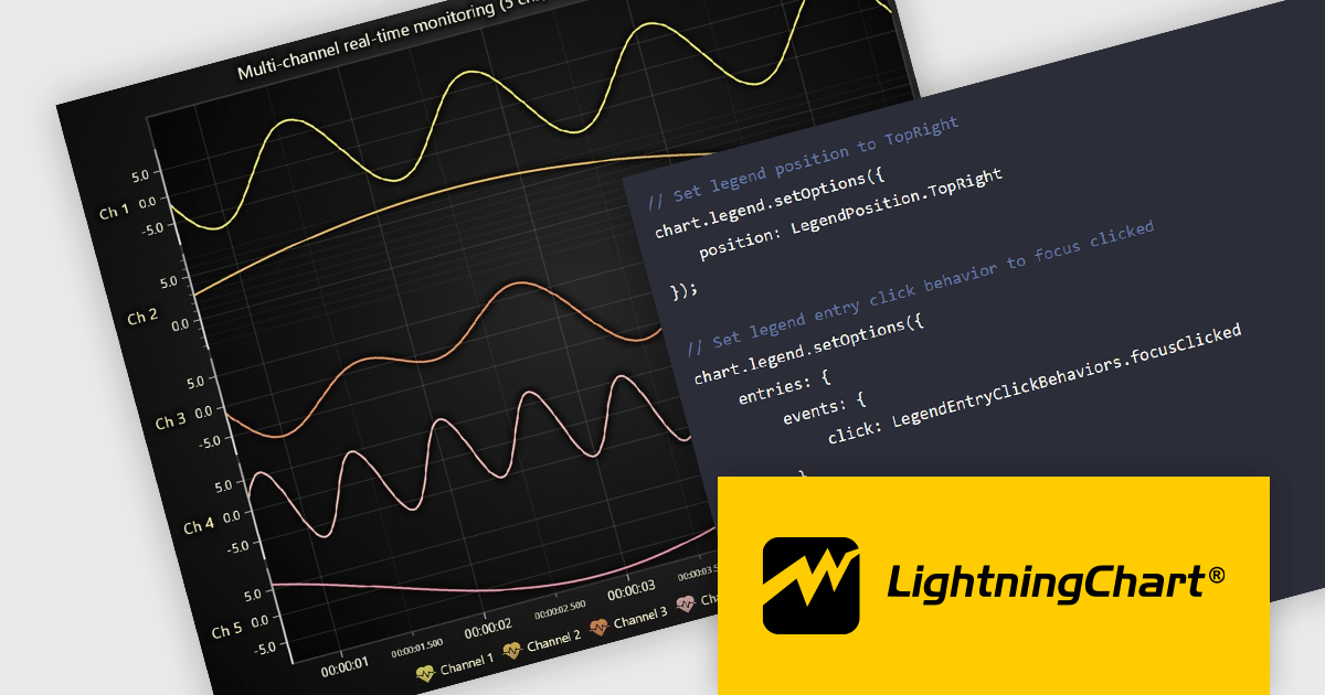
The LightningChart JS v8.0 update completely reworks legend functionality, making legends a property of the chart, removing visual obstructions, and improving adaptability to available space. The API configuration is now more intuitive and capable, with built-in options supporting a wider range of use cases. Plug‑in support also enables easy extension or customization of legend behavior. By default, legends now appear automatically beneath trends, reducing developer setup time, while still allowing you to manually create multiple legends when needed. You can position legends using built-in presets or define custom placements, and control click behavior using either the provided handlers or your own. When creating series, you can also exclude specific ones from appearing in legends, giving you fine-grained control over legend content.
To see a full list of what's new in v8.0, see our release notes.
LightningChart JS is licensed per developer and is available as an annual license with 1 year support. See our LightningChart JS licensing page for full details.
For more information, see our LightningChart JS product page.
聯繫電話: (888) 850 9911
傳真: +1 770 250 6199


