


官方供應商
我們作為官方授權經銷商,直接提供超過200家開發廠家所發行超過1000個的產品授權給您。
請參閱我們所有的品牌。
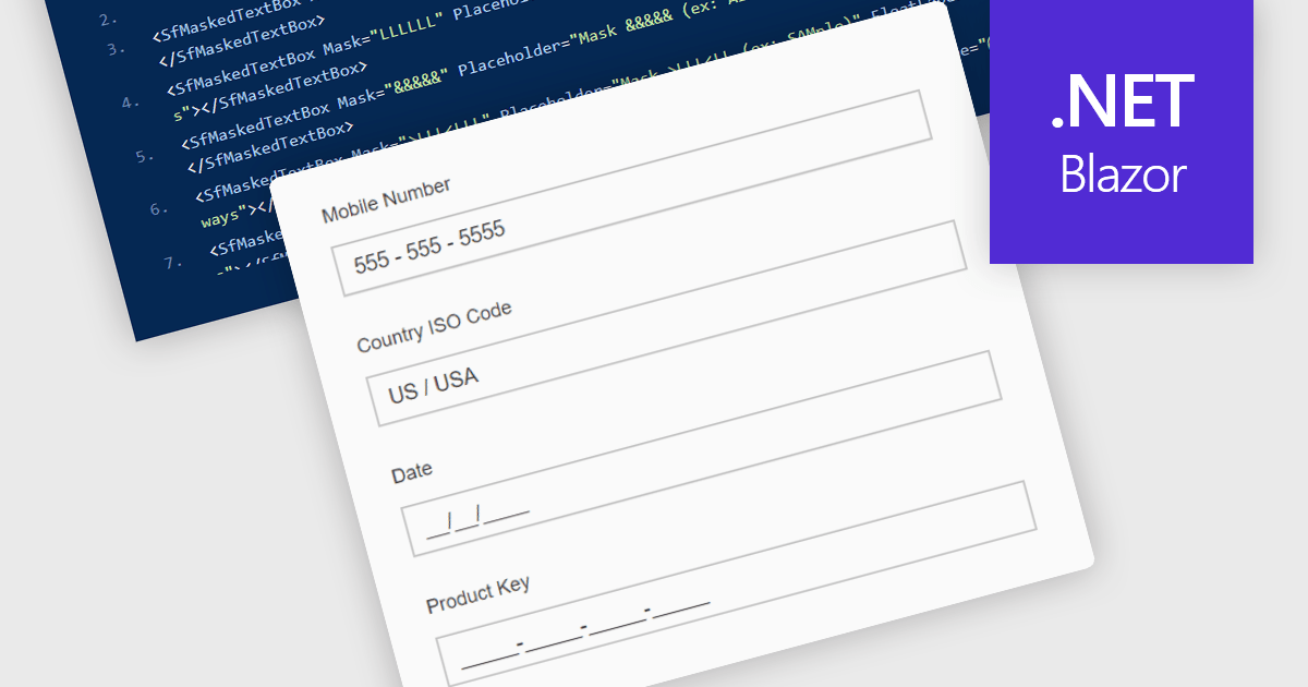
Masked Input Text Box editors are input components that enforce a predefined format while users type, ensuring that entered values follow a specific structure such as phone numbers, dates, postal codes, or identification numbers. By applying an input mask, the editor guides users to enter characters only in valid positions and formats, reducing the likelihood of invalid or incomplete data being submitted. This approach improves data consistency across applications, simplifies validation logic on both the client and server side, and reduces the need for additional parsing or correction of user input. For developers building data-driven Blazor applications, masked input editors help maintain reliable data entry while providing a clear and structured input experience directly within forms and data editing interfaces.
Many .NET Blazor data editor collections contain masked input text box editors including:
For an in-depth analysis of features and price, visit our comparison of .NET Blazor data editors.
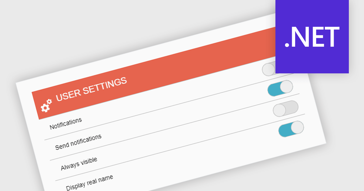
A toggle switch is a user interface control that allows users to quickly switch between two states, typically on and off. It provides a clear visual indication of the current state and enables immediate changes with a single interaction. Toggle switches are widely used in forms, settings panels, and configuration interfaces because they present binary choices in a compact and easily understandable format. Their visual clarity helps reduce user errors, while their interactive design supports efficient input and consistent behavior across desktop and mobile applications.
Several .NET data editor collections give you toggle switch functionality, including:
For an in-depth analysis of features and price, visit our comparison of .NET data editor collections.
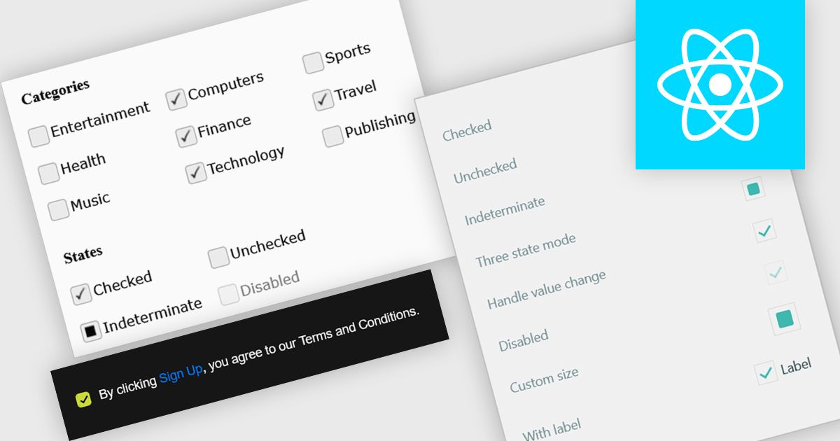
A check box is a user interface element that represents a Boolean field, allowing users to toggle between two states such as true and false directly within a form or data grid. It provides a clear and efficient way to edit logical values without requiring manual text input, reducing the risk of invalid entries and improving data consistency. For software developers, integrating check boxes into data-bound controls simplifies validation logic, and ensures that binary options are presented in a predictable and accessible format across applications.
Several React data editor collections provide check box editing capabilities including:
For an in-depth analysis of features and price, visit our comparison of React Data Editor components.
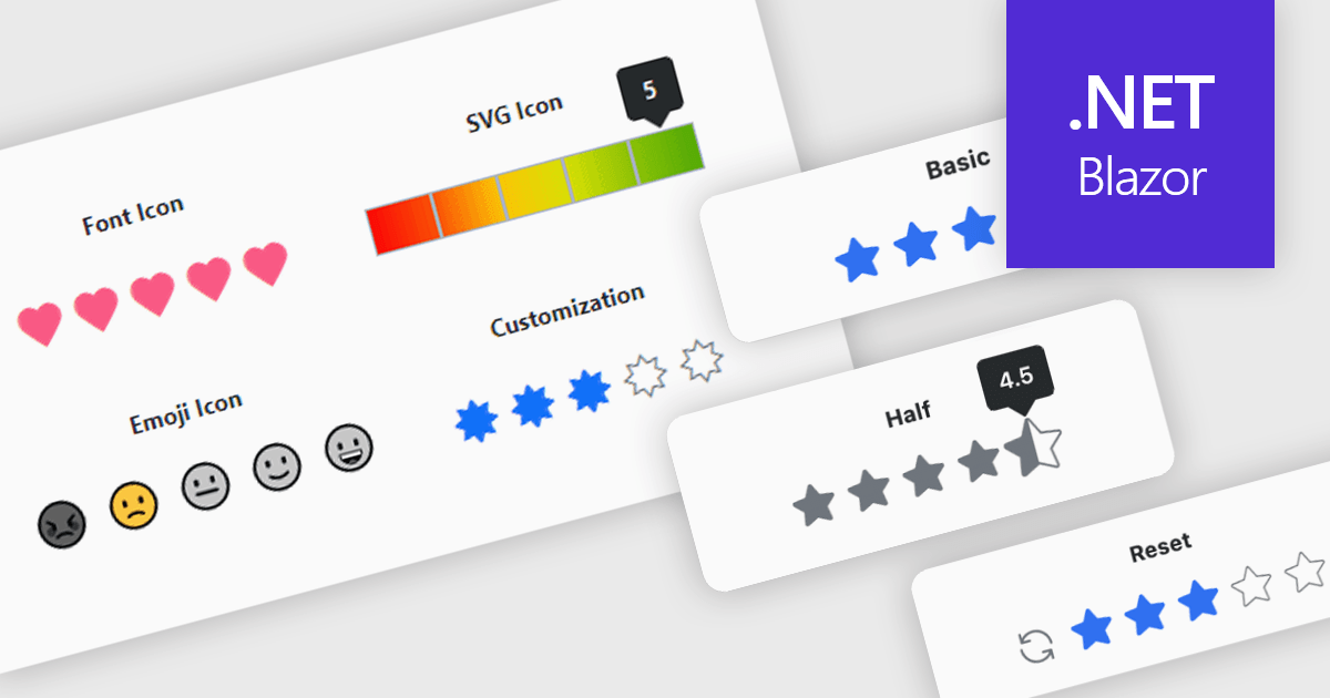
A rating feature in a data editor allows users to assign a value, typically through icon based controls such as stars or similar symbols, directly within a grid or form to evaluate related content. By transforming subjective opinions into structured, quantifiable data, rating components make feedback easy to capture, analyze, and display. This enhances user engagement and supports more informed decision making based on aggregated insights. Common use cases include rating products in ecommerce dashboards, evaluating service performance in internal business systems, scoring support tickets by priority or satisfaction, and assessing content quality within content management platforms.
Several Blazor data editor collections provide rating controls including:
For an in-depth analysis of features and price, visit our Blazor Data Editors comparison.
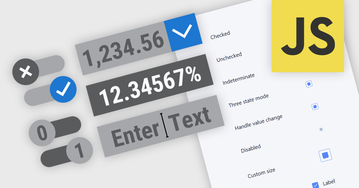
Text, numeric, and boolean data editor components for JavaScript provide the fundamental building blocks for capturing and validating user input in web applications. These editors are designed to handle a wide range of data types and interaction patterns, helping developers present consistent, accessible, and predictable input experiences across forms, grids, and dialogs while integrating cleanly with application logic and data models.
Common editors include:
For an in-depth analysis of features and price, visit our JavaScript data editors comparison.
聯繫電話: (888) 850 9911
傳真: +1 770 250 6199


