


官方供應商
我們作為官方授權經銷商,直接提供超過200家開發廠家所發行超過1000個的產品授權給您。
請參閱我們所有的品牌。
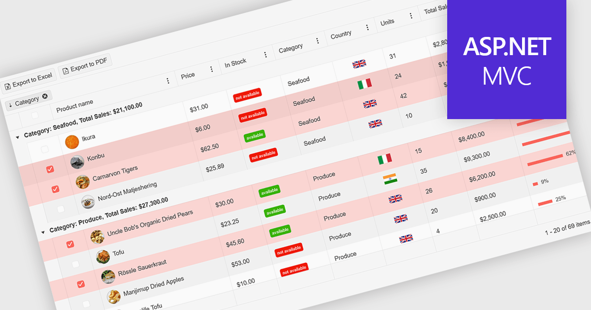
A ListBox is a user interface control that displays a collection of items, allowing users to select one or multiple entries. It supports seamless data binding, customizable item templates, and efficient performance with built-in scrolling and virtualization for large datasets. With keyboard, mouse, and accessibility support, it delivers an intuitive experience for all users. Common use cases include product catalogs, settings management, filtering datasets, and multi-item selection in forms or dashboards.
Here are some examples of ASP.NET MVC data editors collections that include a ListBox:
For an in-depth analysis of features and price, visit our comparison of ASP.NET MVC data editors.
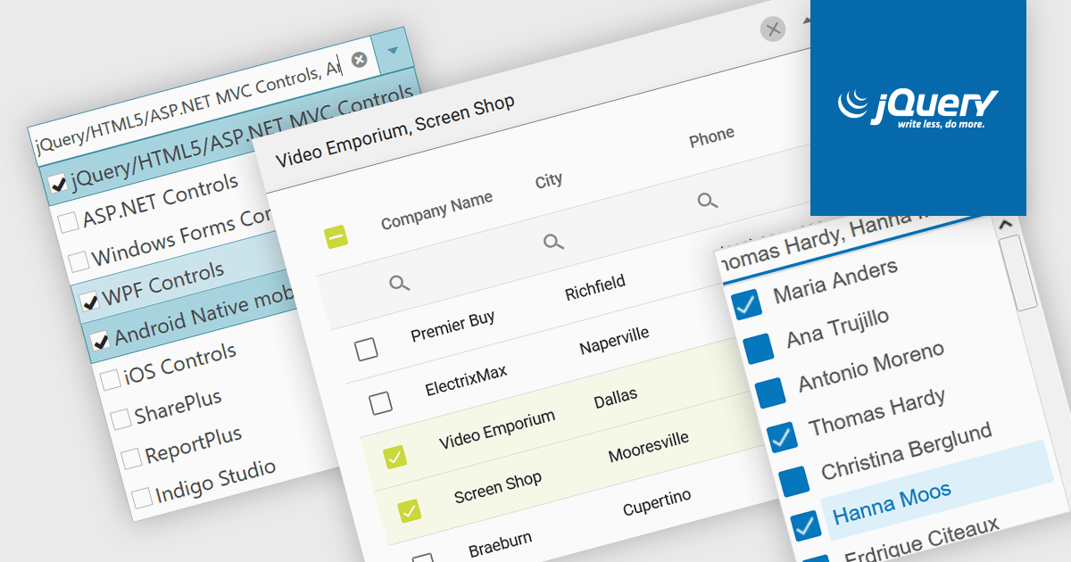
A checked combobox is a data editor component used in user interfaces that consists of a text box with a drop-down panel. This panel displays a predefined list of items, in a clean and organized layout, from which users can input data by making a singular or multiple selections using the adjacent checkboxes. The values are then typically displayed as a comma-separated summary in the collapsed field. This type of control provides developers with a convenient way to implement multi-select functionality within their applications, and is especially effective in scenarios such as filtering datasets or configuring settings, without consuming additional space on the interface.
Several jQuery data editor collections include checked comboboxes, including:
For an in-depth analysis of features and price, visit our comparison of jQuery data editors.
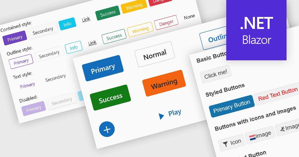
Buttons embedded in data editors enhance user interactions by providing inline command triggers such as clearing input, opening dropdowns, or submitting data. These buttons can be integrated directly into form fields or data grids, enabling more intuitive and compact interfaces. Developers benefit from customization options like icons, styles, behaviors, and events, allowing button functionality to be tailored to application-specific workflows. The inclusion of command buttons in editors simplifies interactions without the need for external UI elements.
Several Blazor data editor collections offer button editor components including:
For an in-depth analysis of features and price, visit our Blazor data editors comparison.
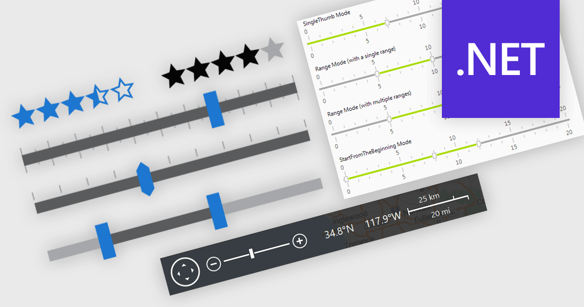
In .NET applications that require data editing, visual UI elements play a vital role in improving how users input and adjust data. For data entry such data visualization components as trackbars, range sliders, zoom controls, and rating elements offer an interactive alternative to text fields or dropdowns, making data input and feedback mechanisms more intuitive and precise. Whether it's setting numerical thresholds or filtering data sets based on user-defined limits, adjusting the view scale of charts, timelines, or graphical data displays, or quickly capturing feedback, these controls contribute to a more responsive and user-friendly interface. These components are especially valuable in scenarios that require fine-tuned input or subjective scoring, helping users make quick adjustments without disrupting the end-user's workflow.
Common features include:
For an in-depth analysis of features and price, visit our .NET data editors comparison.
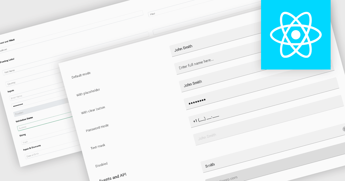
Text Box components in React Data Editors are interactive controls that allow users to input, edit, and manage textual data within a web interface. Designed to handle everything from single-line entries like names and titles to multi-line content such as comments or descriptions, these components are a core part of form-driven applications. They often include features like placeholder text, character limits, validation hooks, and integration with state management tools, which help ensure data quality and user-friendly interactions. Text Boxes are widely used in settings such as user registration forms, feedback systems, and content management interfaces, where accurate and flexible text input is essential to the application's functionality.
Several React data editor collections offer text box components including:
For an in-depth analysis of features and price, visit our React data editors comparison.
聯繫電話: (888) 850 9911
傳真: +1 770 250 6199


