





官方供應商
我們作為官方授權經銷商,直接提供超過200家開發廠家所發行超過1000個的產品授權給您。
請參閱我們所有的品牌。
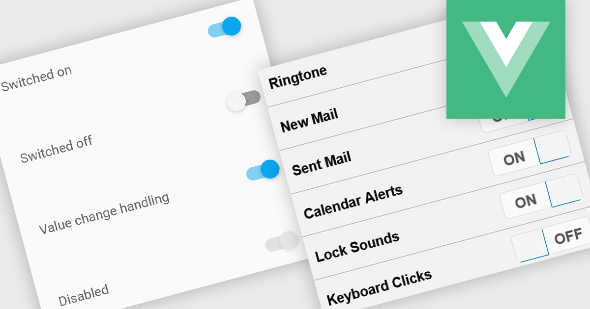
Toggle switches in data editor components provide a user-friendly way to manage boolean values, offering a clear on/off representation that enhances usability. These switches replace traditional checkboxes with a more modern and intuitive interface, making them particularly useful for mobile and web applications where quick interactions are essential. By improving clarity and reducing user errors, toggle switches contribute to a smoother and more efficient data entry experience.
Several Vue.js data editor collections offer toggle switch controls including:
For an in-depth analysis of features and price, visit our Vue.js data editors comparison.
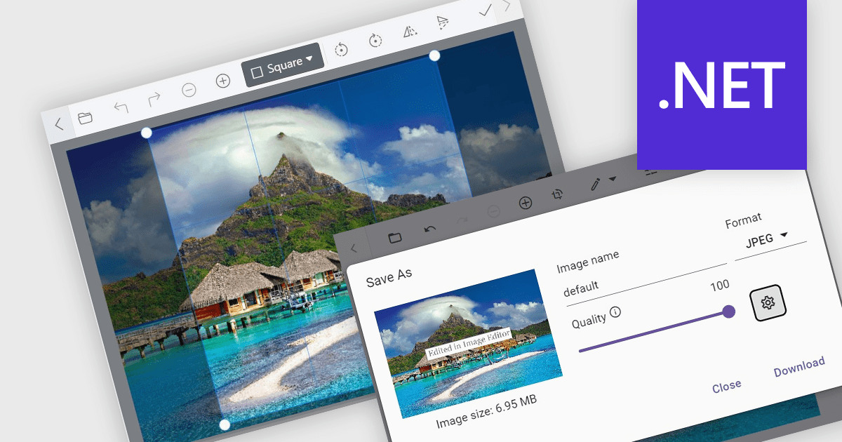
Image editors are user interface (UI) controls that can be embedded in applications, enabling users to load, edit, and save images seamlessly. They typically support a range of operations, including cropping, zooming, resizing, rotating, filtering, and exporting. Ideal for applications that require built-in image manipulation, such as content management systems or design tools, image editors allow users to modify images without relying on external software. By integrating these capabilities, developers can enhance their application's functionality and provide a more versatile user experience.
Several .NET data editor collections provide an image editor, including:
For an in-depth analysis of features and price, visit our .NET data editors comparison.
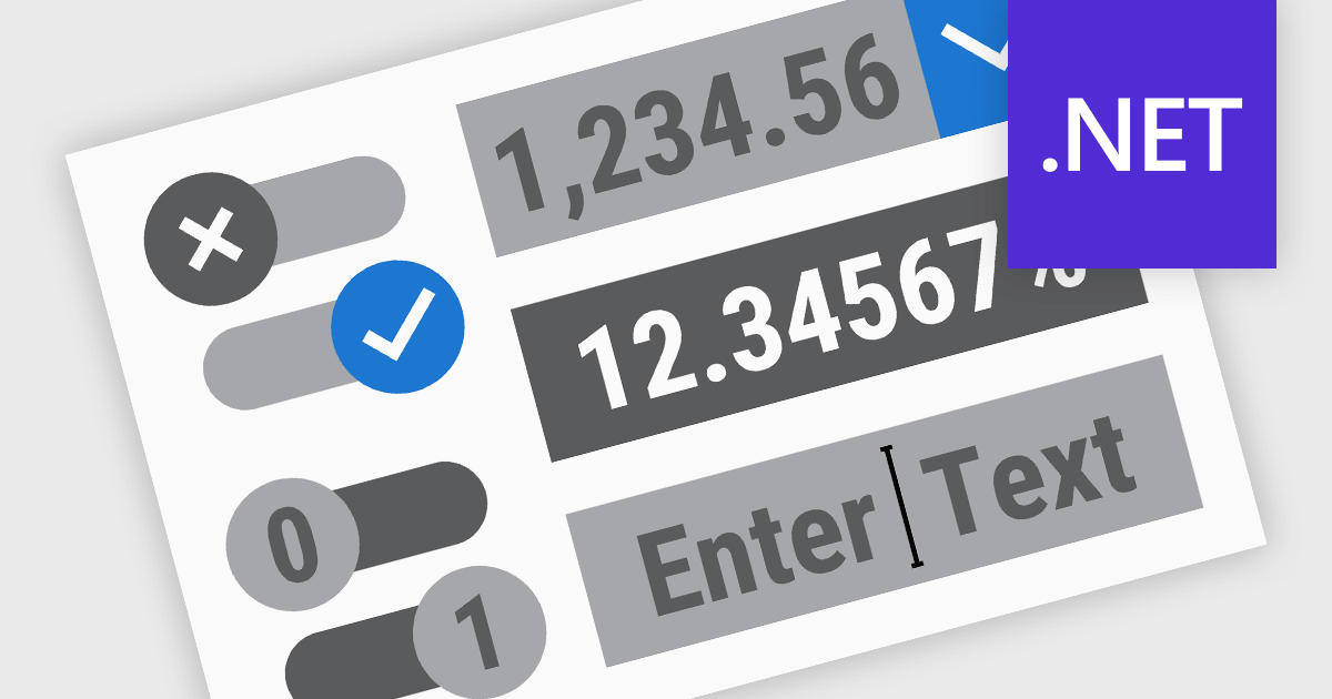
.NET Data Editor components provide a versatile set of tools for handling text, numeric, and Boolean data input within applications. These components enable developers to create user-friendly interfaces that accommodate various data entry needs, from simple text input to structured numeric formats and binary (true/false) selections. By integrating these editors, applications can ensure accuracy, enhance user experience, and streamline data validation. Whether used in forms, reports, or interactive dashboards, these components are essential for building efficient and responsive applications.
Common text, numeric and boolean data editor .NET controls include:
For an in-depth analysis of features and price, visit our .NET Data Editors comparison.
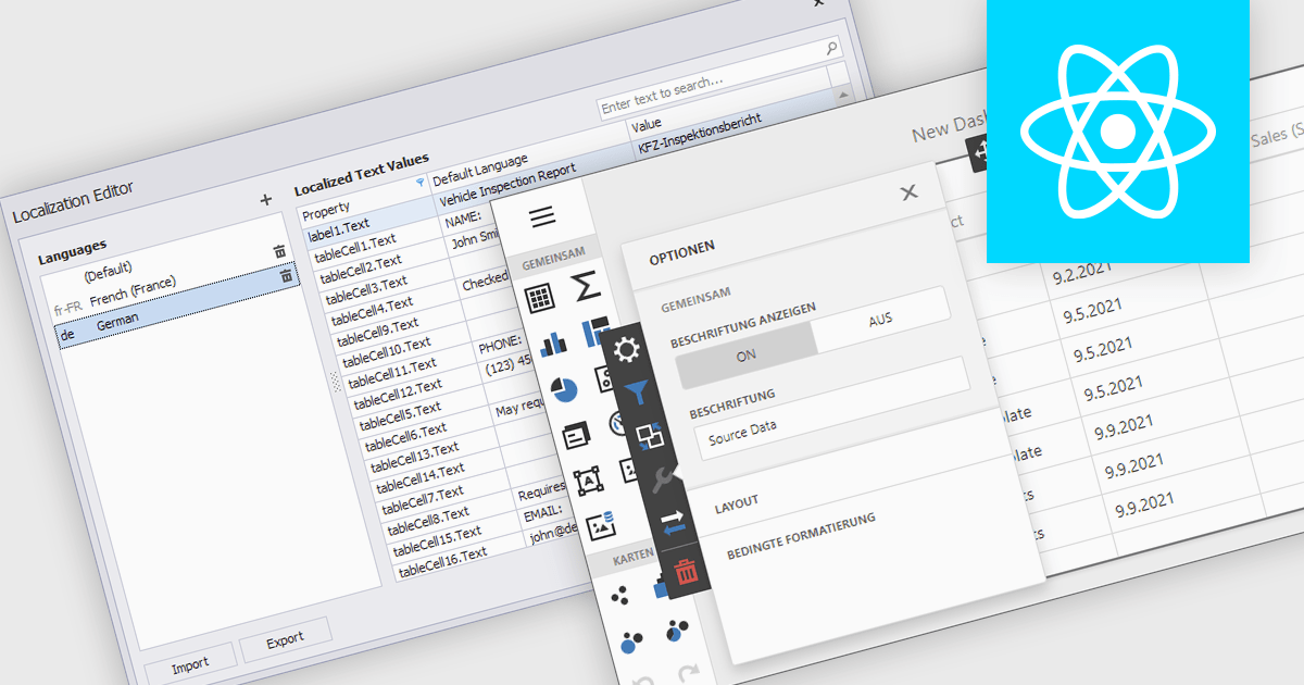
Localization is the process of adapting the user interface and data formatting to support multiple languages and regional conventions. This ensures users can interact with the editor in their preferred language while maintaining accuracy in date, number, and currency formats. It enhances usability, improves accessibility for global teams, ensures compliance with regional standards, and minimizes errors caused by inconsistent formatting. By enabling seamless multilingual collaboration, localization helps developers create inclusive, globally scalable applications that provide a consistent user experience across diverse markets.
Several React data editor collections offer localization support including:
For an in-depth analysis of features and price, visit our React data editors comparison:
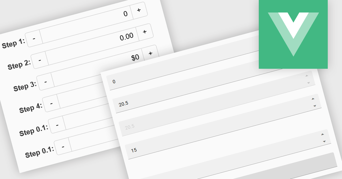
Numeric Spin data editor controls are intended for the efficient and precise input of numerical values. By combining an edit box with up/down spin buttons, users may either type to input directly or utilize the spin buttons to increase or decrease the value. This method promotes faster and less error-prone data entry than manual typing, particularly for large quantities or recurrent value revisions. Many spin editors include built-in validation, range limitations, data type selection, and formatting choices, which further improve data accuracy.
Several Vue.js data editor collections contain numeric spin components including:
For an in-depth analysis of features and price, visit our Vue.js data editors comparison.
聯繫電話: (888) 850 9911
傳真: +1 770 250 6199


