


官方供應商
我們作為官方授權經銷商,直接提供超過200家開發廠家所發行超過1000個的產品授權給您。
請參閱我們所有的品牌。
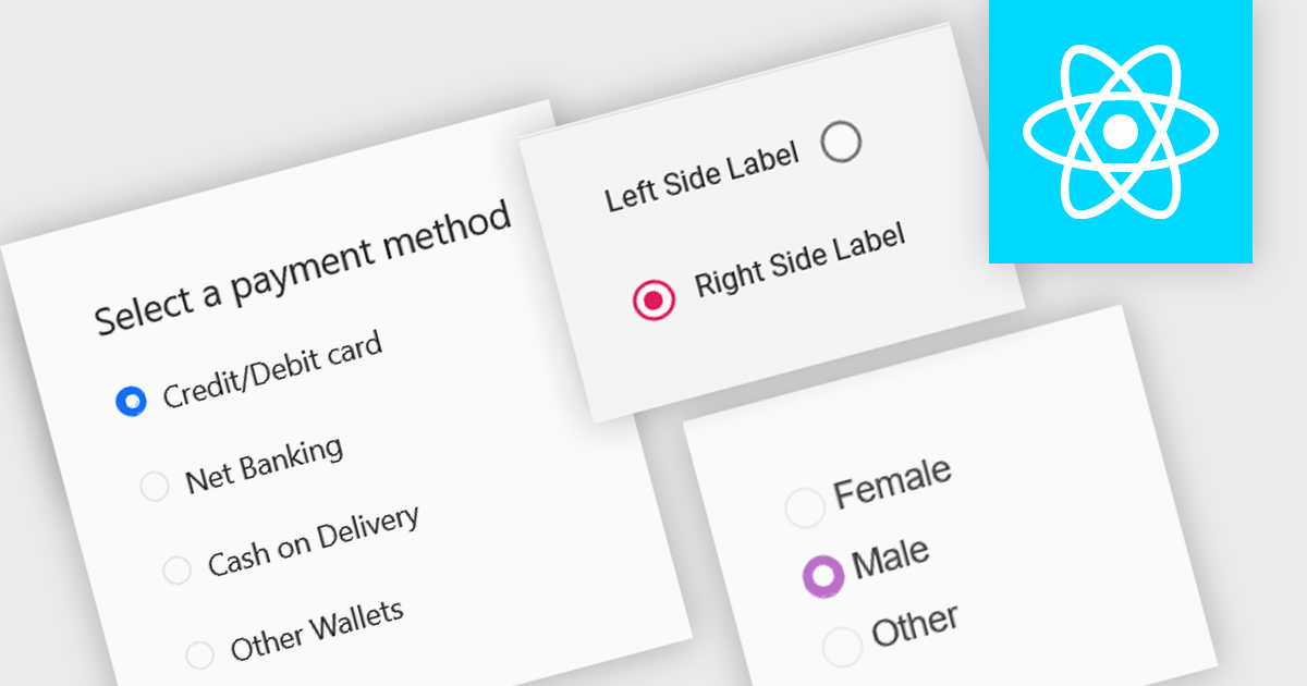
A radio group is a user interface element that presents a set of mutually exclusive options. Users can select only one option from the group at a time, visually represented by a circular button that fills with color when selected. This design pattern is commonly used to represent options like gender, payment method, or difficulty level, where a single choice is required and alternatives are clearly defined. Radio groups enhance user experience by simplifying decision-making, reducing cognitive load, and preventing errors associated with ambiguous selections.
Several React data editor collections feature a radio group, including:
For an in-depth analysis of features and price, visit our React data editors comparison.
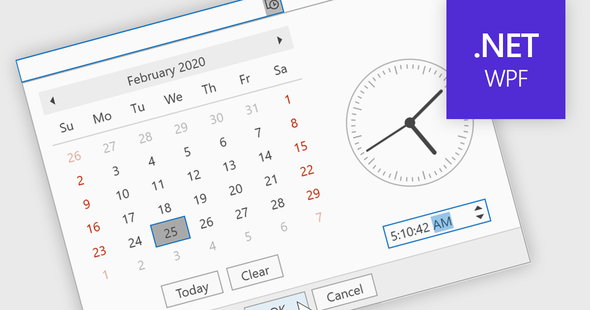
A time picker (time editor) component allows users to select a specific time from a predefined range. It often presents a visual representation of time, such as a clock face or a digital display, and provides intuitive controls for adjusting hours, minutes, and sometimes seconds. This component simplifies time input and selection processes, enhancing user experience and reducing potential errors in applications that require precise time specification, such as scheduling tools, appointment booking systems, and time-based data entry forms.
Several WPF data editor collections feature a time editor, including:
For an in-depth analysis of features and price, visit our WPF data editors comparison.
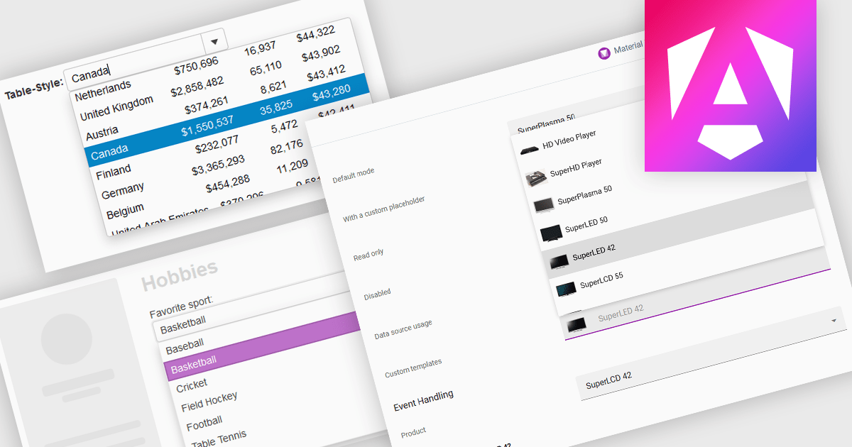
ComboBoxes for Angular are versatile form controls that allow users to select from a predefined list of options or input custom values directly. They provide a flexible and efficient way to handle data entry by combining the ease of selection with the ability to manually input text. For developers, ComboBoxes streamline the user experience by reducing the need for additional input fields while maintaining a clean interface. They enhance data validation and user efficiency, as they can filter large datasets based on user input and bind seamlessly to Angular models, ensuring smooth integration within dynamic forms and grid-based editors.
For an in-depth analysis of features and price, visit our Angular Data Editors controls comparison.
Data editors are user interface components designed to facilitate the viewing, input, modification, and management of data within applications. The visual appearance and styling of these components can often be customized to improve readability, user focus, and comfort during data manipulation and analysis tasks. This can include adjusting factors colors, fonts, layouts, and overall design aesthetics. Theming not only enhances the visual appeal of the data editor but also improves its usability and accessibility for users, whilst also creating a more cohesive and personalized experience which can be aligned with the organization's branding.
Several .NET 8 WinForms data editor collections allow you to apply themes, including:
For an in-depth analysis of features and price, visit our comparison of .NET 8 WinForms data editor collections.
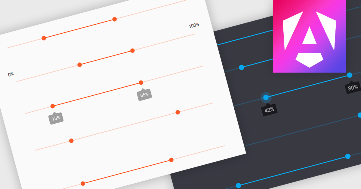
A range trackbar is a UI control that allows users to select a numeric value or a range of values within a predefined minimum and maximum. The range trackbar offers a user-friendly way to adjust values dynamically by dragging a slider, and it can be bound to data using Angular's two-way data binding. This component is particularly beneficial for scenarios where precision control over numeric input is needed, such as setting thresholds, adjusting parameters, or configuring settings, enhancing user interaction and simplifying input collection.
Several Angular Data Editor controls support range trackbars including:
For an in-depth analysis of features and price, visit our comparison of Angular Dada Editor components.
聯繫電話: (888) 850 9911
傳真: +1 770 250 6199


