


官方供應商
我們作為官方授權經銷商,直接提供超過200家開發廠家所發行超過1000個的產品授權給您。
請參閱我們所有的品牌。
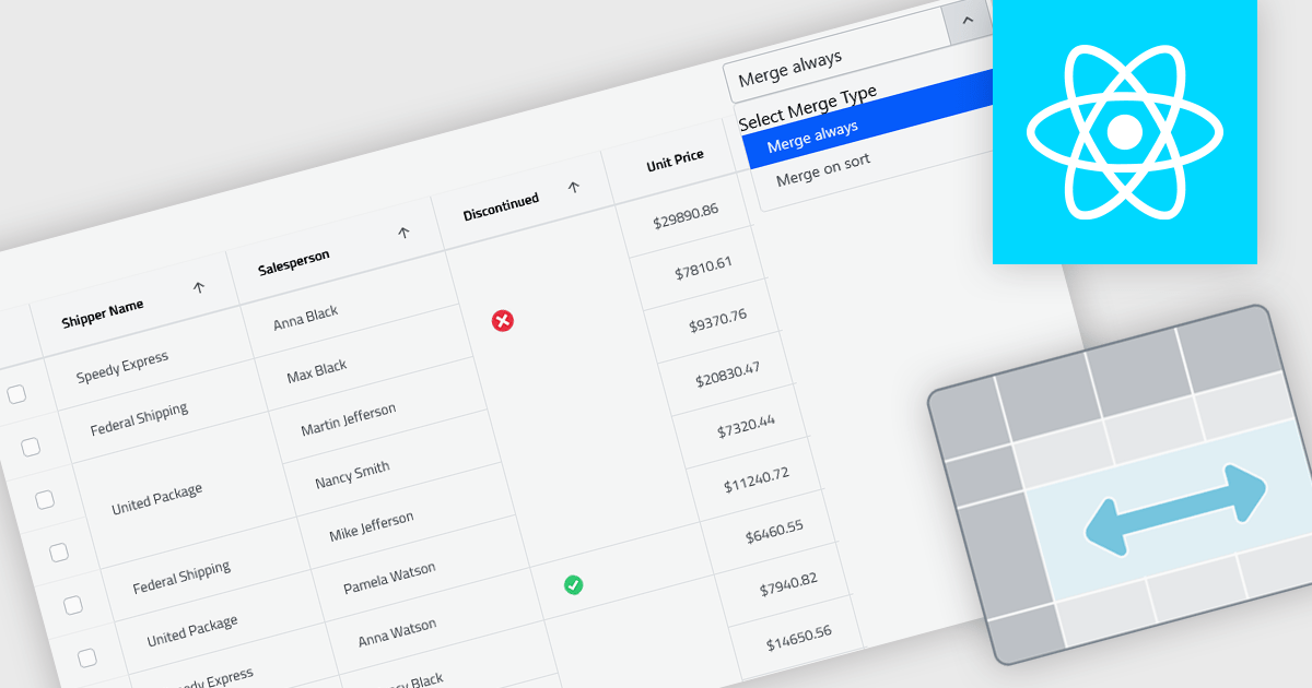
Cell merging in grids combines adjacent cells with matching or conditionally defined values into a single cell, typically within a column. This reduces repetitive data and creates cleaner, more readable tables that are easier to scan and understand. By visually grouping related rows, it helps highlight patterns and relationships in large datasets. The feature can be applied automatically or customized, making it useful for scenarios such as financial reports, schedules, and inventory lists where repeated values can be consolidated for better clarity.
Several React grid controls offer cell merge support including:
For an in-depth analysis of features and price, visit our React grid controls comparison.
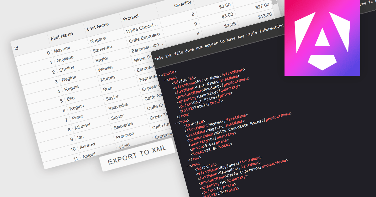
Exporting grid data to XML converts tabular data from a user interface grid into a structured, self-describing format for use beyond the application interface. By organizing data with clearly defined elements, XML ensures consistent interpretation across platforms and systems, regardless of the underlying technology. This enables reliable data exchange, supports interoperability between applications, and makes the data suitable for integration scenarios, long-term storage, and environments that rely on validated, standardized formats for processing and communication.
Several Angular grid components allow you to export to XML, including:
For an in-depth analysis of features and price, visit our comparison of Angular grid components.
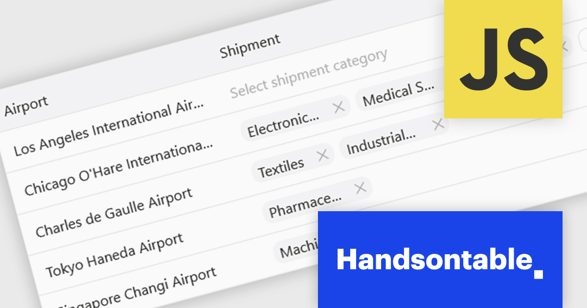
Handsontable is a JavaScript library designed to help developers build interactive data grids into their web applications. Offering a familiar spreadsheet-like interface, it allows users to edit, sort, and filter data with ease. Highly customizable and compatible with popular frameworks like React and Angular, Handsontable empowers developers to build robust data manipulation features into their web applications.
The Handsontable 17.0.0 update adds a new MultiSelect cell type that allows a single cell to hold multiple values, making it well suited for data such as tags, user roles, product categories, or shipment contents. Instead of restricting entries to one option, users can choose any number of items from a dropdown interface that includes search and filtering capabilities for quickly locating options. Full keyboard navigation ensures efficient interaction for power users.
To see a full list of what's new in version 17.0.0, see our release notes.
Handsontable is licensed per developer and is available as an Annual or Perpetual license with 1 year support and maintenance. See our Handsontable licensing page for full details.
For more information, visit our Handsontable product page.
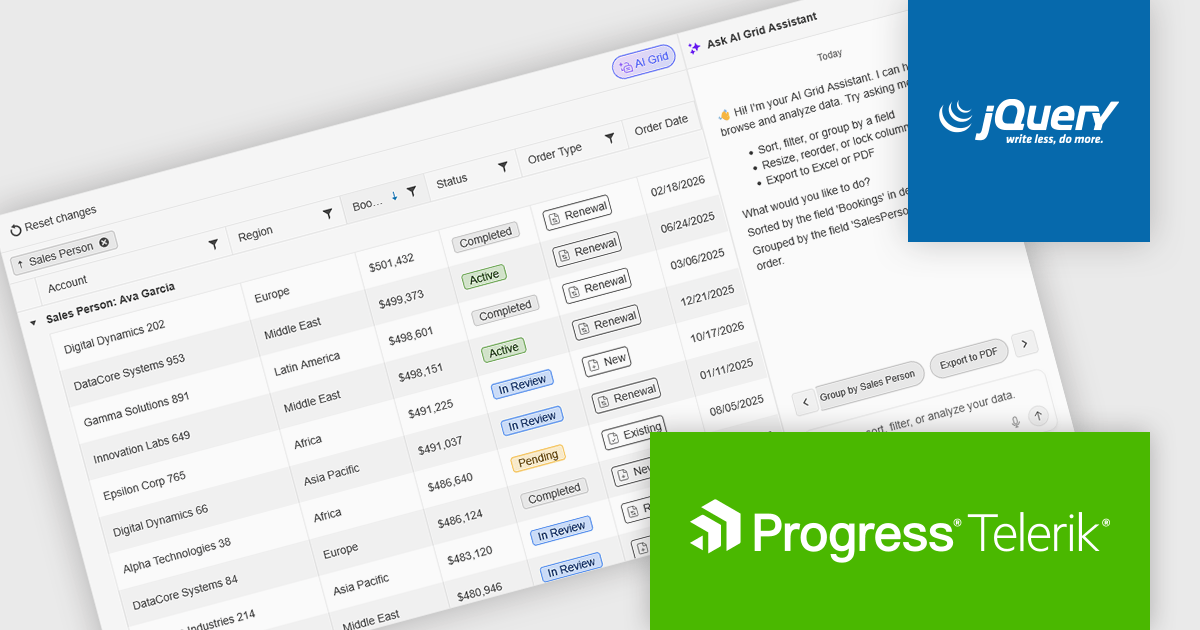
Kendo UI by Telerik is a comprehensive suite of JavaScript UI components designed to accelerate web application development. Offering pre-built, customizable elements for grids, charts, schedulers, and more, it streamlines UI creation across popular frameworks like jQuery, Angular, React, and Vue. Key features include responsive design, accessibility, and high performance, enhancing user experience. Developers benefit from reduced development time, consistent UI patterns, and the ability to build feature-rich applications faster.
The Kendo UI for jQuery v2026 Q1 update introduces AI Chat integration for the Smart Grid, enabling developers to incorporate a conversational interface into data-driven web applications. End users can explore and query structured Grid data using natural-language input, while the integration leverages the Grid’s schema, configuration, and current view to generate precise, context-aware responses. This approach minimizes the need for complex filtering configurations and custom-built query tools, reduces user training requirements, and enhances overall usability. For development teams, it improves implementation while delivering a more efficient and accessible data exploration experience within existing jQuery applications.
To see a full list of what’s new in version 2026 Q1 (2026.1.212), see our release notes.
Kendo UI is licensed per developer and has two licensing models: an annual Subscription License and a Perpetual License. The Subscription license provides access to the latest product updates, technical support, and exclusive benefits for a flat annual fee, and must be renewed to continue using the software. The Perpetual license is a one-time purchase granting access to the current released version and includes a one-year subscription for product updates and technical support. After this initial period, users can choose to renew the subscription element to continue receiving updates and support; otherwise, they may continue using the installed version available during their active subscription term but will forgo future updates and support. See our Kendo UI licensing page for full details.
Kendo UI is also available to buy individually or as part of:
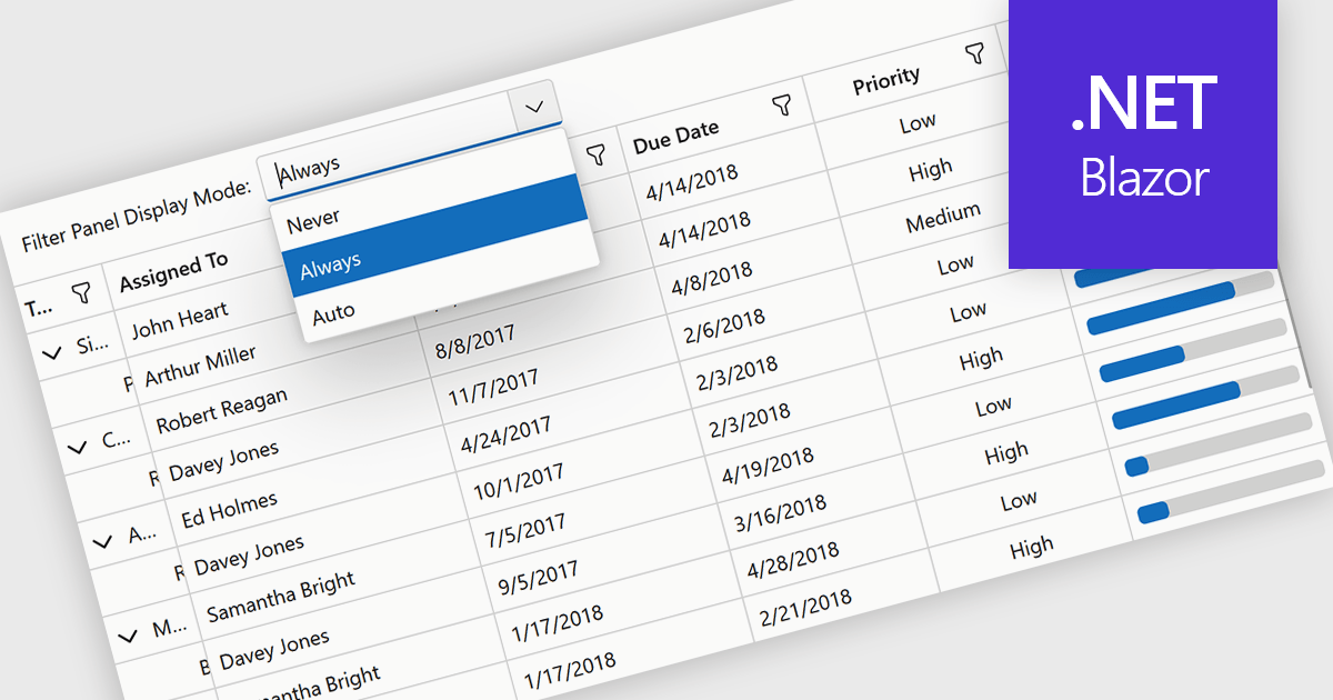
Grid filtering allows users to display only selected rows or columns by choosing specific values, categories, or ranges without modifying the underlying dataset. This capability simplifies navigation through large volumes of data and helps users focus immediately on the most relevant information. By minimizing manual searching and enabling faster comparisons, grid filtering improves productivity and supports more informed decision making. Common use cases include filtering sales data by date range, isolating transactions above a certain value, analyzing results by region or product category, and hiding non essential columns to create clearer, presentation ready reports.
Several .NET Blazor grid controls offer filtering support including:
For an in-depth analysis of features and price, visit our comparison of .NET Blazor grids.
聯繫電話: (888) 850 9911
傳真: +1 770 250 6199


