


官方供應商
我們作為官方授權經銷商,直接提供超過200家開發廠家所發行超過1000個的產品授權給您。
請參閱我們所有的品牌。
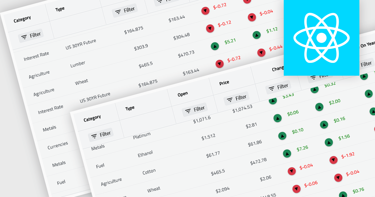
KendoReact by Telerik is a comprehensive library of UI components designed for building modern, feature-rich React applications, enabling developers to create intuitive, responsive, and visually appealing interfaces with ease. It includes robust components like data grids, charts, form elements, and navigation tools, optimized for high performance with features such as virtualization for large datasets and adherence to accessibility standards. Ideal for dashboards, enterprise apps, and data-driven applications, KendoReact empowers teams to accelerate development, ensure design consistency, and deliver inclusive user experiences.
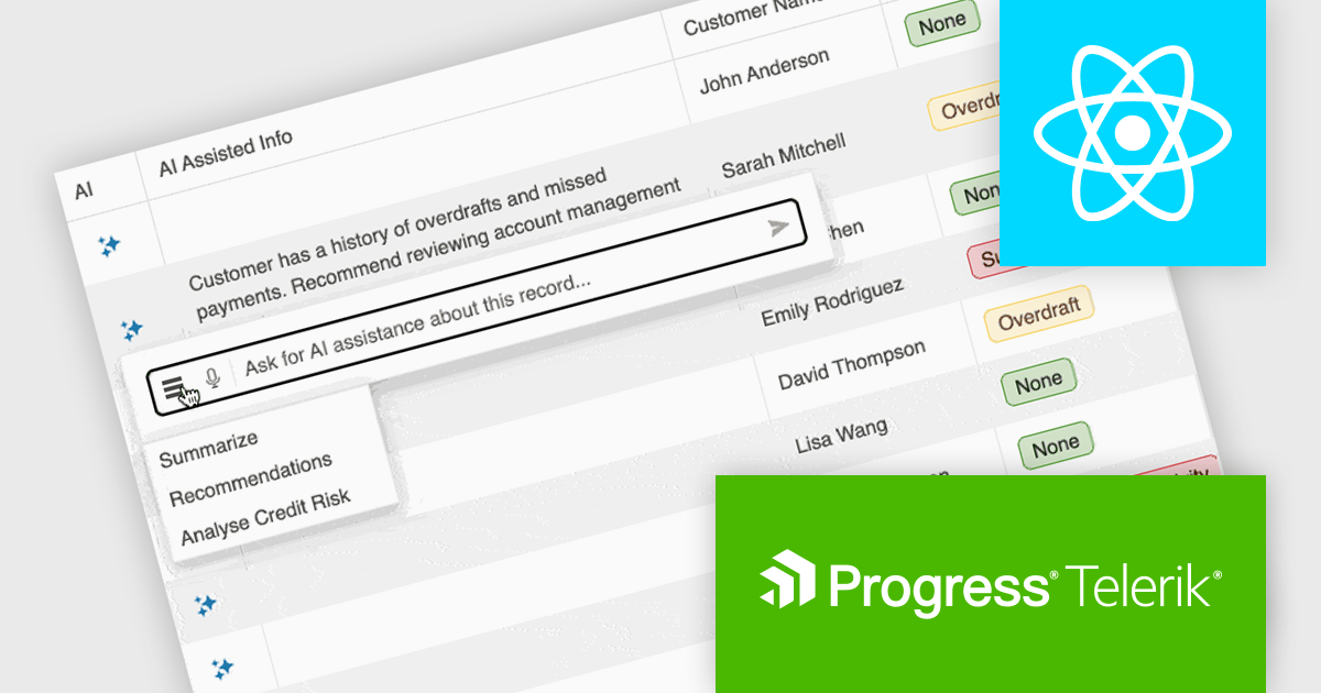
KendoReact provides software developers with a Smart AI Data Grid that allows end users to interact with application data using natural language or voice prompts to filter, group, sort, and analyze information in real time. This reduces the need for complex custom UI controls and lowers the learning curve for end users, while still leveraging the full power of the grid. By embedding conversational interactions and row-level AI analysis directly into the data grid, developers can deliver more efficient, user-friendly data experiences without sacrificing control, predictability, or integration with existing application logic and security requirements.
KendoReact is licensed per developer and has two licensing models: an annual Subscription License and a Perpetual License. The Subscription license provides access to the latest product updates, technical support, and exclusive benefits for a flat annual fee, and must be renewed to continue using the software. The Perpetual license is a one-time purchase granting access to the current released version and includes a one-year subscription for product updates and technical support. After this initial period, users can choose to renew the subscription element to continue receiving updates and support; otherwise, they may continue using the installed version available during their active subscription term but will forgo future updates and support. See our KendoReact licensing page for full details.
KendoReact is available individually or as part of the following products:
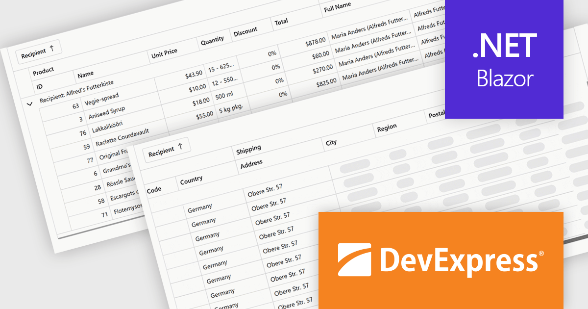
DevExpress Blazor (part of DevExpress ASP.NET and Blazor) helps you create high-impact user experiences for both Blazor Server and Blazor WebAssembly using C#. The Blazor UI Component Library ships with a comprehensive set of native components including a Grid, Pivot Table, Scheduler, Chart, Data Editors and Reporting.
The DevExpress Blazor 25.2 update introduces column virtualization to its Grid, TreeList and Pivot Table UI components, significantly enhancing performance for large datasets. When this feature is enabled, only the columns visible in the user's current viewport are rendered, reducing the Document Object Model (DOM) size and speeding up initial load times. This new approach can be combined with existing row virtualization, allowing both horizontal and vertical data to render efficiently, even in tables with hundreds of fields. Users can smoothly navigate across cells using scrollbars or keyboard shortcuts, maintaining a responsive and fluid experience throughout.
To see a full list of what's new in version 25.2, see our release notes.
DevExpress ASP.NET and Blazor is licensed per developer and is available as a Perpetual License with a 12 month support and maintenance subscription. See our DevExpress ASP.NET and Blazor licensing page for full details.
DevExpress Blazor is available in the following products:
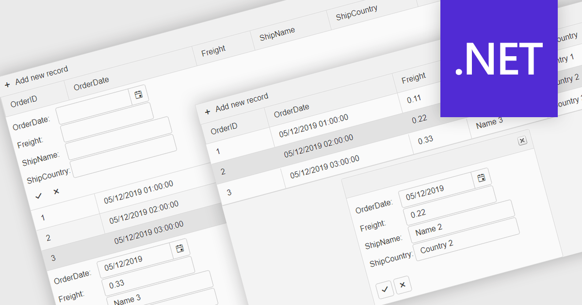
Forms in grids combine tabular data display with built-in form editing, allowing users to view and update records directly within the grid instead of switching to separate edit screens. This approach improves efficiency by keeping users in context, reducing navigation, and providing immediate validation and feedback. Forms in grids are commonly used in administrative dashboards, configuration screens, and data-heavy business applications where users need to edit multiple records quickly while maintaining visibility of related data.
Several .NET grid components enable form-based editing within grids, including:
For an in-depth analysis of features and price, visit our .NET grid controls comparison.
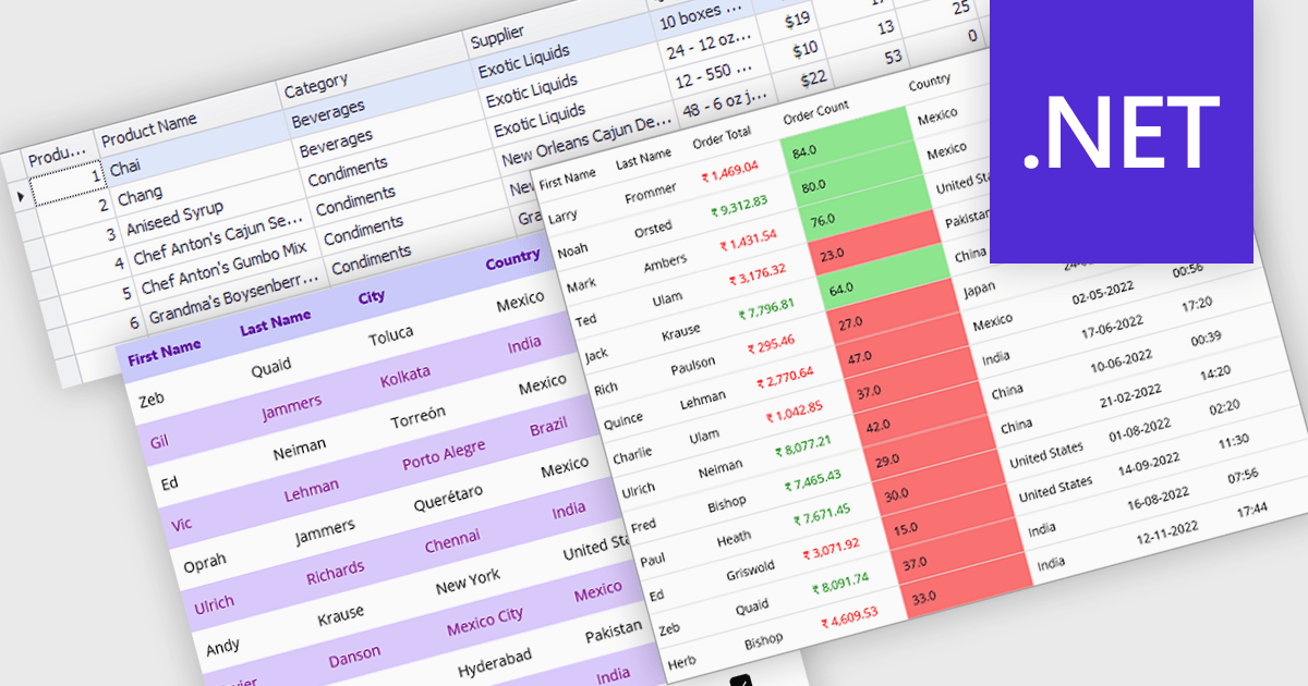
Data grids with column spanning functionality can be configured so the columns collectively extend to fill the entire width of the container, eliminating unused or empty space at the grid's edges. This behavior ensures that available horizontal space is distributed across columns rather than leaving fixed-width gaps, resulting in a more balanced and visually consistent layout. The primary benefits are improved readability, more efficient use of screen space, and a layout that adapts smoothly to resizing and different display sizes without requiring manual adjustment of individual column widths.
Several .NET grid components allow column spanning, including:
For an in-depth analysis of features and price, visit our comparison of .NET grid components.
Virtual scroll support in a grid component is a rendering strategy that displays only the rows and columns currently visible in the viewport while dynamically loading and unloading data as the user scrolls. It minimizes DOM size and memory usage by avoiding the creation of off-screen elements, which improves rendering speed, reduces layout thrashing, and maintains smooth interaction even with very large datasets. This approach enables grids to handle millions of records efficiently without requiring pagination, lowers CPU and GPU load, and delivers consistent performance across a wide range of devices.
Several React grid controls offer virtual scroll capability including:
For an in-depth analysis of features and price, visit our React grid controls comparison.
聯繫電話: (888) 850 9911
傳真: +1 770 250 6199


