


官方供應商
我們作為官方授權經銷商,直接提供超過200家開發廠家所發行超過1000個的產品授權給您。
請參閱我們所有的品牌。
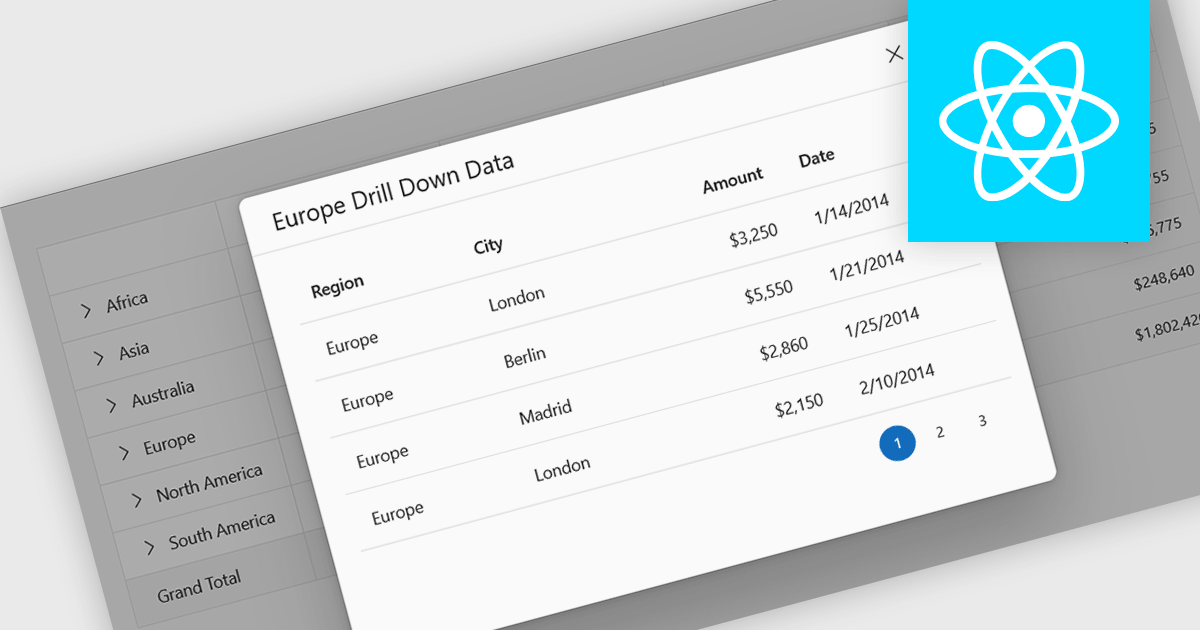
Drill-down support in a grid component allows users to move from summarized data to more detailed records within the same interface, often by expanding rows or selecting linked values that reveal related data. Instead of navigating to a separate page or view, users can access underlying information directly in context. For developers, this reduces the need for additional navigation and simplifies the presentation of hierarchical or related datasets. It also makes it easier to analyze data step by step, helping users inspect specific records or relationships without losing their place in the overall dataset.
Several React grid controls support drill-down features including:
For an in-depth analysis of features and price, visit our React grid controls comparison.
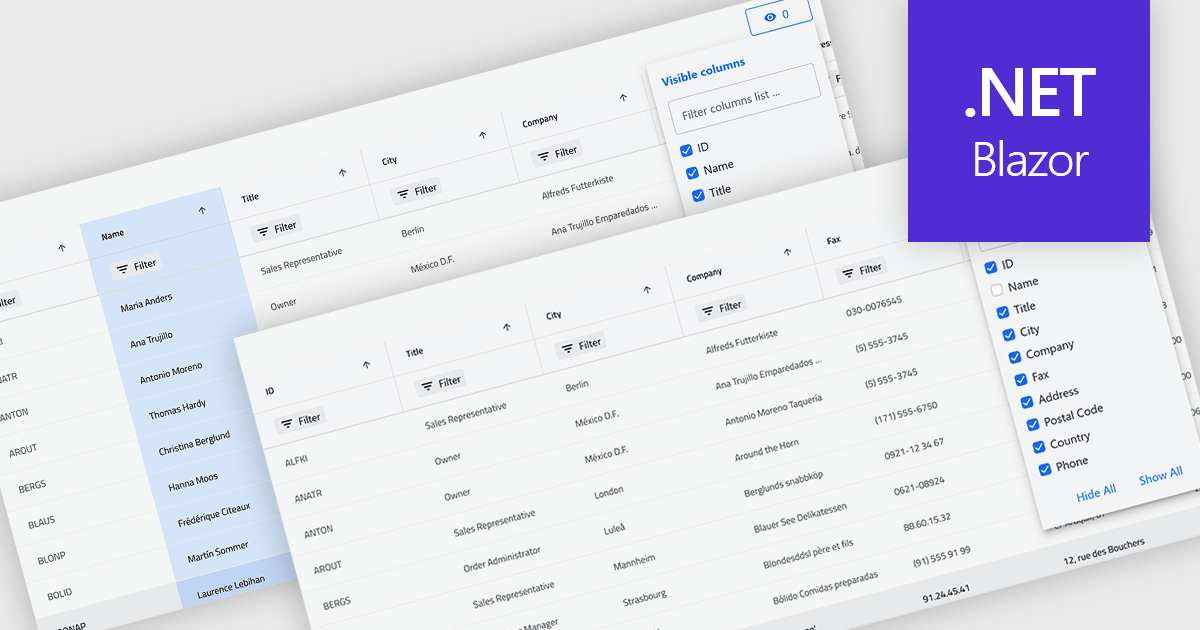
Column hiding in grids allows users to temporarily remove selected columns from view without deleting the underlying data. This provides a more focused and flexible way to work by showing only the fields relevant to a specific task or role. By reducing visual clutter and optimizing screen space, it improves readability and makes data easier to scan and analyze. For example, a financial analyst might display only revenue and profit columns for performance review, while a project manager may hide technical fields to focus on timelines and resources. Because columns can be restored at any time, the feature supports personalized, non-destructive customization.
Several .NET Blazor Grid controls offer the ability to hide columns including:
For an in-depth analysis of features and price, visit our .NET Blazor Grid controls comparison.
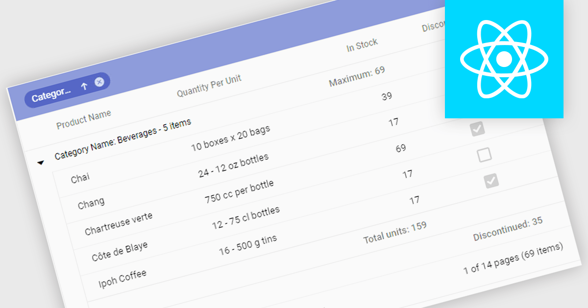
Aggregation in grids is the ability to automatically calculate summary values such as sums, averages, minimums, and maximums directly within tabular data views. By displaying these calculations alongside the underlying data, users can quickly understand trends, compare values, and identify outliers. This enables faster, more informed decision making. Typical use cases include showing total sales figures, calculating average performance metrics, tracking minimum and maximum thresholds, and summarizing financial, operational, or analytical data in real time within business applications.
Several React grid controls offer aggregation including:
For an in-depth analysis of features and price, visit our React grid controls comparison.
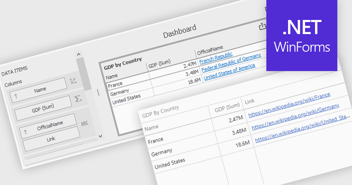
Hyperlinks in grid cells allow data within a grid to be presented as clickable links, enabling users to navigate directly to related pages, records, or actions from a single view. This reduces the need for extra navigation steps, and makes relationships between data clearer and more intuitive. Key benefits include faster access to detailed information and a more interactive user experience. Common use cases include linking order numbers to order details, customer names to profile pages, or grid entries to related documents, reports, or edit screens.
Several .NET WinForms grid controls offer hyperlink cell types, including:
For an in-depth analysis of features and price, visit our .NET WinForms grid controls comparison.
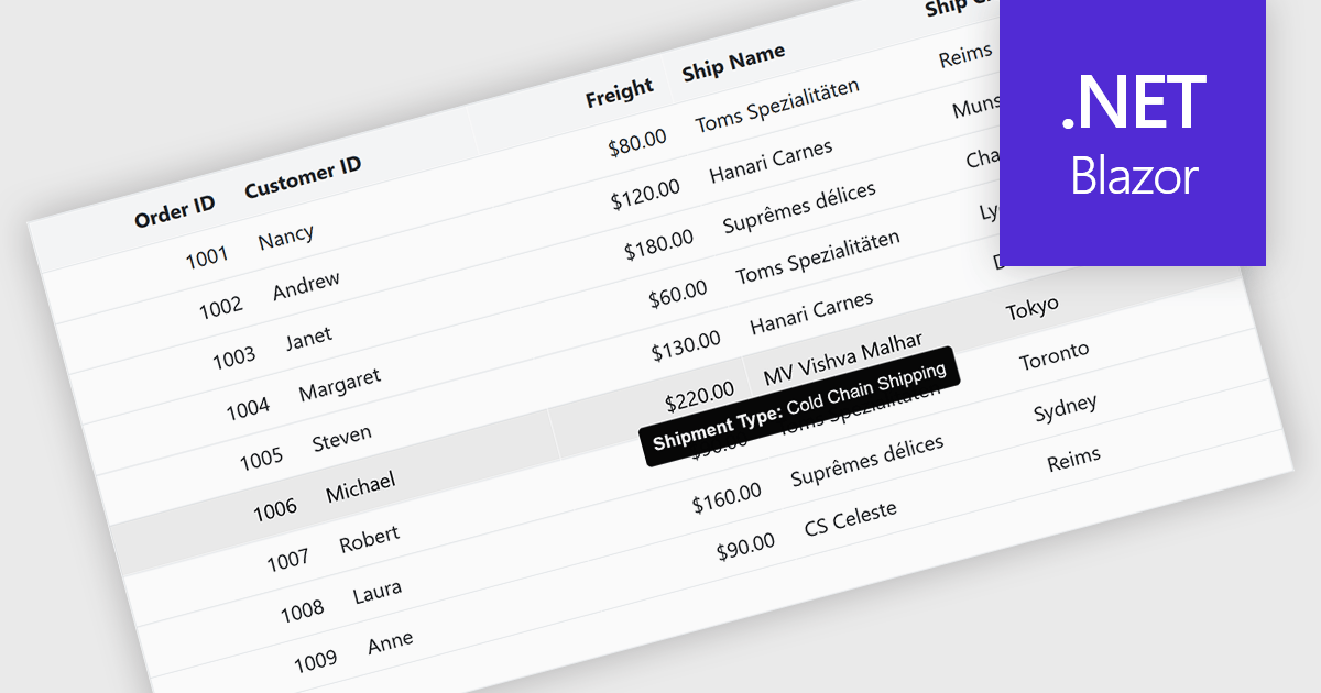
Tooltips in grid components provide contextual information that appears when users hover over or focus on a cell, column header, or row. It offers a practical way to surface additional details such as full text for truncated values, validation messages, or explanatory metadata without overcrowding the grid layout. For data-heavy interfaces, this feature improves readability and usability by keeping the primary view concise while still making secondary information readily accessible when needed.
Several Blazor grid controls offer FEATURE including:
For an in-depth analysis of features and price, visit our Blazor grid controls comparison.
聯繫電話: (888) 850 9911
傳真: +1 770 250 6199


