Syncfusion Essential Studio for JavaScript 2017 Volume 4

Adds new Essential JS 2 toolkit, framework support for Ember, and new combo box.
December 5, 2017
New Version

Features

  • Essential JS 2: Enterprise-Grade JavaScript UI Toolkit - Essential JS 2 is a modern JavaScript UI toolkit that has been built from the ground up to be lightweight, responsive, modular, and touch friendly. It is written in TypeScript and has no external dependencies. It also includes complete support for Angular and React frameworks. The following components are currently available:
    • Grid
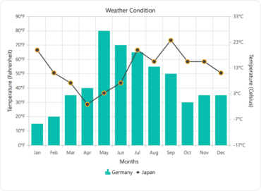
    • Chart
    • Drop-Down List
    • Tree View
    • Date Picker
    • Dialog
    • Numeric Text Box
    • Tab
    • Toolbar
    • Circular Gauge
    • Linear Gauge
    • Form Validator
    • Combo Box
    • Autocomplete
    • Multiselect Drop-Down
    • Calendar
    • Date Range Picker
    • Button
    • Radio Button
    • Check Box
    • Text Box
    • Time Picker
    • Masked Text Box
    • List View
    • Tooltip
    • Context Menu
    • Accordion
  • Ember Support for jQuery-based JavaScript Controls - Ember support has been implemented for most of the important Syncfusion JavaScript controls. Syncfusion provides this support as an add-on, so you can seamlessly use this add-on with your Ember CLI application.
  • Angular 5 Support - Essential JavaScript for Angular components have been upgraded to seamlessly support Angular 5.
  • ComboBox - New control - The combo box component allows the user to type a value or choose an option from a list of predefined options. When the arrow icon that accompanies this component is clicked, the drop-down displays a list of values from which the user can select one.
    • Data binding: Allows binding and accessing the list of items from local or server-side data sources.
    • Grouping: Supports grouping of logically related items under a single or specific category.
    • Sorting: Supports sorting list items in alphabetical order, either ascending or descending.
    • Filtering: Allows filtering list items based on a character typed in the component.
    • Templates: Allows customizing the list items, selected value, header, footer, category group header, and no records content.
    • Accessibility: Built-in accessibility support helps provide access to all the component’s features through the keyboard, screen readers, or other assistive technology devices.
  • Media Player - New control - The media player for JavaScript provides a simple yet powerful video and audio player with built-in control options. It supports HTML5 standard audio and video formats such as MP4, MP3, WebM, and Ogg.
    • Supports HTML5 standard video.
    • Supports YouTube videos.
    • Built-in control bar for desktop and mobile devices with all basic operations, including play/pause, next, previous, volume control, and full screen.
    • Timeline slider for easy navigation.
    • Title bar.
  • Chart
    • Axis label breaks - Provided support for displaying axis labels on multiple lines.
    • Show outside data labels - Partially visible data labels can now be displayed inside the chart area.
    • Automatic label format for date-time and date-time category axis - The label format for the date-time and date-time category axis can be updated automatically based on the interval type.
  • Data Manager
    • Anti-forgery - The anti-forgery token can be used to help protect the application against cross-site request forgery. It generates a hidden form field (anti-forgery token) that is validated when the form is submitted.
    • Additional data operations - IN and NotIN filter operations have been provided for specifying multiple values in a WHERE filter.
  • Date-Range Picker
    • Backward Selection - Backward selection support has been added to the date-range picker control to select start and end dates in any direction or order.
    • Responsive Date-Range Picker - The responsiveness of the date-range picker rendered with preset ranges has improved. To ensure user-friendly selection, it renders as a single calendar on mobile devices.
  • Diagram
    • User handle alignment - Support has been added to customize the user handle position with a desired location.
    • Port enhancement - Ports can now be dragged to reposition them.
    • Symmetric layout - Symmetric layout is an automatic layout used to arrange the diagram in a circular and symmetrical fashion.
    • Label interaction - Interaction support has been provided for labels. They can be selected, dragged, resized, and rotated.
  • Autocomplete
    • Search indices for multicolumn pop-up - Display format and search fields in the multicolumn autocomplete control can now be differentiated, allowing users to search any number of fields in the suggestion list without modifying the selected text format.
  • Bar Code
    • EAN - The bar code control now supports EAN-8 and EAN-13 bar codes.
  • Calculate
    • 27 New Excel Formulas - Support has been provided for the following Excel formulas: ASINH, ATANH, AVERAGEIF, AVERAGEIFS, BASE, BESSELI, BESSELJ, BESSELK, BESSELY, COUNTIF, MMULT, MOD, NORMSDIST, NORMDIST, ODD, POWER, PV, RADIANS, RAND, ROUND, ROUNDUP, ROUNDDOWN, SECH, SUMPRODUCT, TEXT, VLOOKUP, and STDEV.
  • Drop-Down List
    • Server filtering - This feature filters a data source when text is typed in the search box. Filtering is done based on the collection that contains matchings item from the entire data source.
  • File Explorer
    • Mouse selection support - Provided support for managing files/folders selection using a mouse in the file explorer control.
  • Kanban
    • External drag and drop - The Kanban control now supports drag-and-drop operations between the Kanban board and other controls.
    • Kanban column without data source - Kanban columns can be rendered without binding a data source and an option has been included to add new cards dynamically.
  • Schedule
    • Excel exporting of appointments - Supports exporting the appointment collection in Excel format, along with field customization to export only the specified columns of the appointment data.
    • Auto-scroll viewable area while dragging appointments to the edges - Auto-scroll support is now available, so that while dragging an appointment to the top or bottom edges of the viewable area, the schedule will scroll accordingly.
    • Persisting scroll position on refresh - The scroller position on the schedule can be persisted now, even after refreshing the entire layout.
    • Printing appointments with background color - Appointments can now be printed with proper background color.
    • Displaying specific date collection - Additional support to display only the user specific date collection is included, which can be of a periodic date range collection or a different date collection.
  • Slider
    • Button Support - A button that can be hidden has been added to allow increments and decrements to the slider value.
  • Gantt
    • Resource allocation view - The Gantt control now provides support for a resource allocation view. Using this view, the user can interpret tasks occurring on same dates and the over-allocation of resources in a project.
    • Sequencing tasks - It is now possible to display tasks with serial or sequence number based on the row order.
    • Multiple row selection - It is now possible to select multiple rows and perform indent and negative indent actions.
    • Column filtering - It is now possible to filter specific fields or columns in the Gantt control.
    • Expand/collapse records at levels - The Gantt control now provides support for expanding and collapsing records at specific levels.
  • Grid
    • Hierarchy export support - Support has been added to export multiple hierarchy levels in the grid control for PDF, Excel, and Word file formats.
    • Add current selection to filter option in Excel filter menu - The add current selection to filter check box is now displayed while searching, allowing users to add the currently selected or cleared check box list data along with already-filtered data in the grid.
    • Between operator option in menu filter - The between operator option has been added in the menu filter for filtering grid records based on the specified range.
    • Export template column - Export the grid with template columns in Excel, PDF, and Word file formats.
    • Export details template - Export the grid with the details template in Excel, PDF, and Word file formats.
  • Pager
    • Template - Template support has been provided to the pager component to customize the UI based on application needs.
    • Pivot Chart, Client and Grid
    • Paging support for Mondrian Server (Client Mode) - Paging splits large records into separate segments so you can view data easily. It also improves the performance of the pivot controls connected to Mondrian Server.
  • Tree Grid
    • Stacked header - The tree grid control now provides support for stacked column headers.
    • Header context menu - The tree grid control now provides support for context menus for column headers.
    • Excel filtering - The tree grid control now provides support for an Excel-like menu for filtering column values.
    • Toolbar filtering - It is now possible to filter tree grid contents using toolbar filtering.
A modern JavaScript UI toolkit.

Syncfusion Essential Studio JavaScript

A comprehensive UI library for JavaScript.

Got a Question?

Live Chat with our Syncfusion licensing specialists now.