Infragistics Ignite UI for React 20.1

Adds new column chooser component which allows end-users to hide/show columns through the UI.
June 3, 2020
New Version

Features

  • Dock Manager - Provides a way to manage a complex layout using different types of panes with various sizes, positions, and behaviors, and that can be docked to various locations within an app. The dock manager allows your end-users to customize it further by pinning, resizing, moving, floating, and hiding panes.
  • Data Grid
    • Toolbar - A brand-new grid toolbar component which is essentially a container for UI operations. The toolbar is located at the top of the Grid and it matches its horizontal size. The toolbar container hosts different UI controls which are related to some of the Grid's features - column hiding, column pinning, and filtering just to name a few.
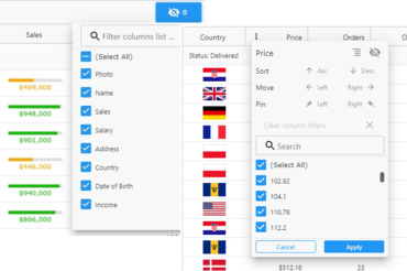
    • Column Chooser - A brand-new column chooser component has been added which allows end-users to perform column hiding/showing directly through the UI. This new column chooser can be used through the grid's toolbar to change the visible state of the columns. In addition, developers can always define the column hiding UI as a separate component and place it anywhere they want on the page.
    • Column Options Dialog - This dialog will give your end-users the ability to group, hide, pin, move, and sort a column, as well as apply filtering with a single click of a button. The new Options Dialog can be access by clicking on the 3-dots in the column header.
    • Column Pinning - With this latest release, end-users can now pin a column, or multiple columns, to the left or right side of the data grid. End-users can also lock columns in a specific order. The grid has a built-in column pinning UI, which can be used through the grid's toolbar, or the new grid options dialog, to change the pin state of the columns. In addition, you can define a custom UI and change the pin state of the columns using the data grid’s column pinning API.
    • Column Summaries - The grid now ships with a summaries feature that functions on a per-column level as a group footer. Summaries are a powerful feature which enables the end-user to aggregate data in a very simplistic way using a predefined set of default summary items, depending on the type of data within the column. The built-in summaries include:
      • Count
      • Min
      • Max
      • Average
      • Sum
      • Custom
Column Chooser and Column Options Dialog

Infragistics Ignite UI for React

High-performance data grid and high-volume data charts.

Got a Question?

Live Chat with our Infragistics licensing specialists now.