Actipro WPF Essentials 2020.1

Adds the ability to fully customize theming in your apps plus now includes .NET Core assemblies.
October 6, 2020
New Version

Features

Microsoft .NET Core Assemblies

  • Control products now ship in both Microsoft .NET Framework 4.0 and Microsoft .NET Core 3.0 assembly variations. You will now be able to use native .NET Core-based Actipro assemblies in your .NET Core apps.

NuGet Packages

  • Another big request has been to supply NuGet packages for the controls. NuGet packages are published on nuget.org and contain both the .NET Core and .NET Framework variations of the assemblies.

Docking/MDI

  • Added the ToolWindowContainer.TitleBarMinHeight property that sets the title bar's minimum height.
  • Updated tabbed MDI document list buttons and tool window title bar options buttons to be PopupButtons for better pressed state appearance.
  • No longer included the optional Docking/MDI 'legacy' assemblies containing the product's pre-2016.1 codebase.

Editors

  • Added the AutoCompleteBoxEventArgs.OriginalText property, which contains the control's text prior to a selected item overriding it.
  • Improved integration logic between all Editors and PropertyGrid.
  • Improved the DoubleEditBox and SingleEditBox parsing of values when using a percentage format.
  • Updated the edit box glyphs like drop-down arrows to use theme glyphs.

Navigation

  • Updated the NavigationBar glyphs to use theme glyphs.

Ribbon

  • Made massive updates to modernize the Ribbon and all of its controls so that it renders similar to the latest Microsoft Office version.
  • Added subtle animations for things like Ribbon selected tab underlines, and animating the selected tab's content into view.
  • Updated Backstage in modern themes to use WindowChrome's new overlay feature, and to animate into place.
  • Updated Ribbon to use its inherited font size, allowing it to keep a consistent appearance with the rest of the containing Window.
  • Updated ButtonBase.Command property changes to not immediately coerce the CommandParameter property.
  • Removed the Ribbon.UseScenicLayout property since the old Microsoft Office 2007 orb application button style is no longer supported.

Themes

  • WindowChrome
    • Improved the WindowChrome template that implements a custom chrome with many new features.
    • Added WindowChrome support for hiding the entire window title bar.
    • Added WindowChrome support for showing different window title bar text from the text displayed in the Microsoft Windows taskbar.
    • Added WindowChrome support for hiding the window title bar text.
    • Added WindowChrome support for replacing the title bar text with custom header UI.
    • Added WindowChrome support for injecting custom UI in the left side of the window's title bar, next to the icon.
    • Added WindowChrome support for injecting custom UI in the right side of the window's title bar, next to the system title bar buttons.
    • Added WindowChrome properties for controlling layout in scenarios where not all title bar elements fit in the available space.
    • Added WindowChrome support for optionally having the Window.Background brush extend to fill the title bar area background as well as the window's content area background.
    • Added WindowChrome support for optionally having the Window.Content extend to fill the title bar area.
    • Added WindowChrome support for a fully-customizable and themeable WPF-based title bar system menu.
    • Added WindowChrome support for animated overlays containing temporary custom content that is positioned over the entire window, such as for a home screen, an Microsoft Office-like Backstage, or a processing indicator.
    • Added WindowChrome support for an alternate title bar and title bar button style in certain situations.
    • Added WindowChrome support for setting the minimum title bar height.
    • Added the attached WindowChrome.TitleBarHeight property that returns the final arranged title bar height of a window using WindowChrome.
    • Added the attached WindowChrome.TitleBarLeftContentWidth and TitleBarRightContentWidth properties that return the final arranged widths of the left/right sides of a window title bar using WindowChrome, accounting for icons, buttons, and custom content.
    • Added several new built-in glyph templates for use in custom title bar buttons.
    • Added many new Themes QuickStarts that show off new WindowChrome features.
    • Simplified WindowChrome by removing Aero glass features that were only available in Microsoft Windows 7, which is no longer supported by Microsoft.
  • DynamicImage and ImageProvider
    • Added the ImageProvider class that supports dynamic manipulation of both vector and raster images in multiple ways.
    • Updated the DynamicImage control, a drop-in replacement for the native Image control, to be the primary UI mechanism for interfacing with ImageProvider and its features.
    • DynamicImage supports chromatic adaptation (color shifting) for images, which allows images designed for light themes to be automatically adjusted for use in dark themes.
    • DynamicImage supports dynamic loading of pre-defined high-DPI and/or theme-specific image variations for raster images.
    • DynamicImage supports automatic conversion of an image to grayscale and optional transparency when the control is disabled.
    • DynamicImage supports conversion of monochrome images to use the current foreground color.
    • Added a DynamicImage QuickStart sample to demonstrate many usage scenarios.
    • Added optional ImageConverter.Width, Height, and ImageProvider properties that are passed onto the created DynamicImage instance.
  • Menus and Popups
    • Added the TitleBarMenu control, which is a Menu control that is tailored for usage in window title bars.
    • Improved our styles for native menu items by increasing their size, adjusting element alignment, and rendering input gesture text in a lower-contrast color.
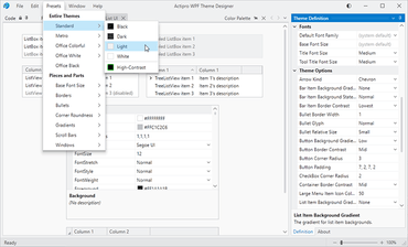
    • Added theme definition options for menu corner radius and padding, along with menu item column widths and padding.
    • Added a theme definition option for popup shadow direction.
    • Added a new SharedResourceKeys.MenuHeadingStyleKey style that makes a MenuItem render like a heading.
  • ScrollBars
    • Adjusted the ScrollBar template and added new theme resources to support thumb brush, thickness, and corner radius customization.
    • Added a new ScrollThemeProperties.HasButtons attached property that can be set on ScrollViewer or ScrollBar instances to determine if they have buttons, or only a thumb.
    • Checks and Radio Buttons
    • Updated CheckBox and RadioButton bullets to scale based on the control's font size.
    • Added theme definition options for bullet glyph kind (normal, inverted, accent), bullet relative size, border width, and CheckBox corner radius.
    • Modernized the check glyph.
  • Other Controls
    • Adjusted various Button, ToolBar, Expander, Slider and other related control templates to have a more modern appearance.
  • Miscellaneous
    • Added a theme definition option for arrow kinds (chevron vs. filled triangle).
    • Added the ThemeManager.RegisteredThemeDefinitions property, and RegisterThemeDefinition, UnregisterThemeDefinition, GetThemeDefinition, and CreateDefaultThemeDefinition methods, all of which deal with theme definitions.
    • Added the ThemeManager.SystemApplicationMode property, which returns the system preferred theme mode (light, dark, or high-contrast). The related SystemApplicationModeChanged event was also added.
    • Added the ThemeManager.RegisterAutomaticThemes method, which can automatically switch application themes to specified themes when SystemApplicationMode changes.
    • Added the ThemeManager.IsAnimationSupported property, which determines if UI animation should be enabled.
    • Added the ThemeManager.IsGraphicsHardwareAccelerationSupported property, which returns whether hardware-accelerated graphics are available on the system.
    • Obsoleted the ThemeName enumeration and added a static ThemeNames class with updated theme names. See the Themes conversion documentation on how several theme names changed.
    • Added new theme brush resources for the entire theme definition color palette.
    • Added new theme font size resources for an absolute ramp of font sizes as well as several contextual font sizes.
    • Removed various unused theme resources from AssetResourceKeys and added many new ones.
    • Removed GlassWindow since Microsoft Windows 7 and glass are past end of life.
    • Refined the high-contrast theme and its use of system colors. Only use this theme when Microsoft Windows itself is in high-contrast mode.
    • Moved the Aero (Microsoft Windows 7) theme and old Microsoft Office 2010 themes to a new ActiproSoftware.Themes.Aero.Wpf assembly, which can optionally be used if those themes are desired.
    • Removed Luna Microsoft (Windows XP) themes.
    • Simplified how XAML theme resources were loaded in each product assembly, removing use of the theme catalog system where it wasn't necessary and improving performance.

Wizard

  • Updated Wizard to try and focus a child control on the selected page when focus is set to the Wizard control.
  • Removed AeroWizardWindow since it was based on the old GlassWindow class, and updated the Aero wizard demo to show a more modern Window interface using WindowChrome.

Shared

  • Added the ShadowChrome primitive control that can render modern drop shadows using optional shader effects, and a related sample.
  • Added an AutoCollapseStackPanel control that can be used in WindowChrome title bars to collapse elements that don't fully fit in the available space.
  • Added the CharacterCasingConverter value converter, which can be used to convert a string's casing to upper or lowercase.
  • Improved the UIColor.Luminance calculation logic.
  • Improved the UIColor.FromMix calculation logic.
  • Updated the AdvancedTextBlock's overflow tooltip to use the same font characteristics as the control.
  • Updated TransitionPresenter logic.
  • PopupButton
    • Refactored and improved the PopupButton control's internal logic, and created a new QuickStart sample to show off all PopupButton functionality.
    • The PopupButton template now includes a Popup, with a default border, background, corner radius, and padding that are all customizable via new PopupButton properties.
    • Added a new CenterMerged PopupButtonDisplayModes option, and changed the default PopupButton.DisplayMode property value to Merged, which is the most common usage.
    • The ButtonOnly display mode will now behave like Merged, except will render without a popup indicator. This display mode allows popups/menus to be displayed without an indicator on the button.
    • If the PopupMenu property is specified, it will now take priority over popup content supplied via PopupContent, PopupContentTemplate, and PopupContentTemplateSelector.
    • See the conversion documentation for information on a couple unnecessary properties that were removed and one that was renamed.

All

  • Updated the main sample application to use a beautiful new modern design, and updated hundreds of samples to use a cleaner presentation.
  • Created a new product installer experience.
  • Some breaking changes were made to accommodate the themes updates.
A theme preset being selected

Actipro WPF Essentials

A suite of professional user interface controls and components for WPF.

Got a Question?

Live Chat with our Actipro Software licensing specialists now.