Infragistics Ignite UI 21.1

Improves Blazor, Web Components, React and Angular controls.
June 3, 2021
New Version

Features

Ignite UI for Angular

Angular 12

  • Added full support for Angular 12.

Angular Components

  • Added new Angular Tree Component - The Angular Tree Component allows users to represent hierarchical data in a tree-view structure, maintaining parent-child relationships, as well as to define a static tree-view structure without a corresponding data model. Its primary purpose is to allow end-users to visualize and navigate within hierarchical data structures. The Ignite UI for Angular Tree Component also provides load on demand capabilities, item activation, bi-state and cascading selection of items through built-in checkboxes, built-in keyboard navigation and more.
  • Angular Date Picker & Angular Time Picker Update - Updated Angular Date Picker and Angular Time Picker components.
  • Angular Date Time Editor - Added the ability to accept ISO 8601 date strings.

Design & Theming

  • Reduced themes size.
  • Added the ability to use global palette values (CSS variables).
  • Added the ability to scope custom CSS properties to component selectors.
  • Added the ability to expose elevations as custom CSS properties.
  • Now allows typography to be explicitly set by the user.
  • Added new Bootstrap Theming Sample.

Angular Grids: Grid, Tree Grid and Hierarchical Grid

  • Export Angular Hierarchical Grid to Microsoft Excel - The Excel Exporter service can now export data to Microsoft Excel from the Ignite UI Angular Hierarchical Grid.
  • Datetime & Time Column Types - Added two new members to the Angular Column Data Types portfolio. The appearance of the date portions will be set (e.g. day, month, year) based on locale format or pipeArgs input. The pipe arguments can be used to specify a custom date format or timezone.
  • Refactored Angular Tabs & Angular Bottom Navigation.
  • Exposes API for a new row object in Angular Grid - The Grid provides a convenient way to perform data manipulations through inline row adding and a powerful API for Angular CRUD operations. Add an Action Strip component with editing actions enabled in the grid's template, hover a row and use the provided button or press ALT + + to spawn the row adding UI.

Angular Grid Interactions

  • Added new detach method for IgxOverlay.

Ignite UI for Blazor

Blazor Grid

  • Enter Behavior After Edit - Added new property named EnterBehaviorAfterEdit. This property will control the behavior of the Enter key when it is pressed to commit an edit operation. The EnterBehaviorAfterEdit property has the following options:
    • None (Default) - after an edit is committed using the Enter key, the current cell stays active.
    • MoveUp - after an edit is committed using the Enter key, the cell above the current cell becomes active.
    • MoveDown - after an edit is committed using the Enter key, the cell below the active cell becomes active.
    • MoveLeft - after an edit is committed using the Enter key, the cell to the left of the current cell becomes active.
    • MoveRight - after an edit is committed using the Enter key, the cell to the right of the current cell becomes active.
  • Enter Behavior - Use the Enter key to navigate cells instead of entering edit mode on a cell. The EnterBehavior property has the following options:
    • None - pressing the Enter key does nothing.
    • Edit (Default) - the active cell enters edit mode on pressing the enter key.
    • MoveUp - the cell above the current active cell becomes active.
    • MoveDown - the cell below the current active cell becomes active.
    • MoveLeft - the cell to the left of the current active cell becomes active.
    • MoveRight - the cell to the right of the current active cell becomes active.
  • Begin Editing on Key Press - You can now immediately enter edit mode on an active cell by typing valid edit characters on the keyboard.
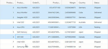
  • Selection Improvements - Added row range selection. Row selection can be made using either the mouse or keyboard.
  • Column Summaries in Column Options - End-users can now add summaries to any column they want using the column options dialog.

Blazor Date Picker

  • Text Input - You can now use the keyboard to enter dates into the Blazor date picker component without selecting a date from the calendar drop down. You enter the date value as a numeric or an alpha-numeric representation of the date.
  • Format Input Text - Now that text input is allowed in the Blazor Date Picker, it is important that you can format the date that is displayed in the text area of the date picker component for your locale.
  • Today Button - Added a “Today Button” to the calendar drop down. This "Today" button will bring the current date into focus within the calendar drop down no matter what month or year you have navigated to within the calendar.
  • First Day of Week - You can now define the first day of the week for your locale by setting the FirstDayOfWeek property.
  • Week Numbers - By setting the ShowWeekNumbers property to true, you can display a column which displays the number of weeks in the current month.
  • First Week of Year - When using Week Numbers, you can define when to start the first week of the year.
  • Date Limits - When date limits are set via the MinDate and MaxDate properties, the Blazor Date Picker will not allow out-of-bounds dates to be picked or entered. All dates that fall outside the set date limits will be disabled and grayed out.
  • Labels - You can provide a text caption or description for the Blazor Date Picker by setting the Label property.
  • Placeholders - When the value of the Blazor Date Picker is null, you can render a text hint to your end users by setting the Placeholder property of the component.
  • Accessibility - The Blazor Date Picker is now accessible by screen readers and provides full WAI-ARIA accessibility support and 508 compliance.

Ignite UI for React

React Grid

  • Enter Behavior After Edit - Added new property named EnterBehaviorAfterEdit. This property will control the behavior of the Enter key when it is pressed to commit an edit operation. The EnterBehaviorAfterEdit property has the following options:
    • None (Default) - after an edit is committed using the Enter key, the current cell stays active.
    • MoveUp - after an edit is committed using the Enter key, the cell above the current cell becomes active.
    • MoveDown - after an edit is committed using the Enter key, the cell below the active cell becomes active.
    • MoveLeft - after an edit is committed using the Enter key, the cell to the left of the current cell becomes active.
    • MoveRight - after an edit is committed using the Enter key, the cell to the right of the current cell becomes active.
  • Enter Behavior - Use the Enter key to navigate cells instead of entering edit mode on a cell. The EnterBehavior property has the following options:
    • None - pressing the Enter key does nothing.
    • Edit (Default) - the active cell enters edit mode on pressing the enter key.
    • MoveUp - the cell above the current active cell becomes active.
    • MoveDown - the cell below the current active cell becomes active.
    • MoveLeft - the cell to the left of the current active cell becomes active.
    • MoveRight - the cell to the right of the current active cell becomes active.
  • Begin Editing on Key Press - You can now immediately enter edit mode on an active cell by typing valid edit characters on the keyboard.
  • Selection Improvements - Added row range selection. Row selection can be made using either the mouse or keyboard.
  • Column Summaries in Column Options - End-users can now add summaries to any column they want using the column options dialog.

React Date Picker

  • Text Input - You can now use the keyboard to enter dates into the React date picker component without selecting a date from the calendar drop down. You enter the date value as a numeric or an alpha-numeric representation of the date.
  • Format Input Text - Now that text input is allowed in the React Date Picker, it is important that you can format the date that is displayed in the text area of the date picker component for your locale.
  • Today Button - Added a “Today Button” to the calendar drop down. This "Today" button will bring the current date into focus within the calendar drop down no matter what month or year you have navigated to within the calendar.
  • First Day of Week - You can now define the first day of the week for your locale by setting the FirstDayOfWeek property.
  • Week Numbers - By setting the ShowWeekNumbers property to true, you can display a column which displays the number of weeks in the current month.
  • First Week of Year - When using Week Numbers, you can define when to start the first week of the year.
  • Date Limits - When date limits are set via the MinDate and MaxDate properties, the React Date Picker will not allow out-of-bounds dates to be picked or entered. All dates that fall outside the set date limits will be disabled and grayed out.
  • Labels - You can provide a text caption or description for the React Date Picker by setting the Label property.
  • Placeholders - When the value of the React Date Picker is null, you can render a text hint to your end users by setting the Placeholder property of the component.
  • Accessibility - The React Date Picker is now accessible by screen readers and provides full WAI-ARIA accessibility support and 508 compliance.

Infragistics Ignite UI for Web Components

Web Components Grid

  • Enter Behavior After Edit - Added new property named EnterBehaviorAfterEdit. This property will control the behavior of the Enter key when it is pressed to commit an edit operation. The EnterBehaviorAfterEdit property has the following options:
    • None (Default) - after an edit is committed using the Enter key, the current cell stays active.
    • MoveUp - after an edit is committed using the Enter key, the cell above the current cell becomes active.
    • MoveDown - after an edit is committed using the Enter key, the cell below the active cell becomes active.
    • MoveLeft - after an edit is committed using the Enter key, the cell to the left of the current cell becomes active.
    • MoveRight - after an edit is committed using the Enter key, the cell to the right of the current cell becomes active.
  • Enter Behavior - Use the Enter key to navigate cells instead of entering edit mode on a cell. The EnterBehavior property has the following options:
    • None - pressing the Enter key does nothing.
    • Edit (Default) - the active cell enters edit mode on pressing the enter key.
    • MoveUp - the cell above the current active cell becomes active.
    • MoveDown - the cell below the current active cell becomes active.
    • MoveLeft - the cell to the left of the current active cell becomes active.
    • MoveRight - the cell to the right of the current active cell becomes active.
  • Begin Editing on Key Press - You can now immediately enter edit mode on an active cell by typing valid edit characters on the keyboard.
  • Selection Improvements - Added row range selection. Row selection can be made using either the mouse or keyboard.
  • Column Summaries in Column Options - End-users can now add summaries to any column they want using the column options dialog.

Web Components Date Picker

  • Text Input - You can now use the keyboard to enter dates into the Web Components date picker component without selecting a date from the calendar drop down. You enter the date value as a numeric or an alpha-numeric representation of the date.
  • Format Input Text - Now that text input is allowed in the Web Components Date Picker, it is important that you can format the date that is displayed in the text area of the date picker component for your locale.
  • Today Button - Added a “Today Button” to the calendar drop down. This "Today" button will bring the current date into focus within the calendar drop down no matter what month or year you have navigated to within the calendar.
  • First Day of Week - You can now define the first day of the week for your locale by setting the FirstDayOfWeek property.
  • Week Numbers - By setting the ShowWeekNumbers property to true, you can display a column which displays the number of weeks in the current month.
  • First Week of Year - When using Week Numbers, you can define when to start the first week of the year.
  • Date Limits - When date limits are set via the MinDate and MaxDate properties, the Web Components Date Picker will not allow out-of-bounds dates to be picked or entered. All dates that fall outside the set date limits will be disabled and grayed out.
  • Labels - You can provide a text caption or description for the Web Components Date Picker by setting the Label property.
  • Placeholders - When the value of the Web Components Date Picker is null, you can render a text hint to your end users by setting the Placeholder property of the component.
  • Accessibility - The Web Components Date Picker is now accessible by screen readers and provides full WAI-ARIA accessibility support and 508 compliance.
Row Range Selection

Infragistics Ignite UI

Quickly build fast performing Web apps.

Got a Question?

Live Chat with our Infragistics licensing specialists now.