Infragistics Ignite UI for Web Components 22.1

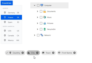
Adds new Chip, Drop Down and Tree components.
June 16, 2022
New Version

Features

Web Components Grid

  • Added support for pagination - Pagination is used to split a large set of data into a sequence of pages that have similar content. With pagination, data can be displayed in a set number of rows, letting users “scroll” through their data, without needing a scroll bar. The UI for table pagination usually includes things like the current page, total pages, and clickable Previous and Next arrows/buttons that let users flip through the pages of data.

Web Components Data Visualization

  • Improved the chart component - Including new defaults for the look and feel of the charts and new features across all of the data visualization components. New features include:
    • Auto-Label Rotation.
    • Enhanced Margin Computation.
    • Properties for Label Gaps.
    • Positioning in Callout Layers.
    • Style Events.
    • New Highlighting Series Modes.
    • Horizontal & Vertical Scrollbars.
    • Margin Angle Modes.
  • Added two brand new data visualization components:
    • Data Legend - The Data Legend is a new component that is similar to the Legend, but it focuses more on showing the values of series, the legend badges, and the series titles.
    • Data Tooltip - The Data Tooltip is a new type of tooltip layer that displays detailed information about a series including values, legend badge and series title. Essentially, this tooltip displays a Data Legend as its content. Therefore, it will have the same styling, formatting, and filtering properties as the Data Legend component.

Web Components Chip

  • The Chip component is a small container of information. Chips can contain text, avatars, images, icons, and more. Chips are commonly used as tags, filters, choices, and providing input to an application. The Chip component is highly customizable and supports selection, removing, as well as adding other components as either a prefix or suffix.

Web Components Drop Down

  • The Web Components Drop Down component displays a toggleable list of predefined values and allows users to easily select a single option item with a click. It can be quickly configured to act as a drop-down menu or you can simply use it to deliver more useful visual information by grouping data. With grouping you can use both flat and hierarchical data.

Web Components Expansion Panel

  • The Web Components Expansion Panel is a lightweight accordion component which can be rendered in two states - collapsed or expanded. The expansion panel can be toggled using mouse click, or keyboard interactions.

Web Components Mask Input

  • The Web Components Mask Input is an enhanced input component that provides an easy and reliable way to collect end-user input:
    • Masks allow you to require input characters, optionally accept input characters, and define the type of character that is expected at a specific position in the Mask Input.
    • By using a mask, you can easily distinguish between a proper and an improper user input value. This means you can validate the input provided by the user and notify the user of any errors.
    • Common masks include phone numbers, credit card numbers, social security numbers, dates, and many more.

Web Components Progress Bar - Linear and Circular

  • The Web Components Linear Progress Bar component provides a visual indicator of an application’s process as it changes. This can include processes like loading data from a database, uploading a file, or making a web service call.
    • You can use the Progress Bar to visually inform your end-users about the progress of a long running task or a series of steps. This is commonly done by showing a percentage of the process that increments as it gets closer to completing.
    • Sometimes, the time to complete a long running task is unknown. To support this scenario, the Progress Bar supports an “Indeterminate” mode. Instead of reporting a specific value of completion, the Progress Bar animation will continue to loop until the process has completed.

Web Components Rating

  • The Web Components Rating component allows your end-users to select a rating value from a group of visual symbols such as stars. The Rating component is often used to provide insight regarding the opinions and experiences of users for products and services they may have used or purchased.

Web Components Slider and Range Slider

  • The Web Components Slider component is a type of input control that allows selecting a value by moving the thumb along a track within a given range of values. The track can be defined as continuous or stepped. The Slider components provides a set of configurable features such as labels, tick marks, tooltips, constraints, and custom styling.
  • The Web Components Range Slider is almost identical to the Slider component. The only difference being that you can select a range of values instead of a single value. Selecting a range of values is done by moving two independent thumbs along a track within a range of given values. One thumb will represent the first value of the selected range, while the second thumb will represent the last value of the selected range.

Web Components Snackbar

  • The Web Components Snackbar component is used to show a brief message or notification within the application which may require feedback from the end-user. A common use-case for the Snack Bar component is to inform an end-user that a record has been deleted, and then provide an option to undo the delete operation to restore the record.

Web Components Toast

  • The Web Components Toast component is used to display an alert or notification on the current page. Common notifications include system messaging, push notifications, warning messages, information, and other non-interactive notifications. The Toast component is usually shown at the bottom of the screen and disappears automatically after a set period of time. It is important to note that the Toast component cannot be dismissed by the end-user.

Web Components Tree

  • The Web Components Tree component allows users to represent hierarchical data in a tree-view structure, maintaining parent-child relationships, as well as to define static tree-view structure without a corresponding data model. Its primary purpose is to allow end-users to visualize and navigate within hierarchical data structures. The Tree component also provides load on demand capabilities, item activation, bi-state and cascading selection of items through built-in checkboxes, built-in keyboard navigation and more.
Chip, Drop Down and Tree components.

Infragistics Ignite UI for Web Components

Build modern Web applications using reusable HTML/JS/CSS components.

Got a Question?

Live Chat with our Infragistics licensing specialists now.