


Official Supplier
As official and authorized distributors, we supply you with legitimate licenses directly from 200+ software publishers.
See all our Brands.
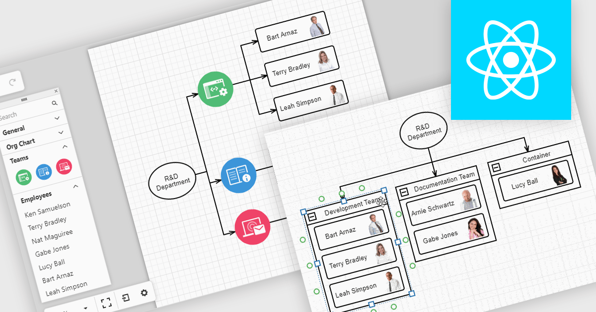
Diagrams in UI toolkits help turn complex data into easy-to-understand visuals that teams can interact with. For example, organizational charts show company structures and reporting lines in a layout that can be updated automatically from HR data. These charts can be expanded, collapsed, or reorganized with drag-and-drop tools, making it easier to understand team relationships and keep information up to date. Diagrams can also be used for workflows, decision trees, and network maps, giving teams a clear, flexible way to present and manage information.
Several React UI suites offer diagram controls including:
For an in-depth analysis of features and price, visit our React UI suite comparison.


Tel: (888) 850 9911
Fax: +1 770 250 6199


