Analyze Market Data with Financial Charts

March 30, 2026
Visualize price movements and trends using specialized charts designed for accurate and intuitive financial analysis.

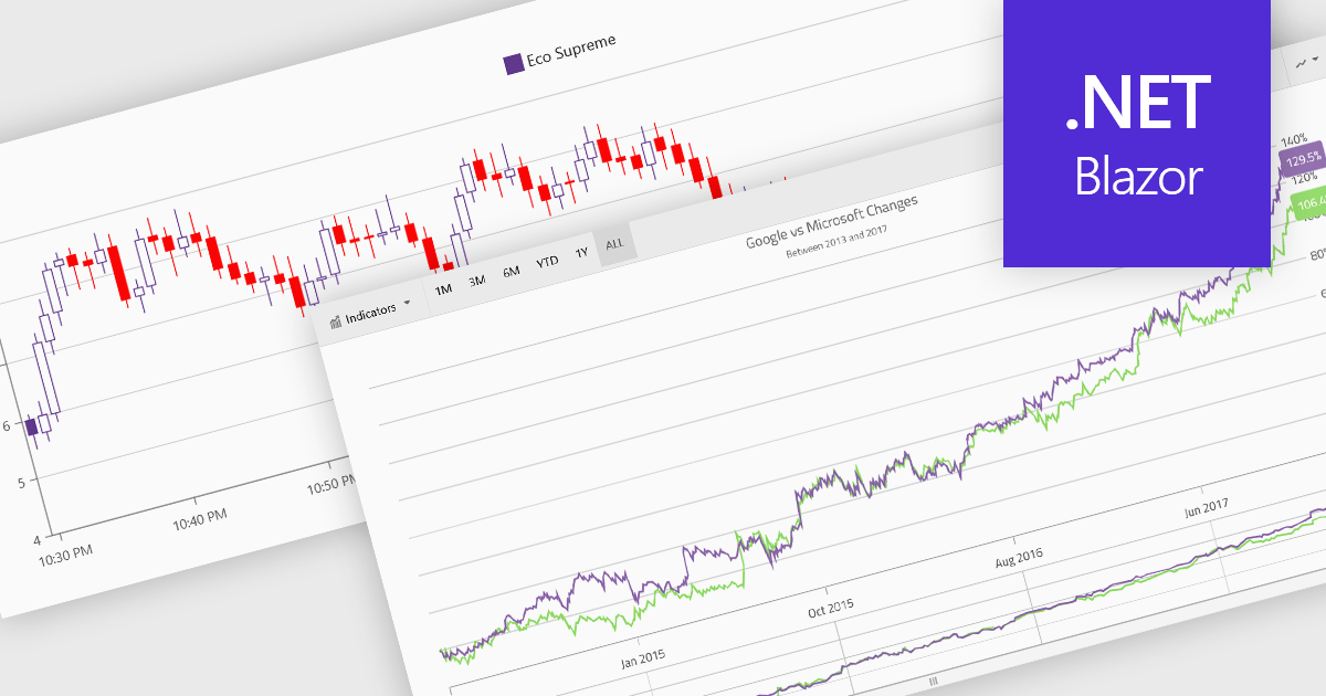
Financial charts are specialized visualizations designed to represent market data and price movements over time. Commonly used in trading platforms and analytical applications, these charts help users interpret open, high, low, and close values, as well as trends and volatility. By providing standardized financial visualizations, charting components enable developers to deliver tools that support technical analysis, decision-making, and real-time data exploration in finance-focused applications.

Common features include:

  • Box plots summarize data distribution by displaying quartiles and highlighting variability and outliers within a dataset.
  • Candlestick charts visualize price movements over time using bodies and wicks to represent open, close, high, and low values.
  • OHLC/HLOC charts present similar financial data in a bar-style format, making it easy to compare price ranges within a given period.
  • Point and Figure charts focus on price movements while filtering out time intervals, helping to identify trends and reversals more clearly.
  • Range charts display price changes based on predefined value ranges rather than time, emphasizing volatility and movement thresholds.
  • Spline charts provide smoothed line representations of financial data to highlight overall trends.
  • Step Line charts show discrete changes in price levels with clear transitions between values.
  • Indicators add analytical overlays such as moving averages or momentum calculations to support deeper technical analysis.

For an in-depth analysis of features and price, visit our Blazor charts components comparison.

Explore Blazor Financial Charts