


Official Supplier
As official and authorized distributors, we supply you with legitimate licenses directly from 200+ software publishers.
See all our Brands.
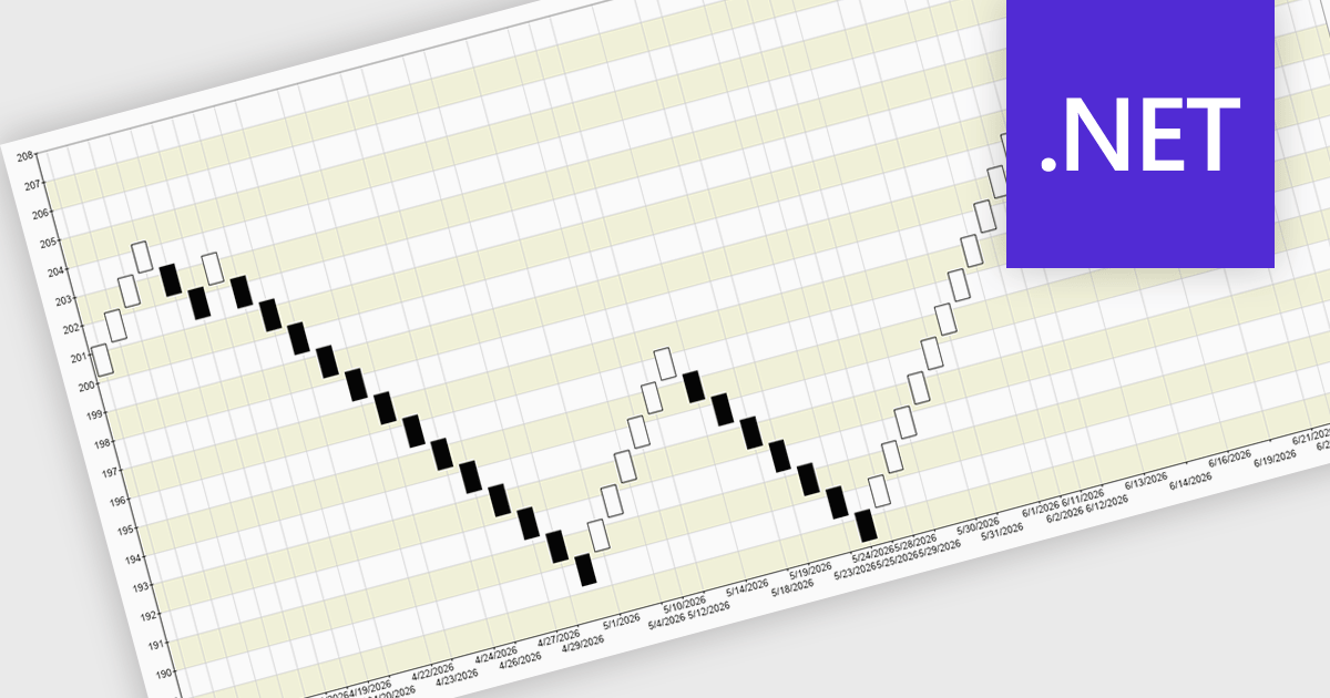
A Renko chart is a type of price chart used in technical analysis that focuses exclusively on price movement rather than time, displaying data as a series of uniform “bricks” that form only when the market moves by a predefined amount. This structure helps filter out minor price fluctuations, making trends and reversals easier to identify while reducing visual noise and improving clarity. As a result, traders can make more informed decisions, confirm trends with greater confidence, and simplify their analysis. Renko charts are commonly used in trend-following strategies, breakout trading, and support and resistance analysis, where a clear view of sustained price direction is more valuable than tracking every small market movement.
Several .NET Chart controls offer a Renko chart including:
For an in-depth analysis of features and price, visit our comparison of .NET Chart controls.


Tel: (888) 850 9911
Fax: +1 770 250 6199


