


Official Supplier
As official and authorized distributors, we supply you with legitimate licenses directly from 200+ software publishers.
See all our Brands.
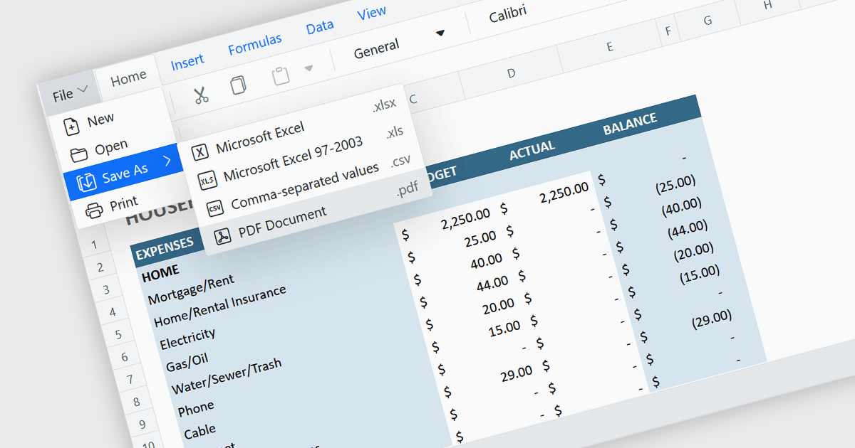
Exporting a spreadsheet to PDF is a widely used feature that allows users to generate fixed-layout, print-ready versions of their spreadsheet data, converting the contents of the spreadsheet file, into a Portable Document Format (PDF) file. This capability ensures that formatting, styling, and content of the original spreadsheet, including tables, charts, and cell styles, are preserved exactly as intended, regardless of the device or application used to open the file. It is especially useful for sharing finalized documents, such as reports or financial summaries, with stakeholders who do not need to interact with the data directly.
Several Angular spreadsheet components allow you to export to PDF, including:
For an in-depth analysis of features and price, visit our comparison of Angular spreadsheet components.
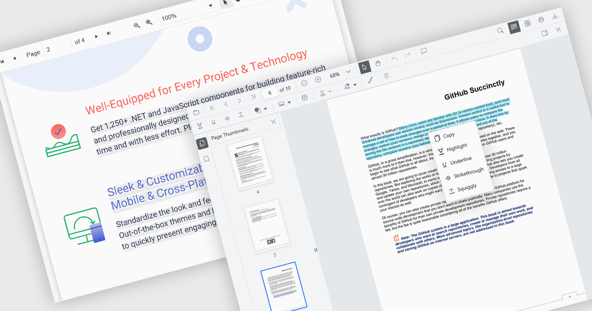
Selecting and copying text is a core feature of PDF viewer components, allowing users to highlight, extract, and paste content from documents without needing an external PDF editor. This capability is essential in workflows where text needs to be reused, such as quoting, data extraction, or forwarding snippets. A well-implemented text selection feature supports precise region selection, preserves text formatting and order (even across lines or columns), and integrates with the system clipboard reliably.
Several Angular PDF viewer controls offer the ability to select and copy text from PDF files, including:
For an in-depth analysis of features and price, visit our Angular PDF viewer controls comparison.
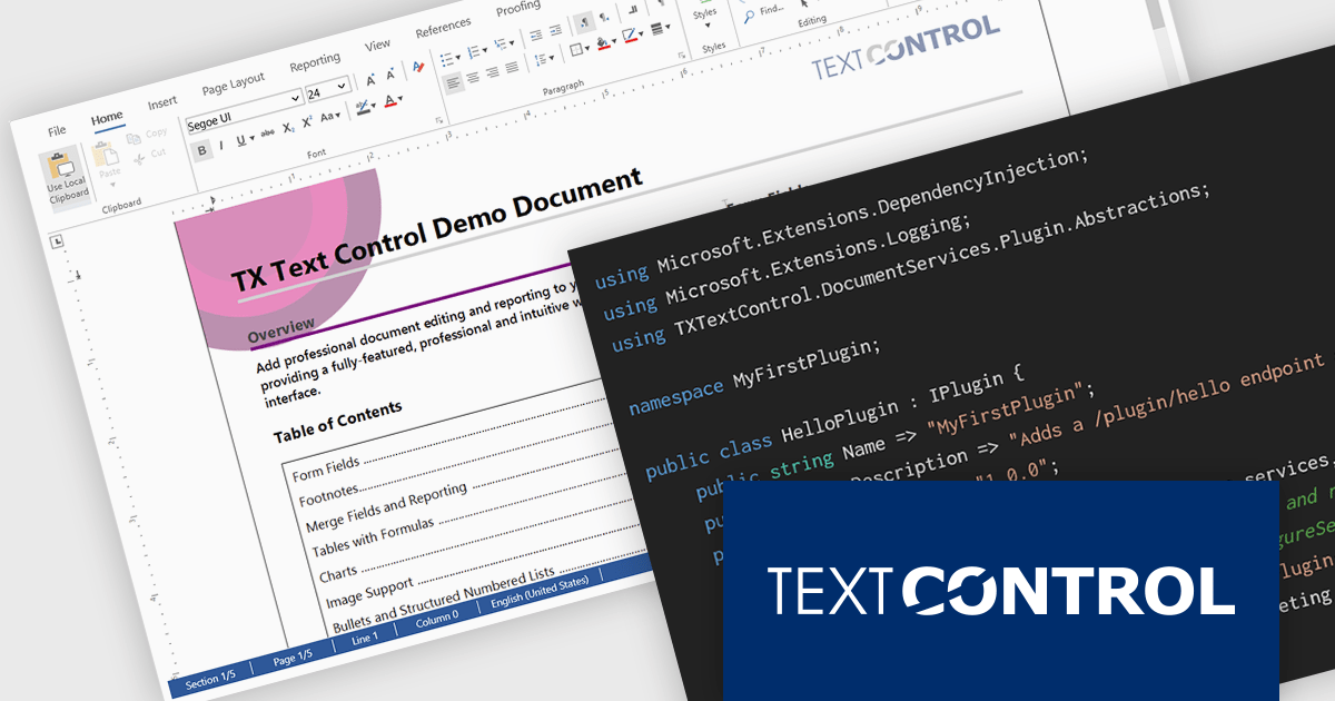
DS Server by Text Control is a powerful document processing backend designed to integrate seamlessly into web applications, providing developers with a robust set of APIs for creating, editing, viewing, and converting documents. Built for scalability and security, DS Server allows organizations to automate document workflows within their own infrastructure or cloud environments, eliminating the need for external dependencies. With support for popular formats like DOCX, PDF, and HTML, it enables rich document capabilities while maintaining full control over data and compliance. Whether you're generating dynamic reports, creating user-editable templates, or embedding secure document viewers, DS Server delivers high-performance document services tailored to modern application needs.
The DS Server 4.1.0 updated introduces a robust plug-in architecture that enables developers to extend the server’s core capabilities by injecting custom middleware, registering services, and integrating with APIs and the UI. Designed for easy deployment, plug-ins can be dropped into a dedicated folder and auto-loaded without altering the base system. Whether you're handling document conversion, templating, or workflow automation, the new plug-in architecture allows you to tailor DS Server’s behavior to match your application’s exact requirements.
To see a full list of what's new in version 4.1.0, see our release notes.
Text Control DS Server is licensed per server and is available as an Annual License that includes software updates. See our Text Control DS Server licensing page for full details.
For more information, visit our Text Control DS Server product page.
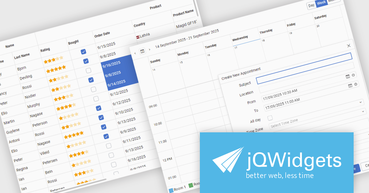
jQWidgets is a comprehensive JavaScript UI framework offering a robust collection of over 60 widgets, themes, and utilities for building professional-grade, cross-platform web applications. Built on jQuery, HTML5, and CSS, it provides extensive functionality including data grids, charts, navigation, input validation, and more. jQWidgets simplifies web development, ensuring your applications work seamlessly across desktop browsers, tablets, and smartphones.
The jQWidgets v24.0.0 update introduces a new Tailwind CSS-based theme that improves the process of styling and customizing user interfaces. By leveraging Tailwind’s utility-first framework, it enables flexible UI customization directly within markup, reducing the need for custom CSS and complex overrides. This integration ensures consistent design across components, promotes cleaner code, and aligns with modern front-end development practices. This release allows teams to deliver responsive, cohesive, and visually consistent applications with greater speed and precision.
To see a full list of what's new in v24.0.0, see our release notes.
jQWidgets is licensed per developer and is available as a Perpetual license 1 year support and maintenance. See our jQWidgets licensing page for full details.
Learn more on our jQWidgets product page.
Infragistics Ignite UI for Angular is a comprehensive suite of Angular components and UI controls designed to accelerate development of high-performance, enterprise-grade web applications. It offers a rich collection of data grids, charts, and other UI elements, along with advanced features like pivoting, docking, and hierarchical data management. Built on Angular, the toolkit integrates into existing projects and provides a foundation for building modern, responsive, and interactive user interfaces.
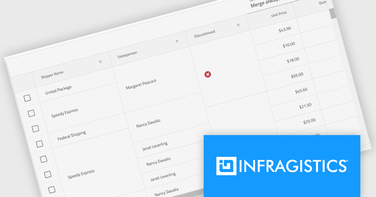
The Ignite UI for Angular 20.1 release introduces a new cell merging feature that enhances data readability by automatically combining vertically adjacent cells with identical values into a single, larger cell. This visual simplification reduces redundancy and makes it easier for users to analyze grouped or repeating information. Developers can apply merging based on default behavior that matches identical values or configure custom logic to control when cells should merge. This flexible approach ensures the feature adapts to a wide range of data presentation needs in complex enterprise applications.
To see a full list of what's new in version 20.1, see our release notes.
Infragistics Ignite UI for Angular is part of Infragistics Ignite UI which is licensed per developer and is available as a Perpetual License with a 1, 2 or 3 year support and maintenance subscription. See our Infragistics Ignite UI licensing page for full details.
Infragistics Ignite UI for Angular is available in the following products:


Tel: (888) 850 9911
Fax: +1 770 250 6199


