ComponentOne Studio WPF 2018 v3

Adds Simplified Ribbon contol, new FlexGrid101 Samples, customized icons, plus updates to Scheduler.
November 21, 2018
New Version

Features

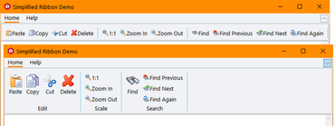
  • Simplified WPF Ribbon - Improve the look and navigation of your WPF apps with the modern, minimalistic simplified ribbon. This new control occupies the middle ground between a ribbon a toolbar, providing a single-line collapsed state, or a three-line ribbon-like appearance, and its design is influenced by Microsoft's ever-evolving Office 365 ribbon. You can customize the style of the ribbon, as well as the buttons you'd like to include.
  • FlexGrid101 Samples - Added a new C1Icon that enables a new level of customization for the sort, filter, and grouping glyphs, as well as FlexGrid101 samples to make it even easier to get started with this popular control. They demonstrate features like selection, cell customization, conditional formatting, filtering, the RowDetails feature, cell merging, and many other points of interest.
  • C1Icon - A new object that is used within the FlexGrid to make it much easier to customize the many icons used throughout for sorting, filter, etc. C1Icon allows you to specify your own image, font character, or use a built-in template to change the appearance of the icons found in the data grid.
  • Scheduler Updates:
    • New TableView Scheduler sample displays appointments in a table view that can be grouped, sorted, or filtered as specified by the developer or end user. It's similar to the Outlook 2016 List and Active views:
    • AgendaView displays appointments grouped by date in a table view where a single table row represents a single appointment. Users can edit appointments by double-clicking on an appointment and opening the EditAppointment dialog. This view is always sorted by dates in ascending order, and doesn't have row or column headers.
    • New "Working Elsewhere" appointment availability status has been added.
  • FlexChart Updates:
    • Animations - FlexChart and Finanical Chart now has animations for loading, updating, and changes to the chart axes. You can also create your own custom animations using the AnimationTransform event.
    • Scale Breaks - FlexChart has also been updated to support axis scale breaks. Scale breaks can make irregular data that varies by a large magnitude easier to read as it makes the lower end of the scale more visible.
    • Ranged drawing mode - allows support for built-in floating bar and Gantt charts. Ranged drawing mode is available for Bar, Column, and Area Charts.
    • UWP controls are now available through NuGet.
Simplified Ribbon Control in C1 Studio for WPF.

ComponentOne Studio WPF

Over 100 essential WPF UI controls.

Got a Question?

Live Chat with our MESCIUS (formerly GrapeCity) licensing specialists now.