查看所有元件類別
查看所有的元件類型
查看所有的元件環境
查看所有的元件開發原廠
看到所有的應用程式類別
看到所有的應用程式類型
看到所有的應用程式開發原廠
查看所有Add-in 類別
看到所有Add-in 的出版商
看到所有品牌
查看所有分類新聞
查看所有結構新聞
查看所有新聞
DevExpress
Telerik
Syncfusion
MESCIUS (formerly GrapeCity)
Infragistics
Codejock Software
Actipro Software
Wisej.NET
Isomorphic Software
功能焦點
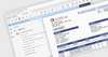
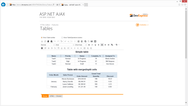
ASP.NET Core 控制項 - DevExpress ASP.NET Core 用戶端控制項與伺服器端 web API 資料處理擴展性相輔相成。因此,無論資料集有多大,使用者都能夠快速塑造和分析任務關鍵型資訊。.
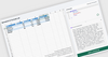
JavaScript 試算表 - 用於以表格格式組織和分析資料的功能豐富的控制項。 它提供了所有常見的 Excel 功能,包括資料綁定、選擇、編輯、格式化、調整大小、排序、導入和匯出 Excel 文件。.
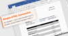
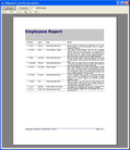
報表 - 一種基於 .NET 伺服器的解決方案,允許您在各種 Web 和桌面應用程式中設計和嵌入互動式報表。 它提供了一個使用者友好的報表設計器,一個強大的 API,具有匯出到 15+ 格式(Word、Excel、PDF等)的功能。.
WinExplorer View - HTML 範本 - HTML-CSS 範本允許您覆蓋所有視圖樣式中的預設資料演示文稿。 使用 HTML 標記指定 WinExplorer View 項的內容,並使用 CSS 代碼自訂 UI 元素的外觀、大小、填充和佈局。.
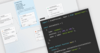
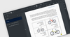
帶標記編輯器的富文本 - 用一組豐富的工具為現代 web 和移動應用程式編輯 WYSIWYG HTML 和標記內容。開發人員可以輕鬆地將控制項合併到博客編輯器、HTML 電子郵件合成器或類似論壇的討論應用程式中。 .
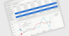
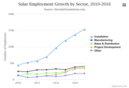
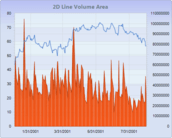
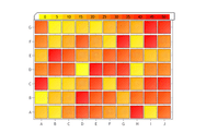
JavaScript 圖表 - 30 多種回應式圖表類型的集合,包括支援綁定到任何資料來源的線條圖、面積圖、橫條圖、圓形圖、漏斗圖、金字塔圖、財務圖、範圍圖和極座標。 您可以輕鬆地組合不同的系列類型,並在同一顯示器內的不同窗格中顯示。.
靈活的 JavaScript 圖表控制項 - 適用於企業應用程式的 80 多種快速、靈活的 JavaScript 圖表. 包括數十個圖表元素、靈活的資料綁定和圖元完美的 SVG 呈現和圖像匯出.
智慧圖表 - 用 JavaScript 編寫的 30 多個輕量級圖表的集合,提供了許多高級功能。 支援兩種不同的渲染技術 - SVG 和 HTML5 Canvas。.
日曆 - Xamarin 日曆配備直觀的導航選擇手勢、動畫和內置的全球化功能。 透過水準或垂直導航和自訂顯示設定對外觀進行自訂。.
120+ WinForms UI 控制項 - Telerik DevCraft UI 包括廣泛的 WinForms 控制項系列,包括資料管理、資料視覺化、交互性、文件處理、編輯器、佈局和導航。.


 (2)
(2)
 (62)
(62)

 (2)
(2)