


Official Supplier
As official and authorized distributors, we supply you with legitimate licenses directly from 200+ software publishers.
See all our Brands.
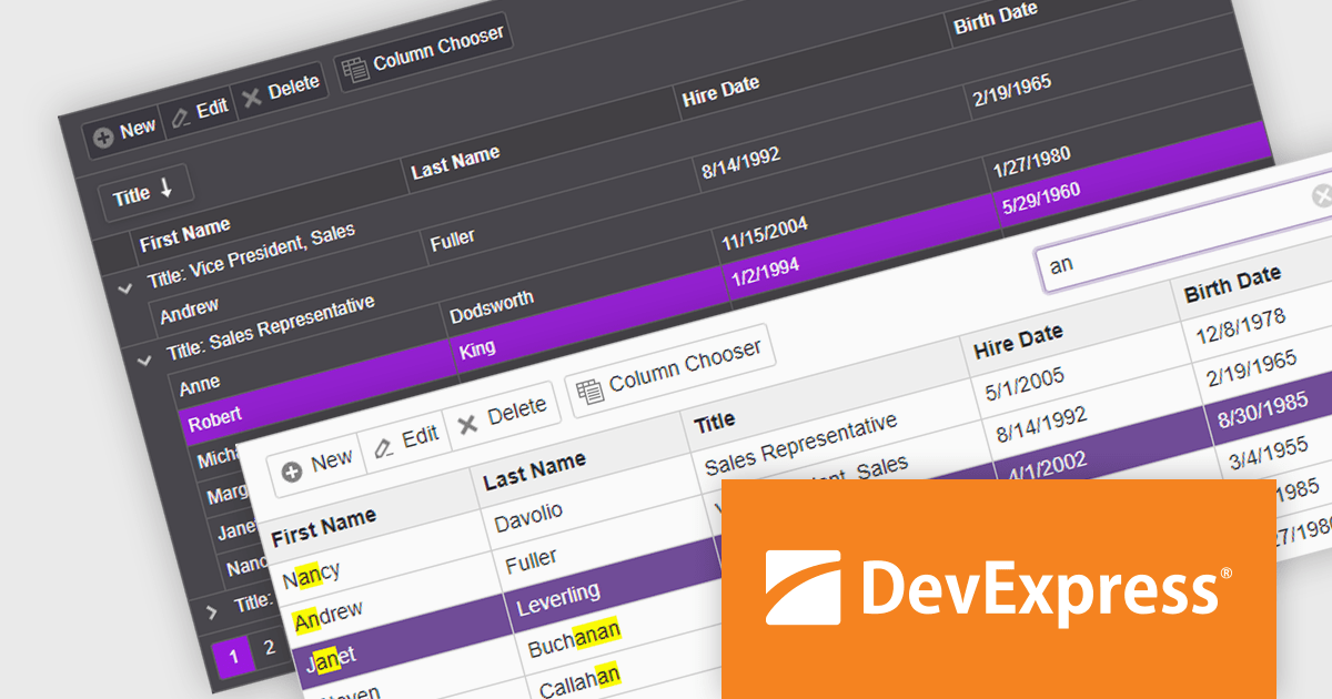
DevExpress ASP.NET and Blazor includes 110+ UI controls for ASP.NET (including Reporting), server-side MVC extensions or client-side controls with everything you need to build Office-inspired applications, over 70 high-performance ASP.NET Core UI controls, ASP.NET Bootstrap Controls for Office-inspired and Data Visualization apps, Blazor Components (including a Data Grid and Pivot Grid) so you can design rich user experiences for both server-side (Razor Components) and client-side (Blazor) platforms and the DevExtreme JavaScript component suite for responsive web development.
The DevExpress Blazor Grid UI component includes a new toolbar section for displaying custom content. In this blog post, DevExpress's Svetlana Mikheeva describes how to use this powerful component to create rich UIs displaying icons, text, or both. Steps include:
Read the complete blog and get started creating rich Blazor Grid applications.
DevExpress ASP.NET and Blazor is licensed per developer and includes a 12 month subscription for minor and major updates. Subscription renewals are also available. See our DevExpress ASP.NET and Blazor licensing page for full details.
Learn more about DevExpress ASP.NET and Blazor.
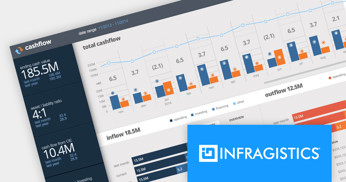
Infragistics Ultimate is a comprehensive toolkit designed to streamline UX/UI creation and development across desktop, web, and mobile platforms. It offers hundreds of pre-built, high-performance UI components like grids and charts, alongside design-to-code tools for rapid prototyping, user testing, and even code generation. This enables developers and designers to create visually appealing and interactive applications faster, while its support for various frameworks and platforms ensures flexibility.
Infragistics Ultimate UI for Windows Forms, Ultimate UI for WPF and Ignite UI for Blazor now support .NET 8. This allows developers to benefit from the performance improvements, cross-platform compatibility, and new APIs in the latest version of Microsoft's leading development framework.
Infragistics Ultimate UI for Windows Forms, Ultimate UI for WPF and Ignite UI for Blazor are licensed per developer and are available as a Perpetual License with 1, 2 or 3 year support and maintenance subscription. See our Infragistics Ultimate UI for Windows Forms, Ultimate UI for WPF and Ignite UI for Blazor licensing pages for full details.
For more information please visit our product pages:
The following product suites also include Infragistics Windows Forms, WPF and Ignite UI:
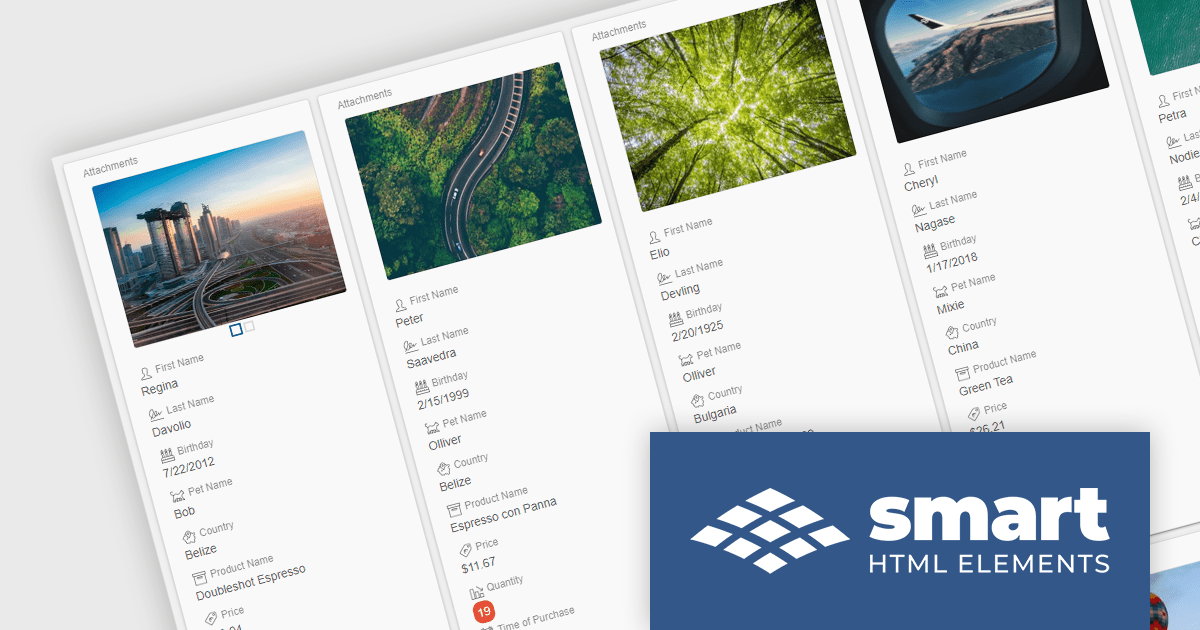
Smart HTML Elements is an enterprise-grade UI library offering pre-built web components for developers in Angular, React, Vue, Blazor, and JavaScript. It boasts over 60 ready-to-use components like grids, charts, schedulers, and editors, all featuring two-way data binding, responsiveness, accessibility, and theming capabilities. This library helps developers rapidly build dynamic and modern web applications with consistent look-and-feel and rich functionalities, accelerating development time and ensuring professional quality.
The Smart HTML Elements v18.0.0 release adds a new grid card view layout that leverages CSS grid to offer an adaptive container for presenting information in a visually appealing card format. Cards can be dynamically populated with text, images, and other multimedia elements, allowing for customization and adaptation to diverse content types. The responsive layout automatically adjusts to various screen sizes and device orientations, ensuring optimal card arrangement and user experience across platforms.
To see a full list of what's new in v18.0.0, see our release notes.
Smart HTML Elements is licensed per developer and is available as a Perpetual license with 1 year support and maintenance. It includes distribution to Unlimited Web applications, SaaS projects, Intranets and Websites. See our Smart HTML Elements licensing page for full details.
Learn more on our Smart HTML Elements product page.
Telerik UI for Blazor is a comprehensive UI library that provides over 110 native Blazor components for building modern and feature-rich web applications. This professional-grade solution offers a complete set of components to satisfy all user interface requirements, saving time and effort in UI design.
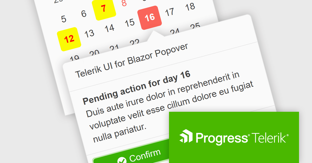
The Telerik UI for Blazor v5.1.0 update (part of the 2024 Q1 release) adds a popover component. More advanced than a tooltip, this component offers a temporary overlay that surfaces contextually relevant information, options or actions upon user interaction (a click or mouse hover) with a designated anchor element. You can set position and collision parameters, as well as customizable parameters for appearance and animations. This provides Blazor developers with a way to offer users additional content without cluttering the primary interface.
To see a full list of what's new in 2024 Q1 (v5.1.0), see our release notes.
Telerik UI for Blazor is licensed per developer and is available as a perpetual license with a one year support subscription, which is available in three tiers: Lite, Priority or Ultimate. See our Telerik UI for Blazor licensing page for full details.
Telerik UI for Blazor is available to buy in the following products:
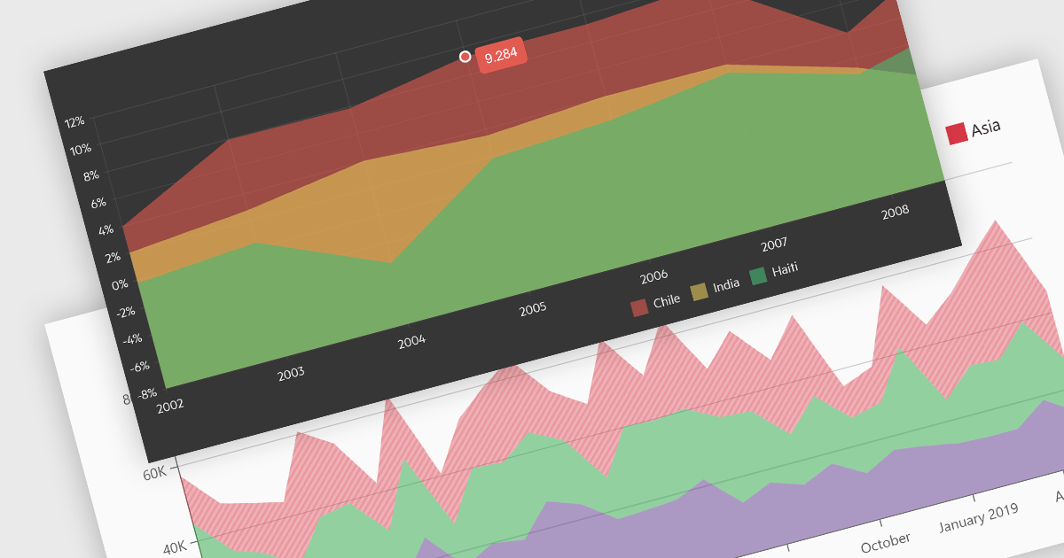
Area charts combine the strengths of line and bar charts, typically depicting how quantitative data changes over time. The area beneath the lines is shaded, emphasizing trends, comparisons between multiple data series, and the magnitude of change within each series. Ideal for showcasing cumulative totals and proportions, area charts excel in revealing trends and relationships within your data.
Several Blazor chart controls offer area charts including:
For an in-depth analysis of features and price, visit our Blazor chart controls comparison.


Tel: (888) 850 9911
Fax: +1 770 250 6199


