


Official Supplier
As official and authorized distributors, we supply you with legitimate licenses directly from 200+ software publishers.
See all our Brands.
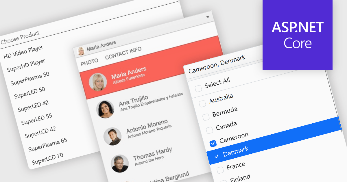
Dropdowns and lists provide structured ways for users to select and manage values within grids, forms, or tables. By constraining input to predefined options, these controls help maintain data consistency, reduce entry errors, and improve overall usability. They are commonly used in business applications where accuracy and efficiency are important, such as configuration panels, data management tools, and enterprise systems.
Common features include:
For an in-depth analysis of features and price, visit our ASP.NET Core data editor components comparison.
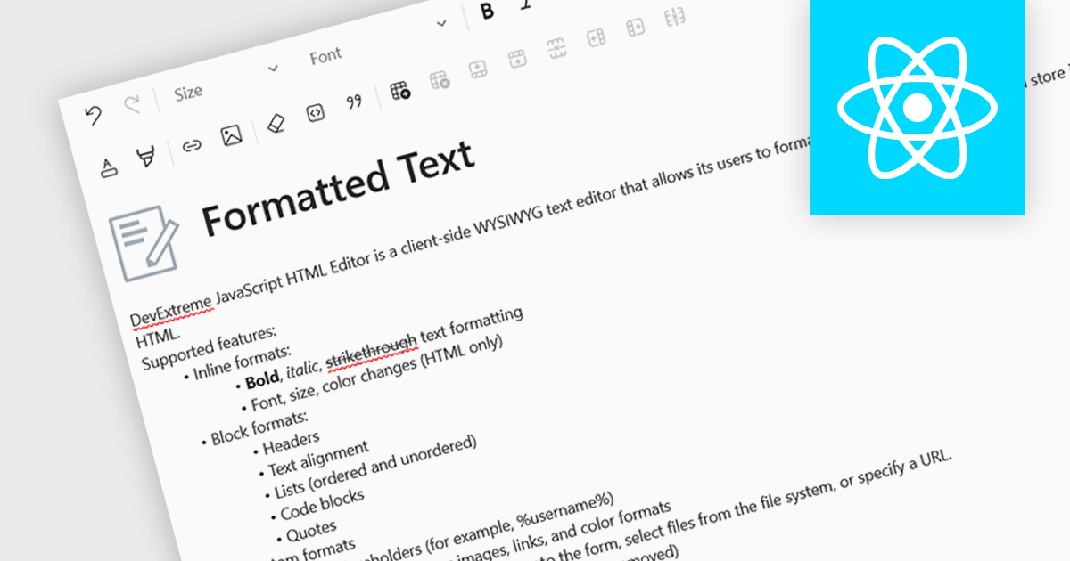
An RTF (Rich Text Format) editor allows users to create and modify formatted text, such as bold, italics, fonts, colors, and embedded elements. This capability is particularly useful in applications where descriptive or user-generated content must retain presentation alongside data, such as CMS platforms, reporting tools, or enterprise data grids. By integrating rich text editing at the component level, it enables more expressive data entry, reduces the need for external editors, and ensures formatting consistency when storing and rendering content across systems.
Several React data editor collections include RTF (rich text format) functionality, including:
For an in-depth analysis of features and price, visit our comparison of React data editors.
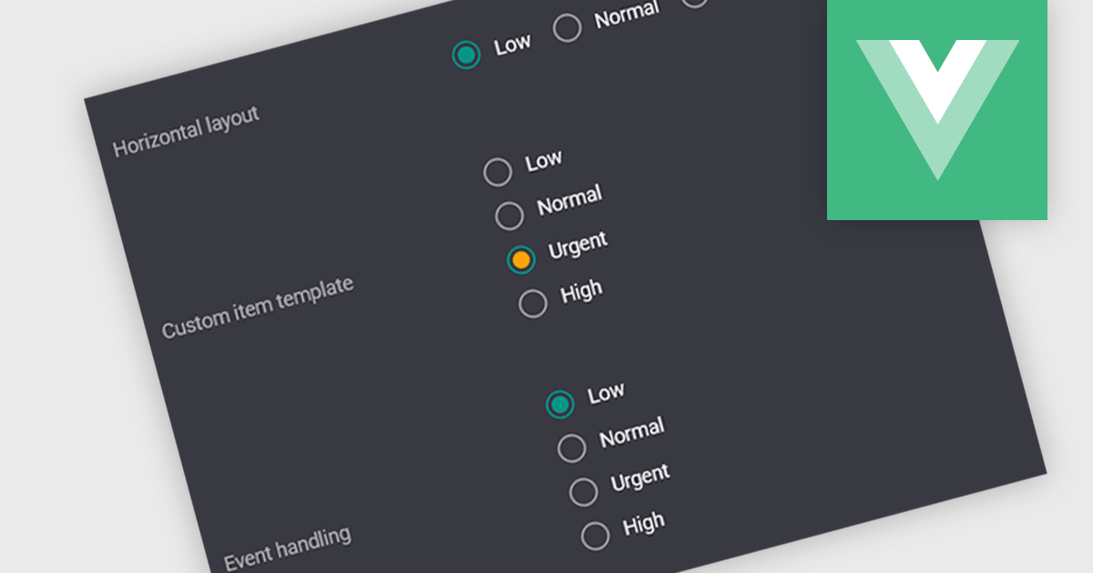
A radio group is a user interface element that presents a set of predefined options where only one value can be selected at a time for a particular field. It allows users to choose a single state, category, or configuration directly within the editing interface, with the selected option mapped to the underlying data value. This approach improves data consistency by preventing invalid combinations, simplifies validation logic by constraining input to known values, and accelerates data entry by replacing manual text input with clear, clickable choices that reduce ambiguity and input errors.
Several Vue.js data editor collections include radio group functionality, including:
For an in-depth analysis of features and price, visit our comparison of Vue.js data editor collections.
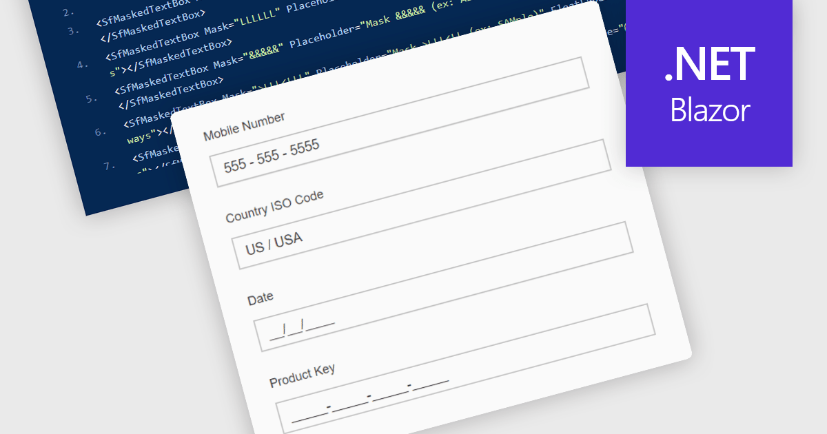
Masked Input Text Box editors are input components that enforce a predefined format while users type, ensuring that entered values follow a specific structure such as phone numbers, dates, postal codes, or identification numbers. By applying an input mask, the editor guides users to enter characters only in valid positions and formats, reducing the likelihood of invalid or incomplete data being submitted. This approach improves data consistency across applications, simplifies validation logic on both the client and server side, and reduces the need for additional parsing or correction of user input. For developers building data-driven Blazor applications, masked input editors help maintain reliable data entry while providing a clear and structured input experience directly within forms and data editing interfaces.
Many .NET Blazor data editor collections contain masked input text box editors including:
For an in-depth analysis of features and price, visit our comparison of .NET Blazor data editors.
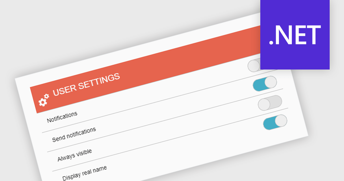
A toggle switch is a user interface control that allows users to quickly switch between two states, typically on and off. It provides a clear visual indication of the current state and enables immediate changes with a single interaction. Toggle switches are widely used in forms, settings panels, and configuration interfaces because they present binary choices in a compact and easily understandable format. Their visual clarity helps reduce user errors, while their interactive design supports efficient input and consistent behavior across desktop and mobile applications.
Several .NET data editor collections give you toggle switch functionality, including:
For an in-depth analysis of features and price, visit our comparison of .NET data editor collections.


Tel: (888) 850 9911
Fax: +1 770 250 6199


