


Official Supplier
As official and authorized distributors, we supply you with legitimate licenses directly from 200+ software publishers.
See all our Brands.
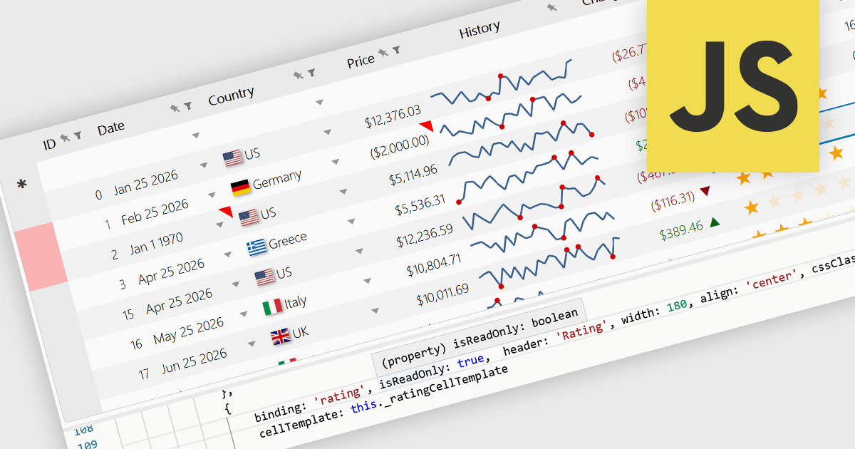
Read-only Columns are grid columns configured to display data without allowing users to edit the values directly in the interface. In a JavaScript grid control, this is typically used for fields that should remain fixed, such as calculated values, identifiers, audit data, or information controlled by business rules or backend processes. The main benefit is that it helps preserve data integrity while still making important information visible, reduces the risk of accidental changes, supports clearer editing workflows by distinguishing editable and non-editable fields, and makes it easier for developers to enforce validation and permission requirements consistently across the application.
Several JavaScript grid controls offer support for Read-only Columns including:
For an in-depth analysis of features and price, visit our comparison of JavaScript grid controls.
Wijmo is a cutting-edge collection of over 100 high-performance JavaScript UI controls designed for modern enterprise applications. Built for speed and flexibility, Wijmo empowers developers to deliver superior user experiences with fully responsive, touch-friendly, and accessible components.
In this blog post, MESCIUS Product Manager Joel Parks takes you through the process to Implement a PostgreSQL JavaScript workflow by capturing DataGrid state changes, issuing asynchronous POST requests, and processing updates through an Express API to reliably persist validated, row-level modifications in PostgreSQL. Steps include:
Detailed source code is included to help you get started.
Read the full blog now and get ready to build fully interactive, data-driven applications backed by PostgreSQL.
Wijmo is licensed per developer. Developer Licenses are perpetual and include 1 year Subscription which provides upgrades, including bug fixes and new features. See our Wijmo licensing page for full details.
Learn more on our Wijmo product page.
Syncfusion Essential Studio UI Component Suite is a comprehensive collection of user interface controls designed to support the development of modern, high-performance applications across web, desktop, and mobile platforms. It provides a wide range of components, from data grids and charts to schedulers and rich text editors, all built with a consistent API and strong integration across frameworks such as .NET, JavaScript, and Flutter. With a focus on reliability, scalability, and ease of use, it enables development teams to accelerate application delivery while maintaining flexibility and control over the user experience..
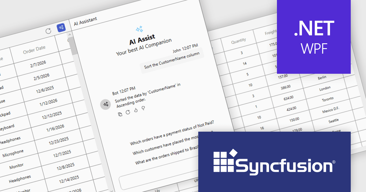
The Syncfusion Essential Studio UI Component Suite 2026 Volume 1 update introduces the Smart DataGrid, enabling developers to integrate natural language driven data interaction into modern WPF applications. This feature allows users to query, sort, filter, group, and highlight data through simple prompts, reducing the need for complex query logic and custom UI implementations. By supporting advanced scenarios such as multi condition filtering and contextual grouping, it improves development while maintaining flexibility and control. As a result, developers can deliver more intuitive data experiences faster, improve application usability, and reduce the overall effort required to implement rich data handling capabilities.
To see a full list of what's new in 2026 Volume 1 (33.1.44), see our release notes.
Syncfusion Essential Studio UI Component Suite is available as part of Syncfusion Essential Studio Enterprise which is licensed per developer and is available as a 12 Month Timed Subscription License which includes support and maintenance. See our Syncfusion Essential Studio Enterprise licensing page for full details.
Learn more on our Syncfusion Essential Studio Enterprise product page.
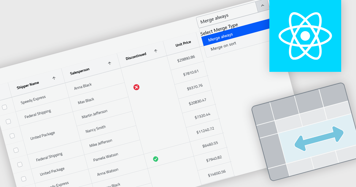
Cell merging in grids combines adjacent cells with matching or conditionally defined values into a single cell, typically within a column. This reduces repetitive data and creates cleaner, more readable tables that are easier to scan and understand. By visually grouping related rows, it helps highlight patterns and relationships in large datasets. The feature can be applied automatically or customized, making it useful for scenarios such as financial reports, schedules, and inventory lists where repeated values can be consolidated for better clarity.
Several React grid controls offer cell merge support including:
For an in-depth analysis of features and price, visit our React grid controls comparison.
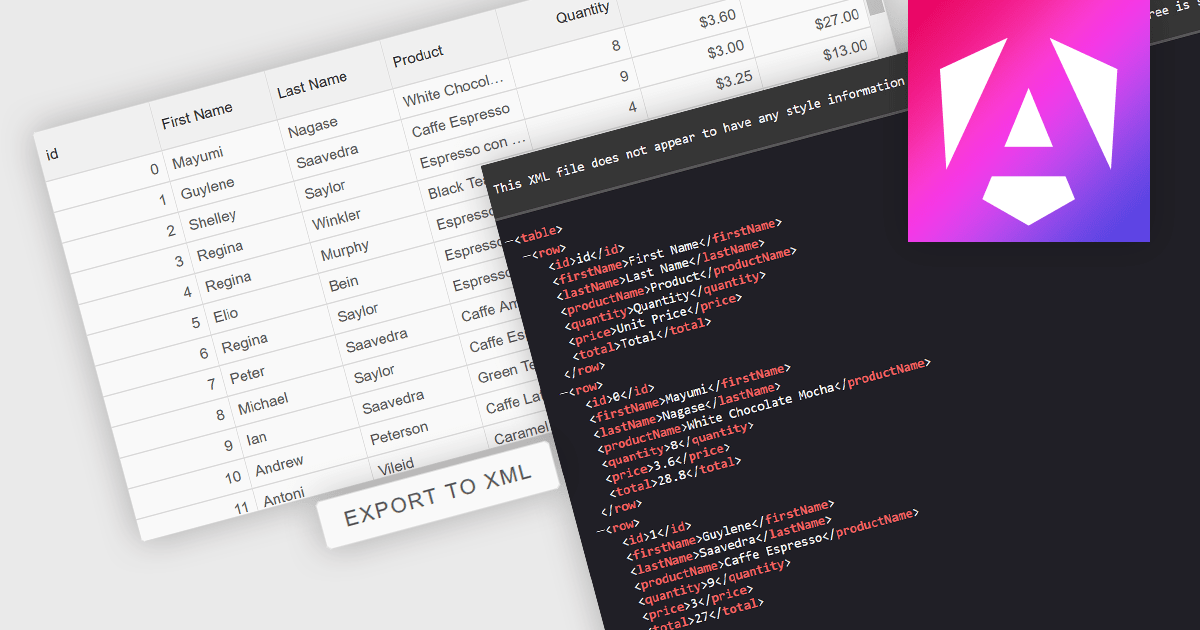
Exporting grid data to XML converts tabular data from a user interface grid into a structured, self-describing format for use beyond the application interface. By organizing data with clearly defined elements, XML ensures consistent interpretation across platforms and systems, regardless of the underlying technology. This enables reliable data exchange, supports interoperability between applications, and makes the data suitable for integration scenarios, long-term storage, and environments that rely on validated, standardized formats for processing and communication.
Several Angular grid components allow you to export to XML, including:
For an in-depth analysis of features and price, visit our comparison of Angular grid components.


Tel: (888) 850 9911
Fax: +1 770 250 6199


