


Official Supplier
As official and authorized distributors, we supply you with legitimate licenses directly from 200+ software publishers.
See all our Brands.
Actipro WPF Essentials is a robust suite of user interface controls designed specifically for Windows Presentation Foundation (WPF) applications. It includes a set of advanced components that enhance the standard WPF experience, focusing on both usability and visual appeal. The product provides developers with high-performance tools such as sophisticated docking windows, property grids, and enhanced controls like task panes and themes, making it easier to build rich, interactive desktop applications.
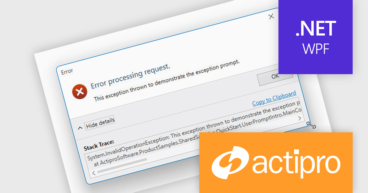
The Actipro WPF Essentials v25.1 update adds support for resizable user prompts, making it easier to implement adaptable dialog boxes. With just one configuration change, developers can now allow end users to adjust prompt sizes, improving usability and accessibility. This feature removes the need for custom resizing logic and ensures consistent behavior across different applications, supporting more responsive and user-friendly interfaces.
To see a full list of what's new in v25.1, see our release notes.
Actipro WPF Essentials is licensed per developer and is available as a Perpetual license with 1 year support and maintenance. See our Actipro WPF Essentials licensing page for full details.
Actipro WPF Essentials is available in the following products:
Actipro Bars for WPF is a UI component library that equips developers with the tools to build advanced ribbons, toolbars, and menus within their WPF applications. It offers an "Office-like" ribbon experience with customization options, supports MVVM design patterns, and includes a rich set of controls specifically designed for use within these elements, allowing for a cohesive and user-friendly interface.
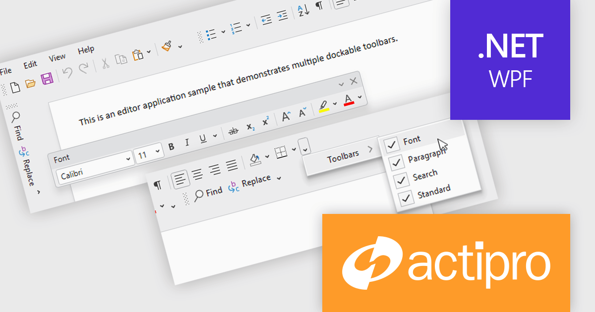
The Actipro Bars for WPF v25.1 update introduces Visual Studio-style dockable toolbars that can be positioned on any edge of a host control or detached and moved to secondary monitors. This provides a highly adaptable workspace layout that users can configure to fit their preferences. Developers gain fine control over docking behavior, floating, stacking, and visibility settings through exposed properties, allowing for a dynamic and customizable interface without requiring complex custom coding.
To see a full list of what's new in v25.1, see our release notes.
Actipro Bars for WPF is licensed per developer and is available as a Perpetual license with 1 year support and maintenance. See our Actipro Bars for WPF licensing page for full details.
Actipro Bars for WPF is available in the following products:
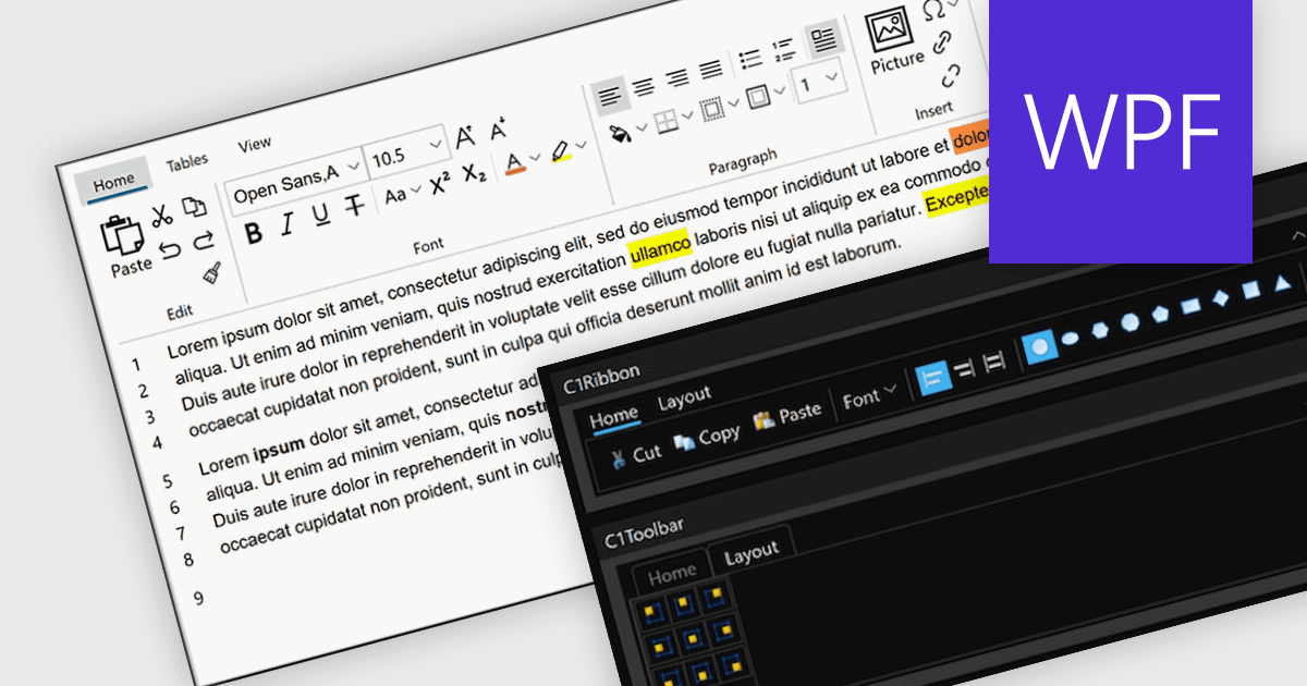
A toolbar user interface component is a horizontal or vertical strip that contains a set of buttons, icons, dropdowns or menus designed to provide quick access to commonly used functions within a software application. These customizable toolbars streamline user interactions by grouping related tools in a consistent and easily accessible location, often near the top or side of the interface. Toolbars enhance productivity by minimizing the number of steps required to perform frequent tasks, improving efficiency, and reducing the need to navigate through deeper menu hierarchies. Such a component also contributes to a cleaner and more organized interface, helping users perform actions more intuitively and with fewer interruptions.
Several WPF user interface suites provide you with toolbars, including:
For an in-depth analysis of features and price, visit our comparison of WPF user interface suites.
ComponentOne Studio Enterprise (formerly ComponentOne Studio) is a comprehensive, flexible collection of performant, extensible .NET UI controls for mobile, web, and desktop. With ComponentOne Enterprise, you get every .NET platform, Data Service components and JavaScript controls with Wijmo Enterprise.
In this blog post, MESCIUS' Greg Lutz shows you the new and improved features that are coming soon with ComponentOne Studio Enterprise 2025 v1. This release is scheduled for early June and will include major enhancements for WinForms, WPF, Blazor, ASP.NET Core, and WinUI controls. The blog post also includes a roadmap of what's planned for 2025 v2 as well as the 2026 releases.
Read the complete blog to learn all about what's included in this upcoming release. Purchasing a license now - or renewing your current subscription - will ensure that you get these updates as soon as they are released.
ComponentOne Studio products are licensed per developer on a perpetual basis and include a 12 month subscription. Priority Support is also available. See our ComponentOne Studio Enterprise licensing page for full details.
Learn more on our ComponentOne Studio Enterprise product page.
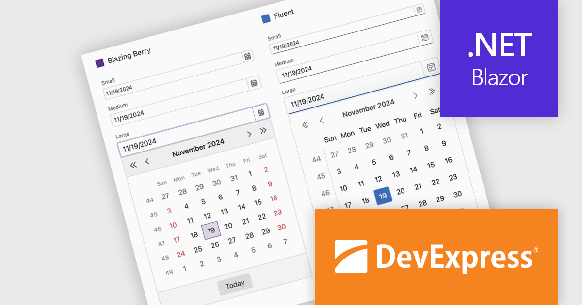
DevExpress Blazor (part of DevExpress ASP.NET and Blazor) helps you create high-impact user experiences for both Blazor Server and Blazor WebAssembly using C#. The Blazor UI Component Library ships with a comprehensive set of native components (including a DataGrid, Pivot Grid, Scheduler, Chart, Data Editors and Reporting).
DevExpress Blazor now includes improved size mode support within the Fluent theme, giving developers greater control over UI density and responsiveness. The Small size mode has been refined to occupy less space, making it well-suited for data-intensive layouts, while the Medium and Large modes have been adjusted to better accommodate standard web and mobile interfaces. Icon sizes now automatically scale with the selected size mode, ensuring visual consistency across the component library and enhancing the overall user experience without additional customization.
DevExpress ASP.NET and Blazor is licensed per developer and is available as a Perpetual License with a 12 month support and maintenance subscription. See our DevExpress ASP.NET and Blazor licensing page for full details.
DevExpress Blazor is available in the following products:


Tel: (888) 850 9911
Fax: +1 770 250 6199


