








Official Supplier
As official and authorized distributors, we supply you with legitimate licenses directly from 200+ software publishers.
See all our Brands.
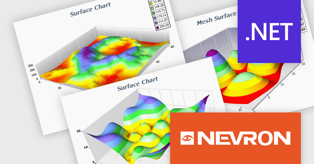
NOV Chart for .NET by Nevron is a comprehensive .NET charting component suite designed for cross-platform application development. It offers an array of 2D and 3D chart types, along with smart data labeling, an advanced chart axes model, numerous interactivity features and GPU-accelerated real-time rendering based on OpenGL. This library allows developers to seamlessly integrate rich, dynamic and interactive business, scientific, financial and presentation data visualizations into their .NET applications for more effective communication.
The NOV Chart for .NET 2024.1 update expands its surface series capabilities to include support for Grid Surface, Mesh Surface, Triangulated Surface, and Vertex Surface series types. Supporting custom colors per vertex, mesh and contour lines, flat contour rendering, real time, shader optimized rendering, and more, each series type offers unique capabilities for depicting data. This enables developers to deliver richer, more informative visual analytics, catering to a wide range of professional and scientific needs.
To see a full list of what's new in 2024.1, see our release notes.
NOV Chart for .NET is licensed per developer and is available as a perpetual license with 1 year support and maintenance. See our NOV Chart for .NET licensing page for full details.
NOV Chart for .NET is available in the following products:
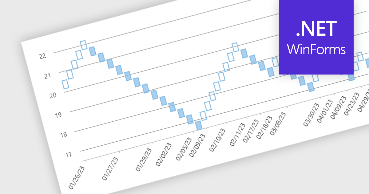
Renko charts are specialized financial charts that represent price movements with fixed-sized bricks, filtering out minor price fluctuations to highlight significant trends. These charts are particularly useful for identifying key support and resistance levels, making trend direction clearer by eliminating noise from the data. A primary benefit of Renko charts lies in their ability to simplify the visualization of market trends and price patterns, aiding developers in creating sophisticated financial applications that require precise and clear representation of market behavior. By using Renko charts, developers can enhance the analytical capabilities of their applications, providing users with powerful tools to make informed trading decisions.
Several .NET WinForms Chart controls offer a Renko chart including:
For an in-depth analysis of features and price, visit our comparison of .NET WinForms Chart controls.
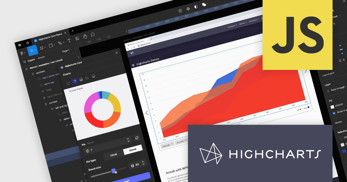
Highcharts Core by Highsoft is a powerful JavaScript charting library that simplifies the creation of interactive and accessible data visualizations for web applications. Featuring a wide variety of chart types, from basic line graphs to complex combinations, and extensive customization options, Highcharts Core (formerly Highcharts JS) allows developers to bring their data to life in a way that is both informative and engaging. This makes it ideal for use cases across various industries, from financial dashboards and scientific reports to marketing campaigns and social media content.
Highsoft has made the Highcharts Core Figma Plug-In available for free on Figma Community. Figma is a web-based design tool that allows you to create user interfaces for websites and apps. Known for its collaborative features, Figma makes it easy for design teams to work together on projects. The new plugin includes:
Read the Highcharts blog for more information about this powerful free plug-in available to licensed users of Highcharts Core.
Highcharts Core is licensed on an annual or perpetual basis, OEM licenses, and Advantage Renewals. It is licensed per Developer and has several license options including Internal, SaaS, SaaS+, and Self Hosted. See our Highsoft Core licensing page for full details.
For more information, visit our Highcharts Core product page.
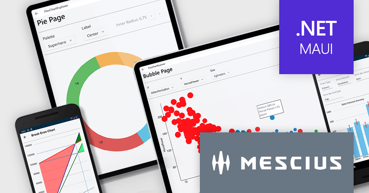
ComponentOne Studio Enterprise by MESCIUS is a comprehensive toolkit for .NET developers, offering a vast collection of pre-built UI controls for desktop (WinForms, WPF, WinUI, UWP), web (ASP.NET MVC, ASP.NET Core, MVC, Blazor), and mobile (.NET MAUI, Xamarin) applications. It extends functionality beyond UI with data visualization tools, data grids, reporting components, and JavaScript controls through Wijmo Enterprise. This all-in-one solution streamlines development by providing pre-designed elements and functionalities, allowing developers to focus on core application logic and deliver feature-rich applications faster.
The ComponentOne Studio Enterprise 2024 v1 release adds ComponentOne MAUI FlexChart, a cross-platform .NET MAUI chart control, empowers you to craft dynamic dashboards and data visualizations. With over 50 chart types including bar charts, line graphs, pie charts, and combination plots, developers can tailor the perfect visual representation for your data. FlexChart offers granular control, allowing you to customize labels, gridlines, tick marks, and more. It enhances user engagement with interactive features like pop-up labels, selection, zoom, pan, and line markers. This powerful tool enhances the ability to present data insights in a clear and engaging way for .NET MAUI projects.
To see a full list of what's new in 2024 v1, see our release notes.
ComponentOne Studio Enterprise is licensed per developer on a perpetual basis and includes a 12 month subscription. Priority Support is also available. See our ComponentOne Studio Enterprise licensing page for full details.
Learn more on our ComponentOne Studio Enterprise product page.
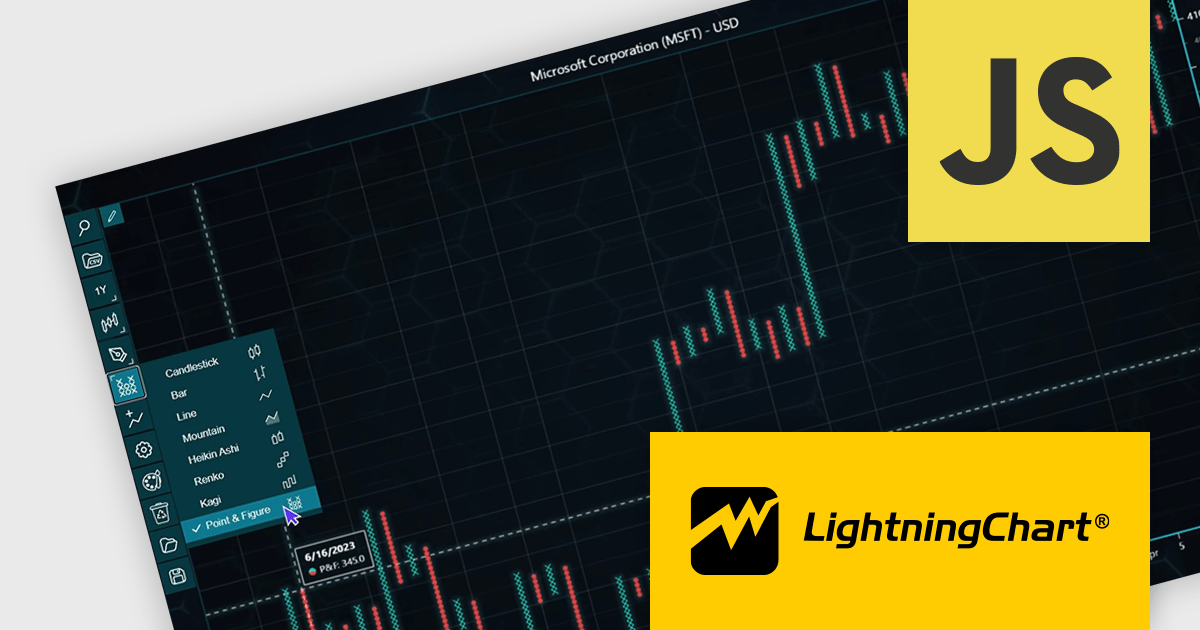
LightningChart JS Trader is a JavaScript/TypeScript library developed by LightningChart that specifically targets the creation of financial and trading applications. It provides high-performance, 2D, 3D, and real-time charting controls and a comprehensive suite of visualizations including candlestick, bar, line, and various technical indicators and drawing tools. This library enables software developers to craft interactive technical analysis tools without the need for server-side setup as it runs completely on the client device.
The LightningChart JS Trader v2.0 update expands its technical analysis toolkit by introducing more chart types, such as Heikin Ashi, Renko, Kagi, and Point-and-Figure charts. These additional chart types equip developers with a wider range of visualization options, significantly enhancing market trend analysis capabilities and allowing them to adapt to different analytical needs and trading strategies.
To see a full list of what's new in v2.0, see our release notes.
LightningChart JS Trader is licensed per developer and is available as an annual license with 1 year support. See our LightningChart JS Trader licensing page for full details.
For more information, see our LightningChart JS Trader product page.





Tel: (888) 850 9911
Fax: +1 770 250 6199


