








Official Supplier
As official and authorized distributors, we supply you with legitimate licenses directly from 200+ software publishers.
See all our Brands.
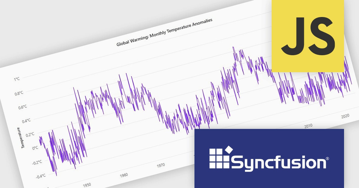
Syncfusion Essential Studio JavaScript is a comprehensive UI library offering over 80 high-performance, lightweight, and responsive components to transform your web apps. Built from scratch with TypeScript, it boasts modularity and touch-friendliness, letting you pick and choose specific features while ensuring smooth mobile interaction. With rich themes, global accessibility features, and extensive documentation, it powers everything from basic buttons to interactive charts and data grids, simplifying frontend development across JavaScript, Angular, React, and Vue.
The Syncfusion Essential Studio JavaScript 2024 Volume 4 update introduces a new toolbar feature that allows users to customize the position of the zoom toolbar within charts. With drag-and-drop functionality, this feature offers greater flexibility in interface design, enabling developers to optimize chart layouts for better usability and alignment with specific application requirements. By allowing the toolbar to be re-positioned anywhere within the chart area, this update enhances both user experience and chart readability, providing a more adaptable and professional solution for modern web applications.
To see a full list of what's new in 2024 Volume 4, see our release notes.
Syncfusion Essential Studio JavaScript is available as part of Syncfusion Essential Studio Enterprise which is licensed per developer starting with a Team License of up to five developers. It is available as a 12 Month Timed Subscription License which includes support and maintenance. See our Syncfusion Essential Studio Enterprise licensing page for full details.
Learn more on our Syncfusion Essential Studio JavaScript product page.
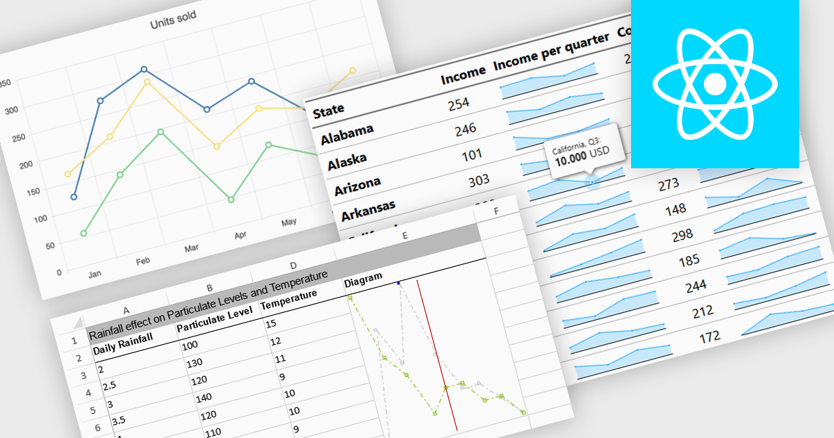
Sparkline charts are compact, data-rich visuals that display trends, patterns, and variations in a minimalistic format. Unlike traditional charts, they save space and seamlessly integrate into tables, dashboards, or reports for quick insights. These charts are particularly useful for identifying trends over time, monitoring real-time changes, and enhancing data readability. Common use cases include financial reports to track stock performance, sales dashboards to visualize revenue fluctuations, and performance monitoring tools to highlight system metrics. With their ability to quickly convey key insights in a visually intuitive manner, sparkline charts are an essential tool for data-driven decision-making.
Several React charts offer sparkline chart support, including:
For an in-depth analysis of features and price, visit our React chart comparison.
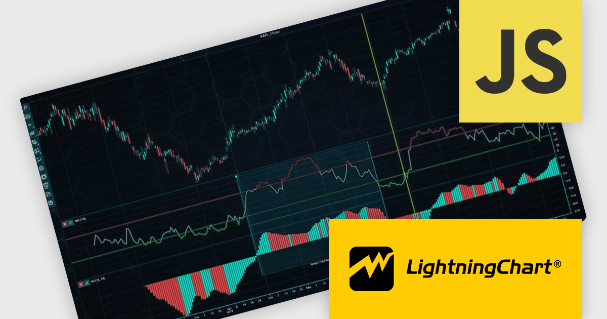
LightningChart JS Trader is a JavaScript/TypeScript library developed by LightningChart that specifically targets the creation of financial and trading applications. It provides high-performance, 2D, 3D, and real-time charting controls and a comprehensive suite of visualizations including candlestick, bar, line, and various technical indicators and drawing tools. This library enables software developers to craft interactive technical analysis tools without the need for server-side setup as it runs completely on the client device.
The LightningChart JS Trader v3 update introduces draggable splitter lines, enabling users to dynamically resize indicator segments and the main chart within a single view. This enhancement provides greater flexibility in data visualization, allowing developers to create a more customizable and user-friendly charting experience. By adjusting the layout interactively, users can allocate space efficiently based on analytical needs, improving readability and workflow efficiency. This update eliminates the need for separate charts, streamlining technical analysis and ensuring all relevant data remains accessible within a unified interface.
To see a full list of what's new in v3, see our release notes.
LightningChart JS Trader is licensed per developer and is available as an annual license with 1 year support. See our LightningChart JS Trader licensing page for full details.
For more information, see our LightningChart JS Trader product page.

Stimulsoft Dashboards.WIN is a versatile suite of tools for crafting interactive data visualizations for web and desktop applications. It empowers developers to embed intuitive dashboards across various platforms, using platform-specific components or a centralized cloud designer. With data analysis elements, customization options, and pre-built templates, Stimulsoft Dashboards helps you transform complex data into clear, actionable insights for any audience.
The Stimulsoft Dashboards.WIN 2025.1.1 update introduces the ability to rotate pie and doughnut charts directly within the dashboard, providing developers with a powerful new tool for creating more interactive and user-focused applications. This feature allows end-users to manipulate chart orientation using simple mouse actions, enhancing the visualization experience by enabling a closer examination of specific data segments. By integrating this functionality, developers can offer a more intuitive and flexible data analysis environment, aligning with modern UI standards and improving the overall usability of dashboards.
To see a full list of what's new in 2025.1.1, see our release notes.
Stimulsoft Dashboards.WIN is licensed per developer and is available as a perpetual license with 1 year support and maintenance. See our Stimulsoft Dashboards.WIN licensing page for full details.
Stimulsoft Dashboards.WIN is available individually or as part of Stimulsoft Ultimate.
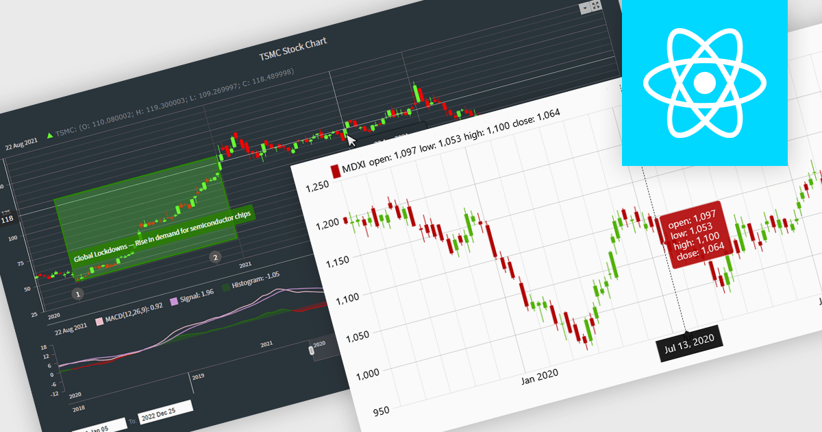
Candlestick charts are a powerful data visualization tool used to represent price movements within a specific time frame, displaying the opening, closing, high, and low prices in a single, compact graphical format. For software developers, integrating candlestick charts into applications enables users to analyze market trends, identify potential reversals, and make informed decisions with precise, actionable data. These charts are adaptable across various time frames, work seamlessly with technical indicators, and offer a clear visual representation that aids in interpreting complex financial data efficiently, making them an essential feature in trading platforms and analytics tools.
Several React chart controls offer candlestick chart support including:
For an in-depth analysis of features and price, visit our React chart controls comparison.





Tel: (888) 850 9911
Fax: +1 770 250 6199


