








Official Supplier
As official and authorized distributors, we supply you with legitimate licenses directly from 200+ software publishers.
See all our Brands.
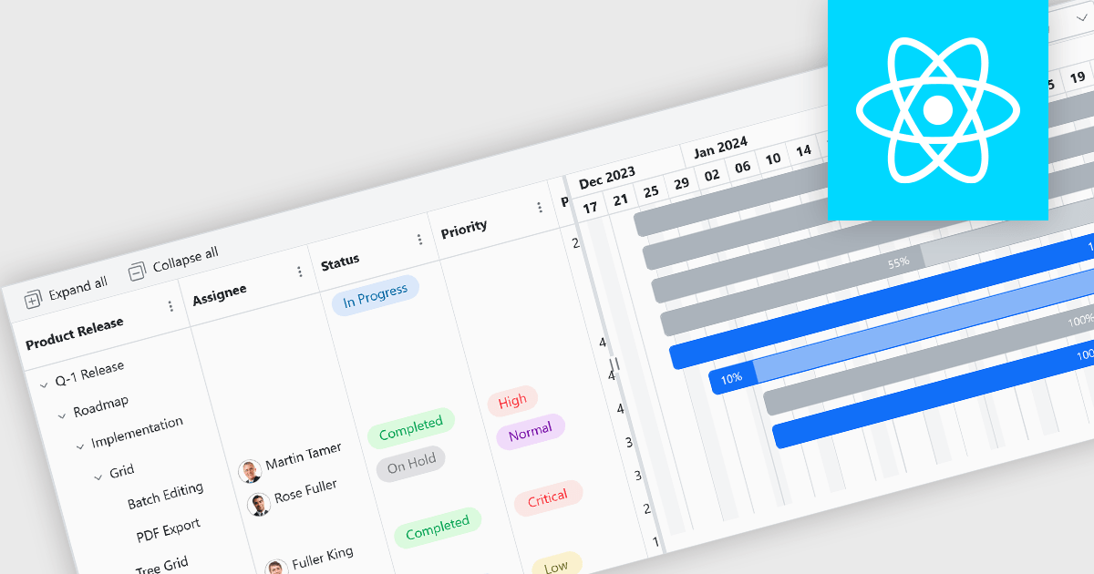
Gantt controls are invaluable tools for project management, particularly in visualizing and tracking the timeline of tasks, dependencies, and progress. These controls are ideal for illustrating project schedules, resource allocation, and critical paths. By providing a clear and concise overview of project milestones, Gantt controls facilitate effective planning, communication, and monitoring, ultimately helping organizations achieve project goals efficiently and on time.
Several React UI suites offer Gantt controls including:
For an in-depth analysis of features and price, visit our React UI suites comparison.
Syncfusion Essential Studio Windows Forms is a powerful UI component suite designed to enhance your WinForms development. It boasts over 100 high-performance controls, ranging from essential grids and charts to advanced schedulers and diagrams, enabling you to craft visually appealing and feature-rich applications with ease. Its extensive customization options and built-in themes allow for tailored user experiences, while touch-friendly design ensures seamless interaction across devices.
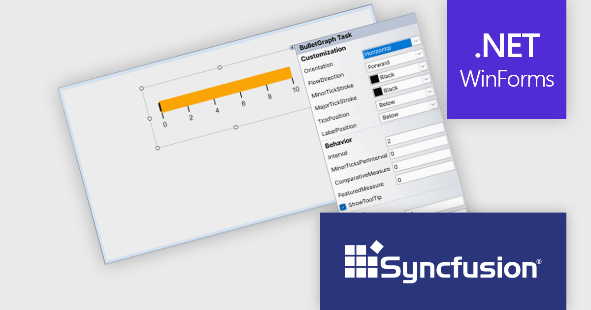
The Syncfusion Essential Studio Windows Forms 2024 Volume 3 release adds smart tag support to the BulletGraph control. Smart tags provide quick access to common properties and settings directly within the design view, eliminating the need for manual property adjustments. This approach accelerates development time and reduces the risk of errors, empowering developers to create visually compelling and informative BulletGraphs with greater efficiency.
To see a full list of what's new in 2024 Volume 3, see our release notes.
Syncfusion Essential Studio Windows Forms is available as part of Syncfusion Essential Studio Enterprise which is licensed per developer starting with a Team License of up to five developers. It is available as a 12 Month Timed Subscription License which includes support and maintenance. See our Syncfusion Essential Studio Enterprise licensing page for full details.
Learn more on our Syncfusion Essential Studio Windows Forms product page.

Bullet charts are efficient data visualization tools designed to display performance metrics against a target within a single, streamlined bar. Ideal for compact spaces on dashboards, bullet charts convey a KPI's current status, target, and performance range in a minimalist view, making them perfect for summarizing key data points without overwhelming the interface. They are highly customizable, supporting varied colors, labels, and thresholds, and their component-based structure in React allows developers to implement real-time updates, enabling users to monitor changing data continuously. These charts promote a responsive, interactive experience, providing powerful options for building detailed, data-rich applications.
Several React chart controls offer bullet chart support including:
For an in-depth analysis of features and price, visit our React bullet chart controls comparison.

Chart components with image export features empower users to save a chart's visual representation as a static image file, providing a convenient way to share, embed, or print data insights. This capability is valuable for developers and end-users alike, as it removes the need for access to the original dataset or charting software when distributing visualizations. With image export, users can preserve the chart's design, style, and formatting, ensuring that its presentation remains consistent across various platforms, from presentations to reports. Additionally, by offering support for standard formats such as PNG, JPEG, or SVG, this feature enables seamless integration of charts into documents, websites, or printed materials, enhancing flexibility and broadening the ways in which data insights can be shared and utilized.
Several WPF charting components support exporting to images including:
For an in-depth analysis of features and price, visit our comparison of WPF charting components.

LightningChart .NET is a high-performance data visualization library designed for .NET developers working with WPF, WinForms, and UWP applications. It offers GPU-accelerated rendering for smooth real-time visualization of massive datasets, exceeding billions of data points. This library supports a wide variety of chart types, including 2D, 3D, polar, and geographic maps, along with extensive customization options for each. LightningChart .NET is a powerful tool for developers creating demanding data visualization applications requiring exceptional performance.
The LightningChart .NET v12.1.1 update delivers a substantial performance boost to 3D interactions, particularly for large surface-rendering objects such as SurfaceGridSeries3D, SurfaceMeshSeries3D, and MeshModel. This improvement allows for faster zooming, rotating, and panning, significantly enhancing the efficiency of workflows involving complex 3D models. Developers working on mid-level systems will experience at least double the performance, while high-end graphics setups can achieve up to a tenfold increase in speed. These optimizations enable smoother and more responsive interaction with large datasets, leading to more productive and seamless user experiences when working in demanding 3D environments.
To see a full list of what's new in v12.1.1, see our release notes.
LightningChart .NET is available per developer in packages for either WPF, WinForms, UWP or all 3. Each package comes as a subscription license (with 1 or 2 years of limited support), or a perpetual license (with 1 or 2 years of Standard or Premium support). Floating licenses and site licenses are available upon request. See our LightningChart .NET licensing page for full details.
Learn more on our LightningChart .NET product page.





Tel: (888) 850 9911
Fax: +1 770 250 6199


